Let’s Build Something Great
Tell us about your goals and request a free project estimate.

A Distinctive Brand Identity Shaped by the Hunting Landscape
Zbrane Budai is a specialist firearms and hunting retailer based in Vinica, Slovakia, providing firearms, ammunition, expert advice and technical services. Founded by Ján Budai in autumn 2022, the business emerged from a local need for a well-equipped hunting store, gradually establishing its presence through personal recommendations and customer relationships.
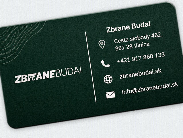
Playful Sparkle developed a complete visual identity reflecting the specialised nature of the business and its connection to the hunting environment. The branding brings together a distinctive typographic logo, a restrained woodland-inspired colour palette and a coordinated collection of corporate stationery, printed promotional materials and digital graphics.
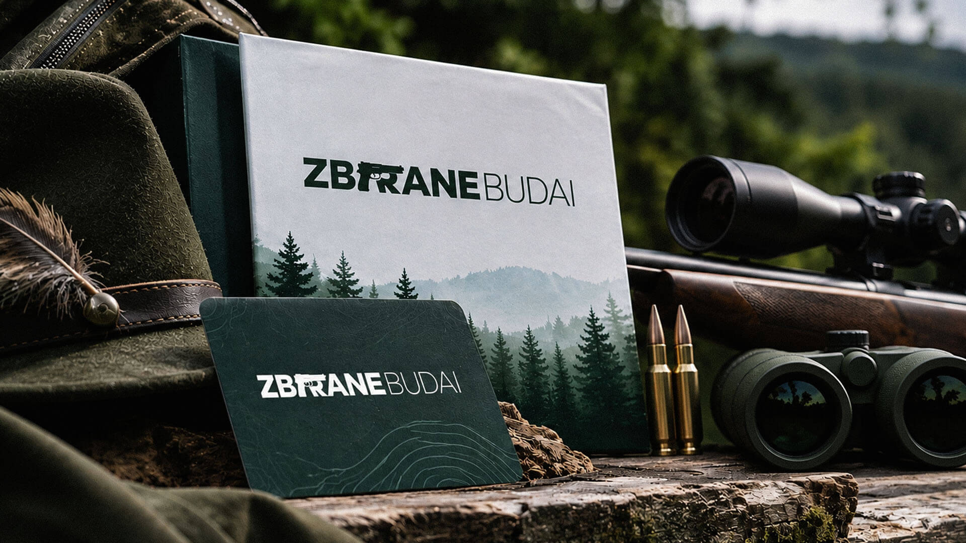
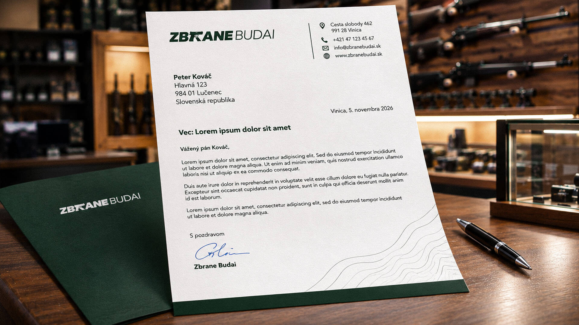
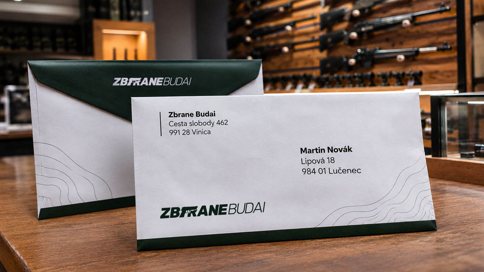
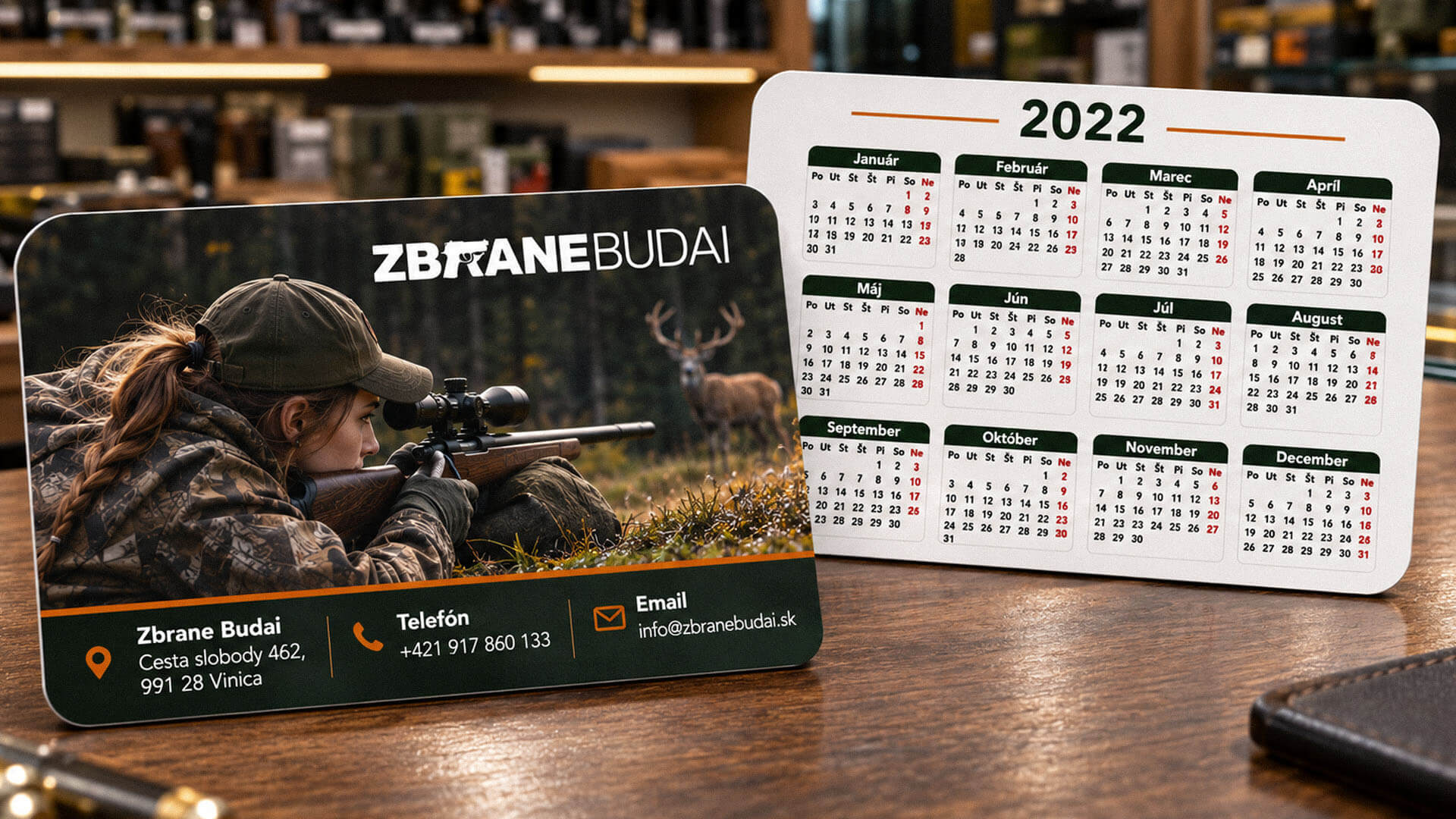
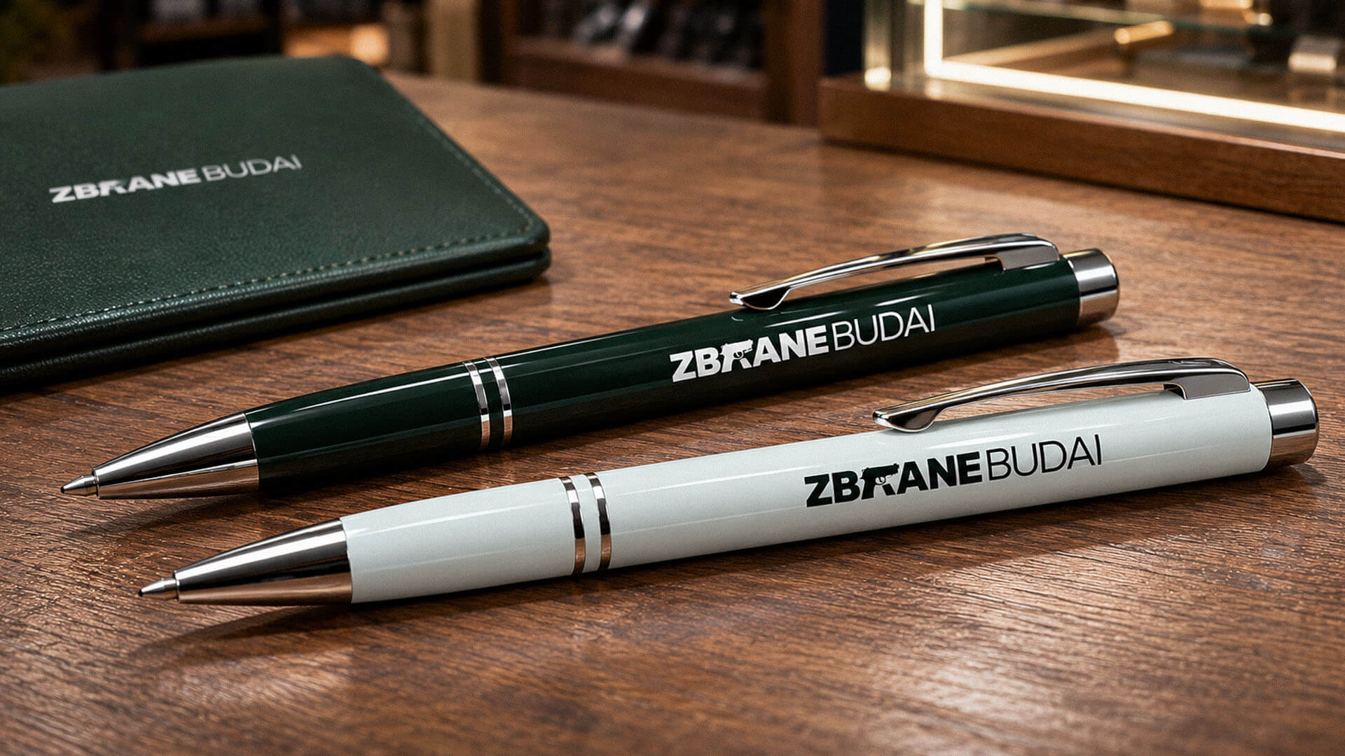
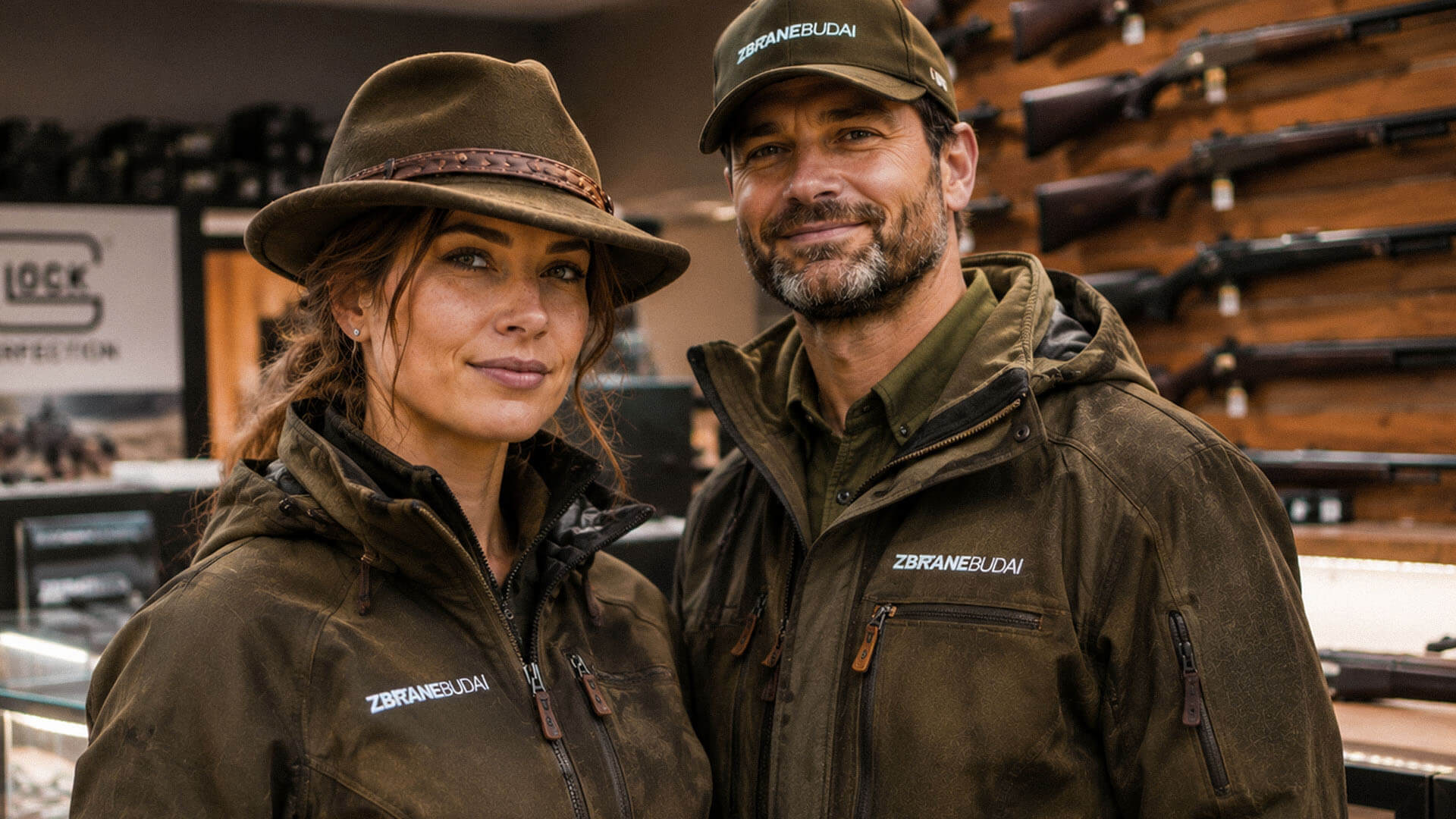
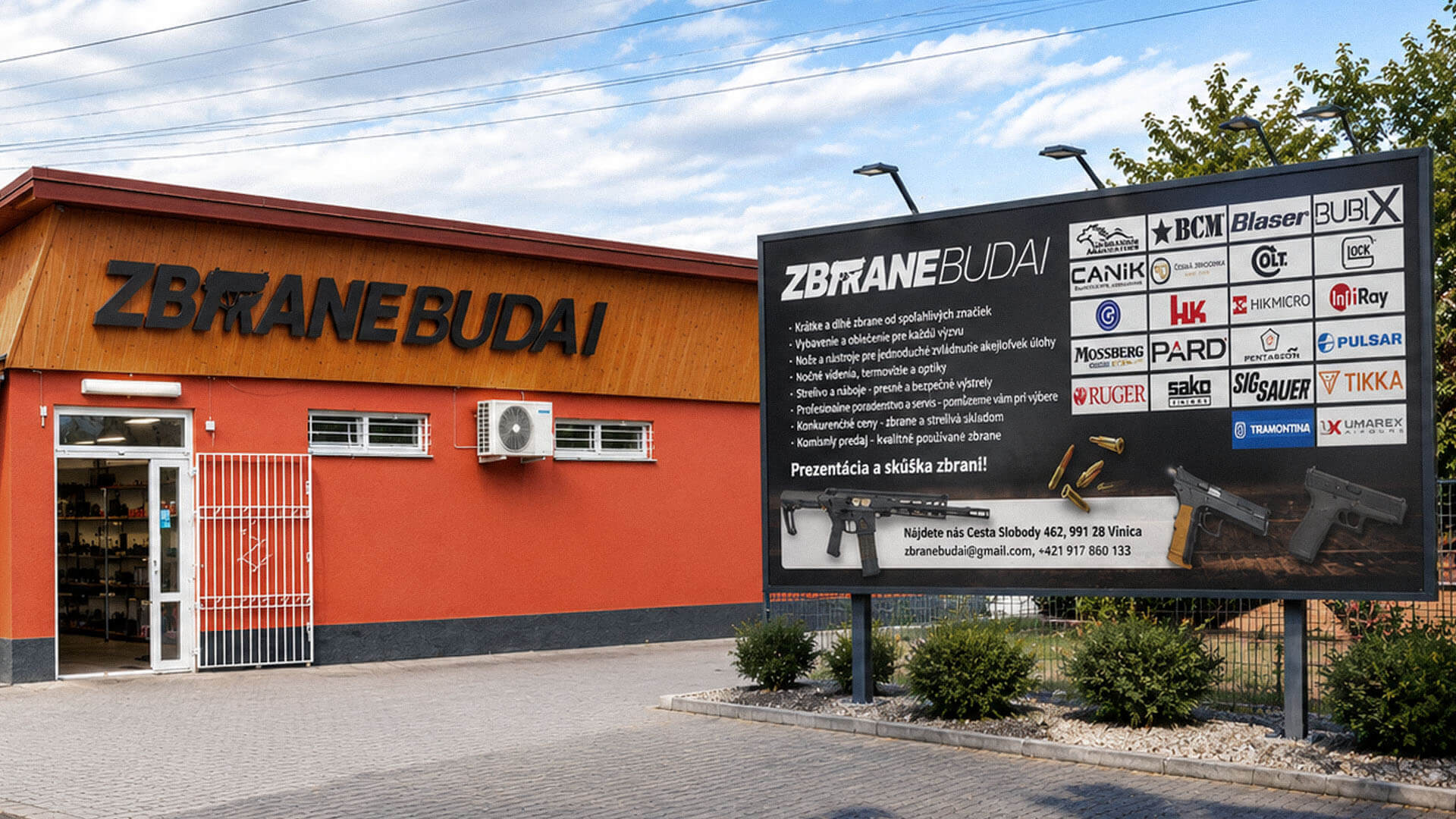
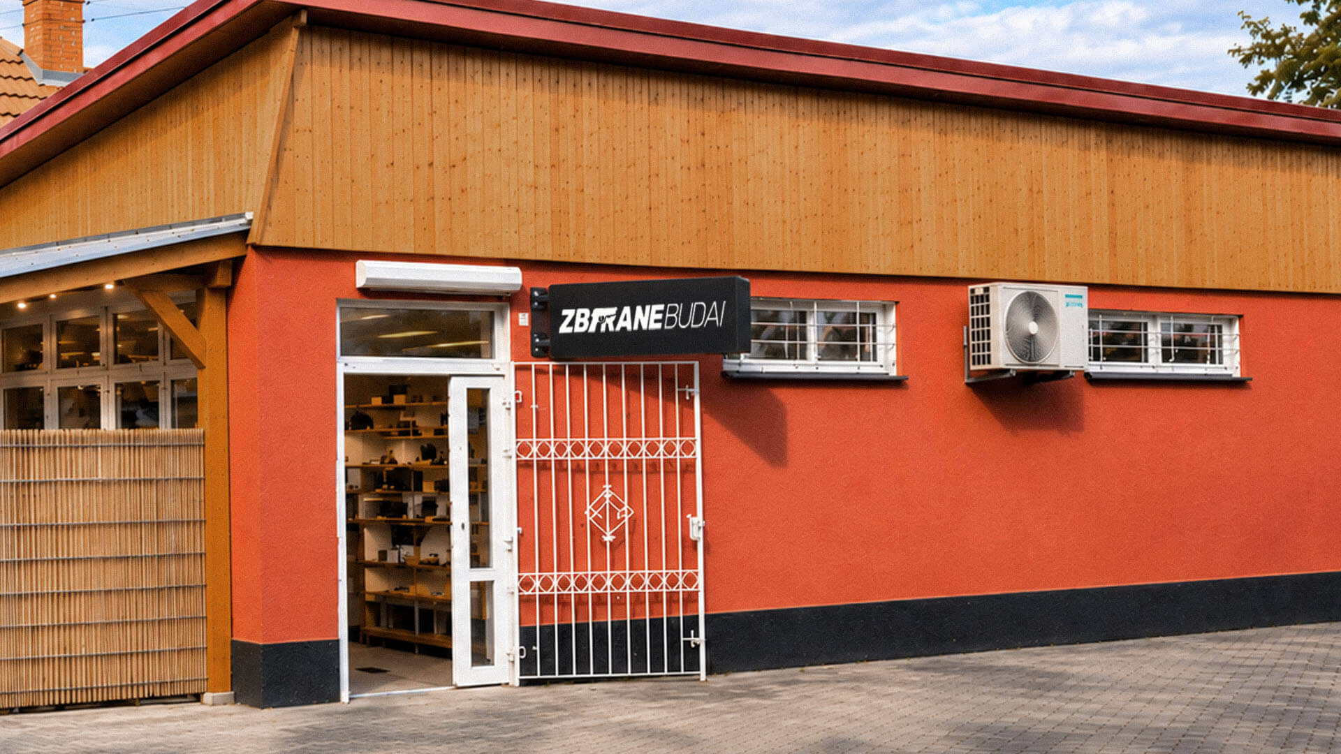
The objective was to establish a recognisable visual identity that communicates specialist expertise while reflecting the character of hunting and the natural environment. The project encompassed logo development, a cohesive colour system and a comprehensive collection of branded materials for corporate communication, retail promotion and digital applications.
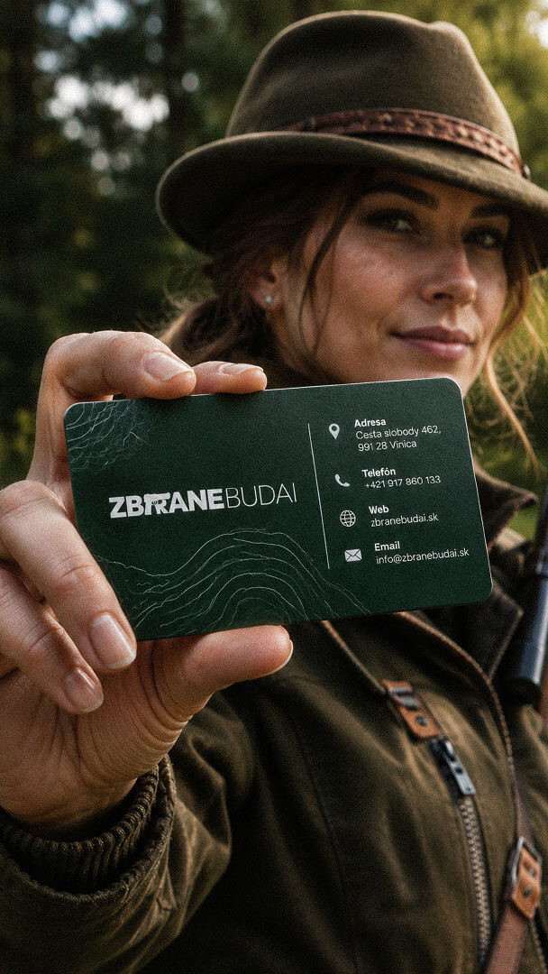
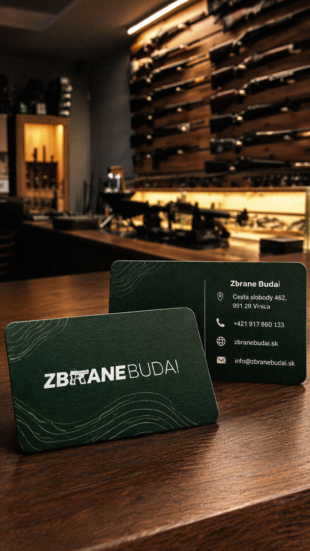
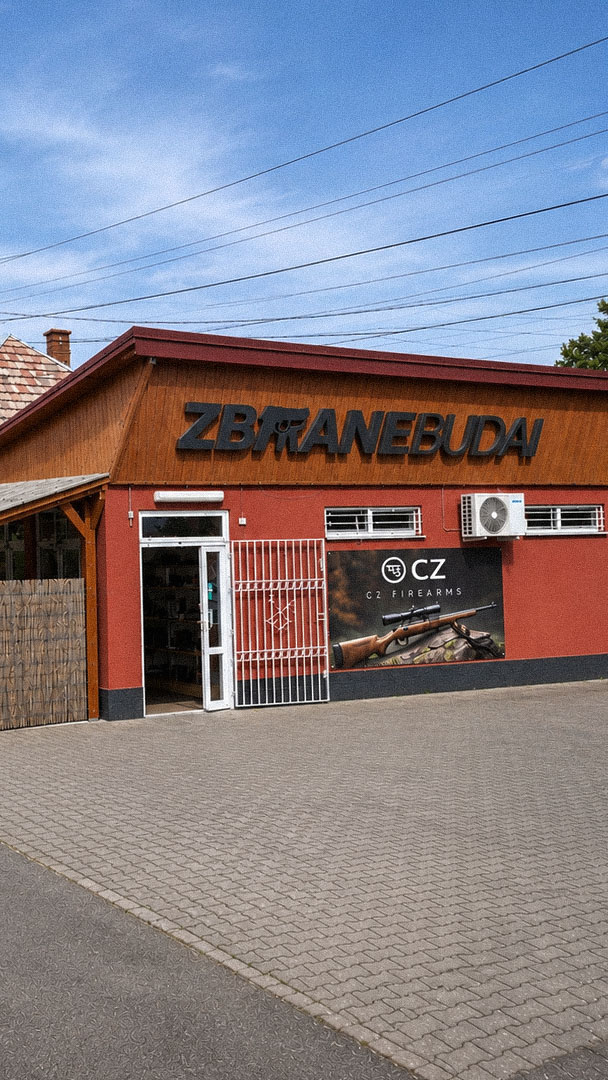
The completed identity gives Zbrane Budai a cohesive visual language across its business communications and promotional materials. The combination of distinctive typography, a recognisable firearm-inspired symbol and a restrained natural colour palette establishes a consistent presentation across both print and digital applications.
The deep woodland green (#152420) and cool off-white (#EEF4F5) create a visual connection to the hunting landscape while maintaining a composed, professional appearance. Applied consistently across the logo, stationery, brochures, posters, roll-up banners and social media graphics, the identity provides a unified brand presence that reflects the specialist character of Zbrane Budai.
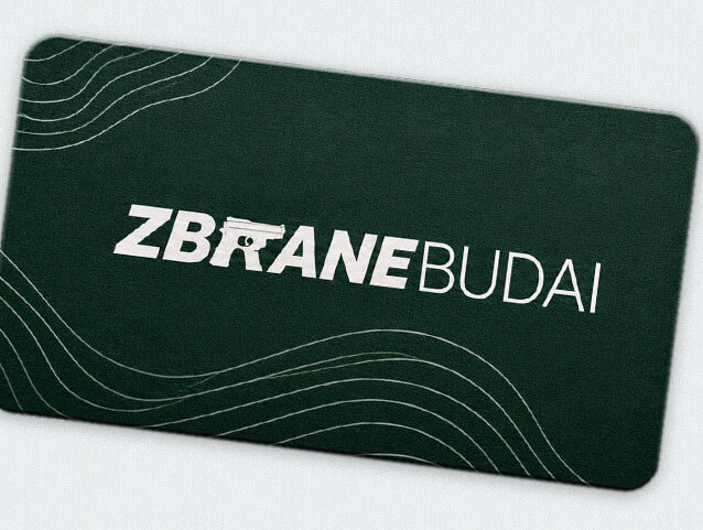
The logo was developed around a distinctive typographic composition, combining bold uppercase letterforms in ZBRANE with the lighter, more refined typography of BUDAI. A firearm silhouette is integrated directly into the wordmark, creating an immediate association with the specialist trade while keeping the company name at the centre of the identity. The contrast in typographic weight establishes a clear visual hierarchy, while the integrated symbol gives the mark a recognisable character.
The colour palette draws from the visual language of the hunting environment. Deep woodland green (#152420) references forest landscapes and natural surroundings, while the cool off-white (#EEF4F5) introduces contrast, clarity and visual space. Rather than relying on conventional camouflage patterns or literal nature illustrations, the identity uses colour, typography and restrained graphic composition to establish its connection to the outdoors. This visual direction was carried consistently across corporate stationery, brochures, posters, roll-up banners and social media materials, creating a coordinated identity system for the business.

Playful Sparkle established and manages Modul Motorsport’s YouTube channel, combining channel branding, search-optimized video metadata, and 3D product animation. The initial video content includes a branded intro and a product showcase featuring 54 3D models of motorsport components for enthusiasts, specialists, and customers working on historic motorsport projects.
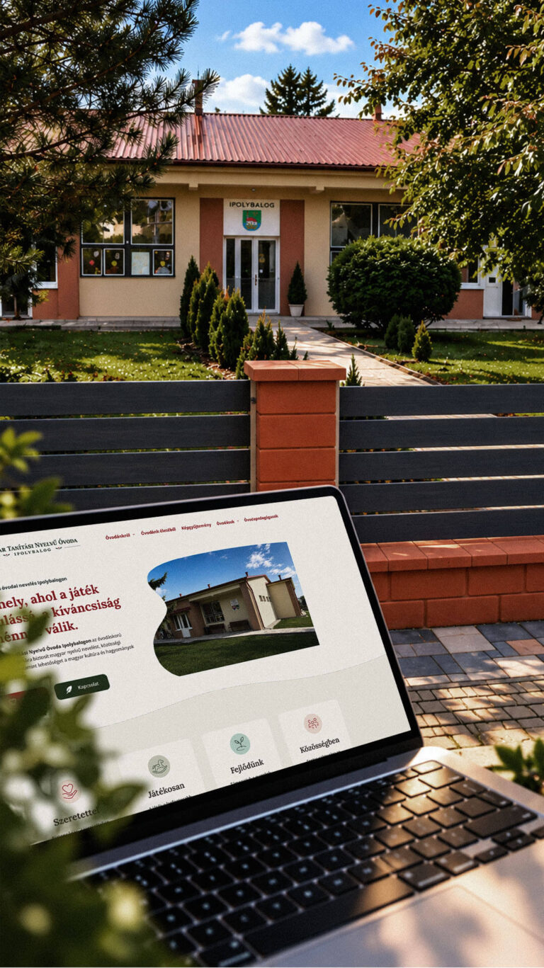
Playful Sparkle created a bilingual WordPress website and a distinctive visual identity for the Hungarian-language kindergarten in Balog nad Ipľom. The project includes Slovak and Hungarian logo variants, published school documents, admissions information, teacher profiles, educational programme details and activity pages, giving parents convenient access to essential information in both...
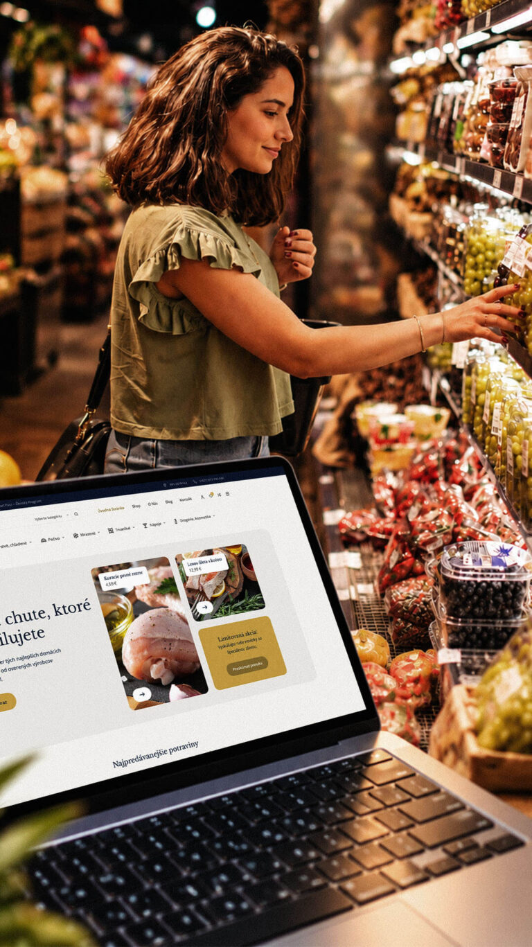
Playful Sparkle developed a WordPress and WooCommerce e-commerce platform for Dirolio Freshbox, bringing fresh and chilled foods, bakery products, frozen goods, pantry essentials, beverages and household care products into one organized catalogue. The store also includes a membership discount system linked to customer purchases, supporting the business’s planned local delivery...
