Let’s Build Something Great
Tell us about your goals and request a free project estimate.

A Modern Motorsport Logo for M-Bikes Motorcycle Shop & Service
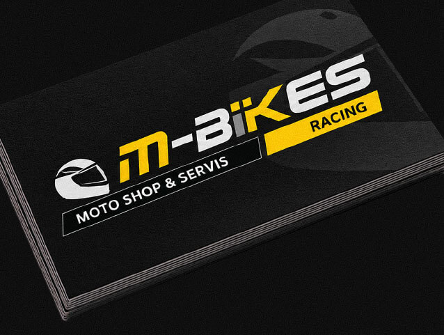
M-Bikes is a motorcycle retail and maintenance business based in Kolárovo, Slovakia. Established in 2009, the company provides motorcycle spare parts, accessories, riding equipment and maintenance services. Playful Sparkle was commissioned to modernize its existing logo and create a more contemporary visual identity that better reflected its motorcycle and motorsport focus.
The previous logo variations relied on italic lettering, horizontal framing and, in one version, a separate motorcycle illustration with red accents. Their overall appearance no longer reflected the visual direction the business wanted. The redesign retained the established M-Bikes name while replacing the previous visual elements with a newly illustrated motorcycle helmet symbol, distinctive typography and a black-and-yellow colour scheme.
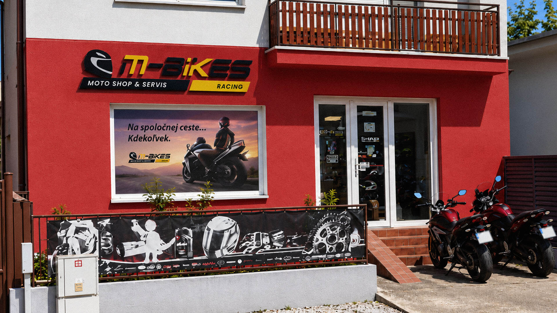
The objective was to create a more distinctive and cohesive logo that communicated M-Bikes’ connection to motorcycling while accommodating its different business activities. The new identity needed to distinguish the motorcycle shop and service offering from the racing association without creating unrelated visual identities.
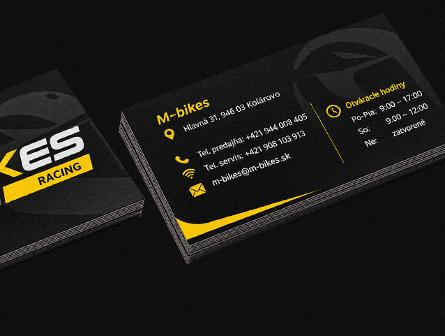
The design also needed to retain recognition of the established business name while introducing a more contemporary motorsport-inspired direction. Alongside the logo, the project required a consistent set of variations, supporting brand guidelines and a business card design.
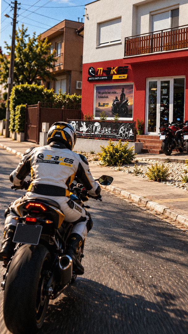
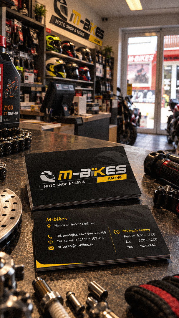
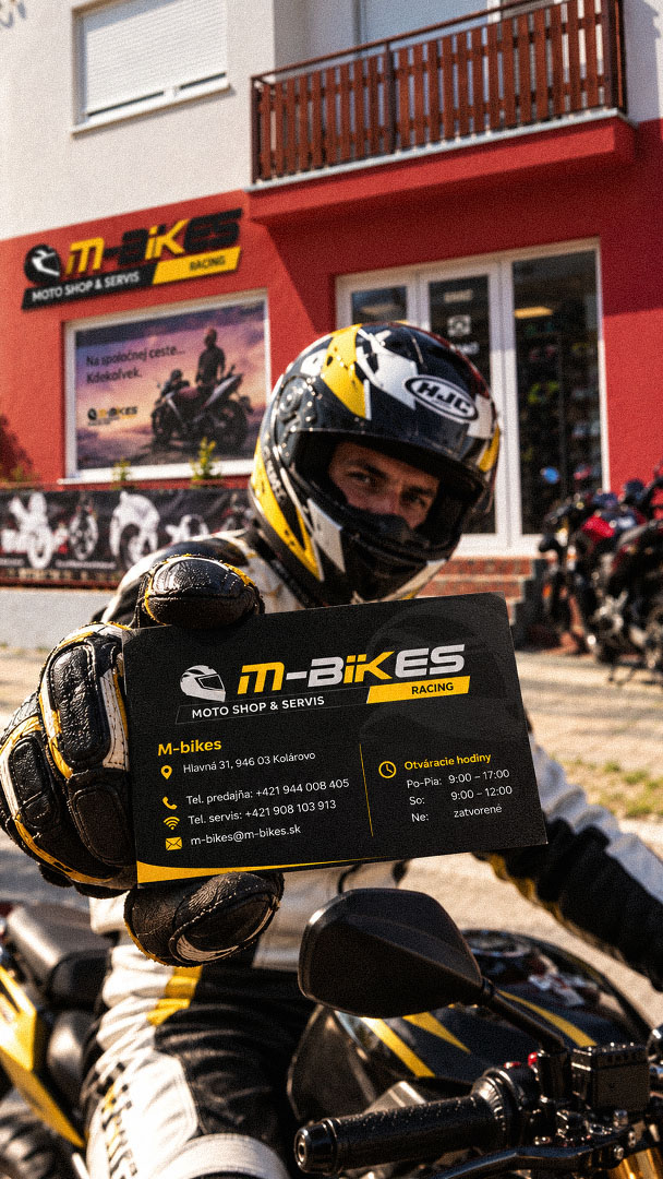
The redesigned identity gives M-Bikes a more defined visual direction built around an original motorcycle helmet emblem, distinctive typography and a contrasting black-and-yellow palette. It retains the established business name while replacing the previous visual treatment with a more cohesive motorsport-inspired composition.
The completed logo distinguishes the Moto Shop & Servis and Racing activities within one consistent brand mark. Standard logo variations, source and export files, brand guidelines and a matching business card design provide the client with the assets needed to apply the updated identity across different communication formats.
The design process started with a review of the existing logo variations to identify the element that needed to remain: the M-Bikes name. We then developed two alternative concepts exploring different ways to combine the wordmark with motorcycle-related imagery. The selected direction uses a separate motorcycle helmet emblem positioned to the left of the main wordmark, creating a clear visual relationship between the symbol and the business name.
The wordmark uses a custom font with bold, italic letterforms that introduce a sense of movement and speed. Playful Sparkle illustrated and vectorized the helmet symbol specifically for the redesign. We also introduced black and yellow as the new brand colours, with the client approving the proposed combination. Black provides the dominant visual structure, while yellow highlights selected parts of the wordmark and creates a distinct visual accent for the racing descriptor.
The supporting Moto Shop & Servis and Racing descriptors sit in separate horizontal panels beneath the main logo. The black panel carries the shop and service wording in white, while the yellow panel distinguishes the racing activity in black. We refined the complete composition and prepared its standard variations, brand guidelines and a matching business card design. The storefront image was created only as an illustrative application, not as a signage design or installation deliverable.
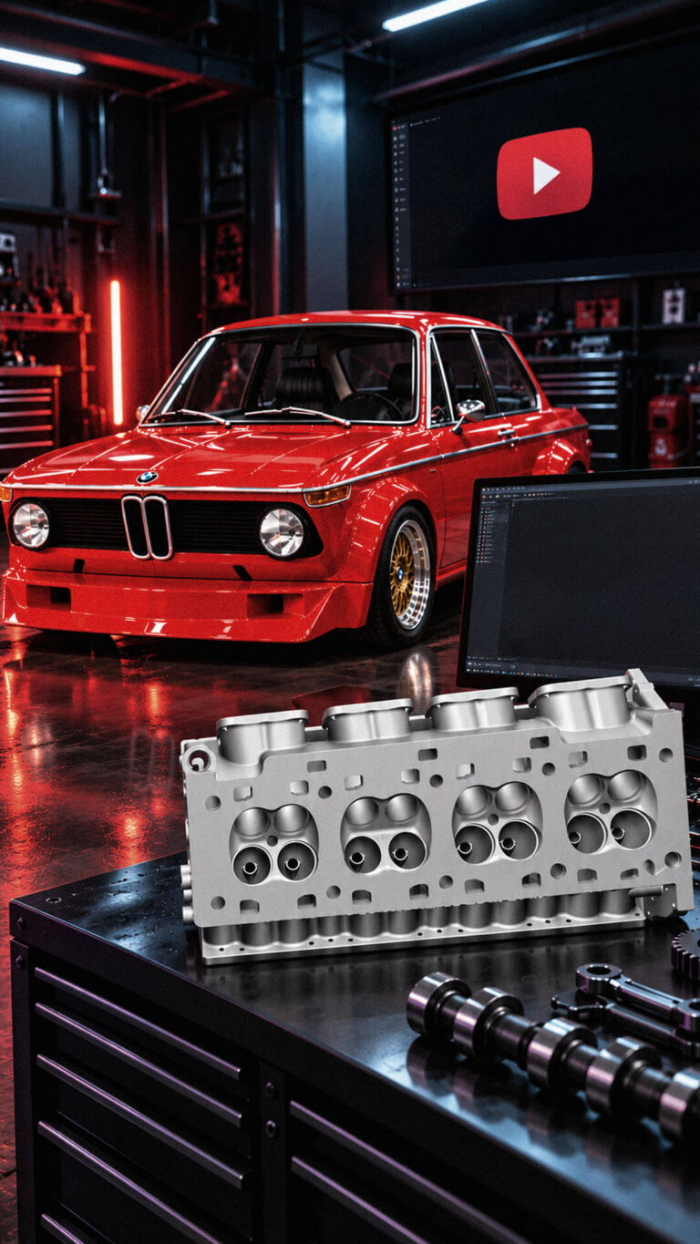
Playful Sparkle established and manages Modul Motorsport’s YouTube channel, combining channel branding, search-optimized video metadata, and 3D product animation. The initial video content includes a branded intro and a product showcase featuring 54 3D models of motorsport components for enthusiasts, specialists, and customers working on historic motorsport projects.
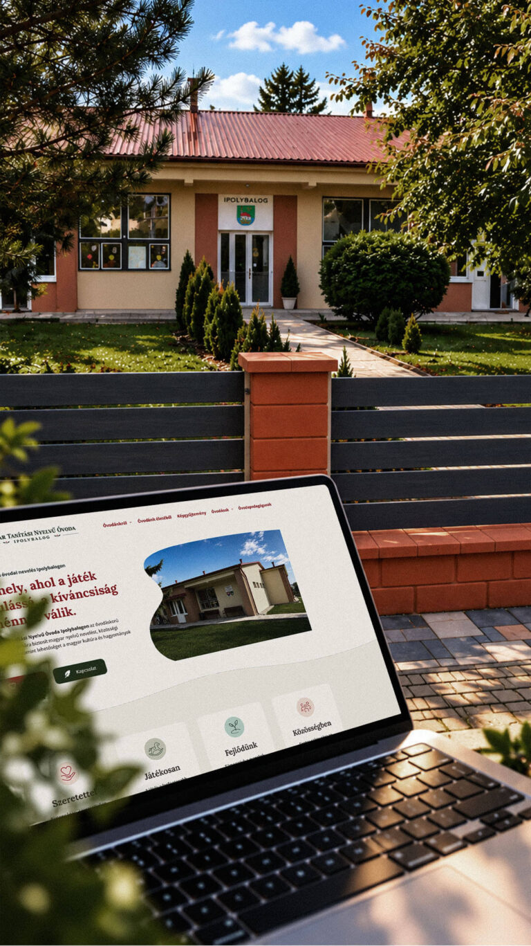
Playful Sparkle created a bilingual WordPress website and a distinctive visual identity for the Hungarian-language kindergarten in Balog nad Ipľom. The project includes Slovak and Hungarian logo variants, published school documents, admissions information, teacher profiles, educational programme details and activity pages, giving parents convenient access to essential information in both...
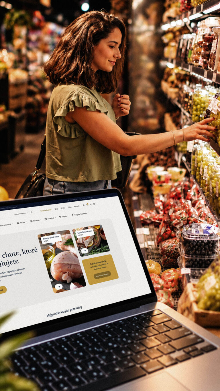
Playful Sparkle developed a WordPress and WooCommerce e-commerce platform for Dirolio Freshbox, bringing fresh and chilled foods, bakery products, frozen goods, pantry essentials, beverages and household care products into one organized catalogue. The store also includes a membership discount system linked to customer purchases, supporting the business’s planned local delivery...
