Let’s Build Something Great
Tell us about your goals and request a free project estimate.

An Architectural-Inspired Logo for MMB-GOLD
MMB-GOLD s.r.o. was established in 2010 and specialises in the sale of a broad range of construction and household accessories and equipment. The company approached Playful Sparkle to develop a more distinctive corporate logo that would strengthen its visual presentation and establish a recognisable identity across its business communication.
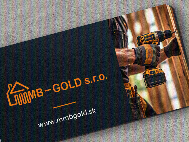
The design combines a geometric, building-inspired symbol with the MMB-GOLD wordmark in a horizontal composition. The development also explored three colour treatments, ranging from a monochromatic dark version to a vivid orange and a blue gradient, demonstrating different visual presentations of the same logo construction.
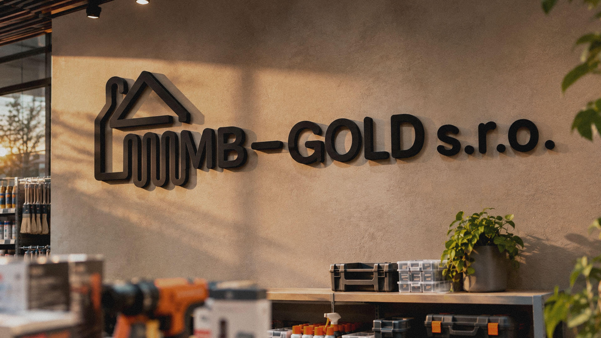
The objective was to develop a recognisable corporate logo that reflects the company’s product range through a building-inspired visual element. The design needed to give the company name greater visual presence, combine the symbol and typography into a balanced composition, and maintain clarity across different reproduction sizes, backgrounds and communication materials.
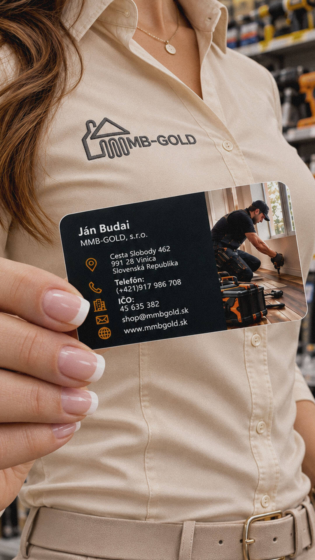
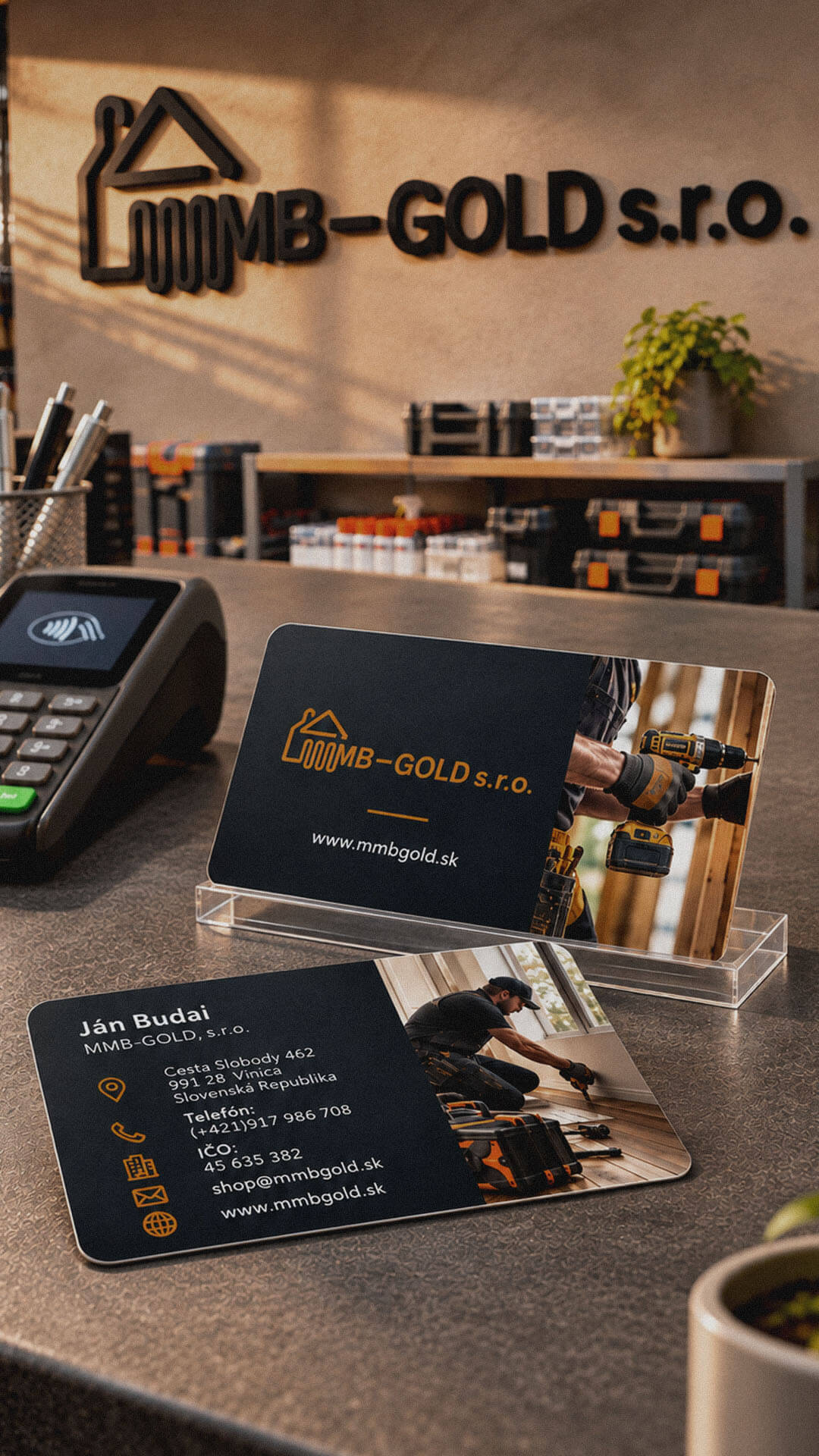
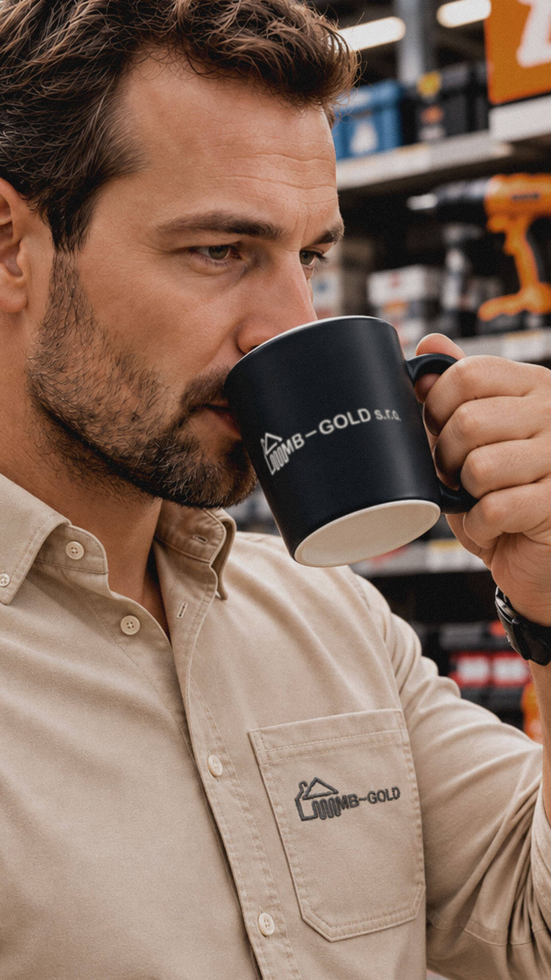
The developed logo gives MMB-GOLD a distinct graphic identity built around an architectural-inspired symbol and a prominent company wordmark. The roof-shaped outline creates a visual association with buildings and the company’s product range, while the integrated abstract geometric construction gives the symbol an individual character. Bold uppercase typography reinforces the company name and provides visual balance within the wide horizontal composition.
Three colour treatments demonstrate how the same logo structure can be presented with different visual characteristics. The dark monochromatic version offers a restrained single-colour treatment, the orange variation introduces a stronger colour accent, and the blue gradient creates a cooler appearance. These alternatives provide flexibility for potential use across digital and printed business communication without changing the logo’s fundamental proportions or construction.
The design process focused on translating the company’s retail activities and product range into a compact, building-inspired symbol. We explored a geometric roofline combined with an abstract vertical and curved graphic structure, using bold, continuous linework and rounded terminals to establish a consistent visual form.
We paired the symbol with a bold uppercase wordmark, using substantial letter weight and rounded geometric characteristics. The lowercase s.r.o. suffix has a more restrained visual presence, keeping the MMB-GOLD name dominant. Once the horizontal composition was established, we explored three colour directions: dark monochromatic, orange and blue gradient. Each variation retains the same symbol, typography and overall arrangement, allowing the colour treatment to change without altering the underlying logo identity.
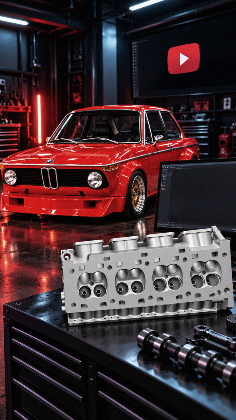
Playful Sparkle established and manages Modul Motorsport’s YouTube channel, combining channel branding, search-optimized video metadata, and 3D product animation. The initial video content includes a branded intro and a product showcase featuring 54 3D models of motorsport components for enthusiasts, specialists, and customers working on historic motorsport projects.
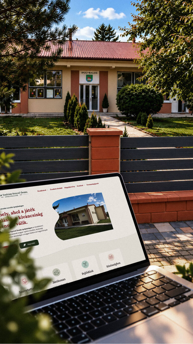
Playful Sparkle created a bilingual WordPress website and a distinctive visual identity for the Hungarian-language kindergarten in Balog nad Ipľom. The project includes Slovak and Hungarian logo variants, published school documents, admissions information, teacher profiles, educational programme details and activity pages, giving parents convenient access to essential information in both...
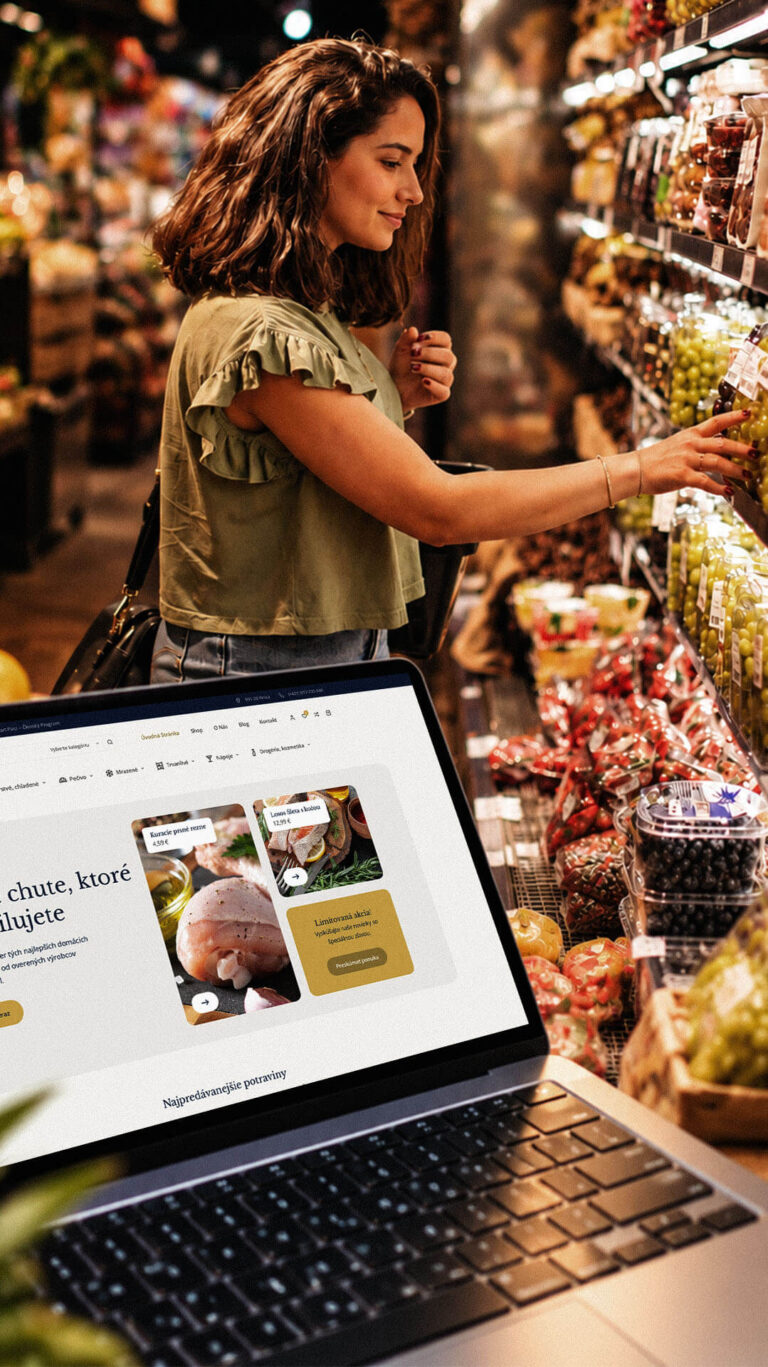
Playful Sparkle developed a WordPress and WooCommerce e-commerce platform for Dirolio Freshbox, bringing fresh and chilled foods, bakery products, frozen goods, pantry essentials, beverages and household care products into one organized catalogue. The store also includes a membership discount system linked to customer purchases, supporting the business’s planned local delivery...
