Let’s Build Something Great
Tell us about your goals and request a free project estimate.

A Distinctive Brand Identity for KARLTECH’s Window and Door Solutions
KARLTECH, owned by Karol Bugyi, is a business based in Vinica, Slovakia, providing window, door and related solutions for residential and commercial buildings. Its product range includes PVC and aluminium windows and doors, sliding systems, glazed façades, winter gardens, garage doors, railings and shading accessories such as blinds and insect screens. Its services cover customer consultation, technical planning, product supply and installation. The business needed an established brand identity to represent its activities through a consistent and professional visual presentation.
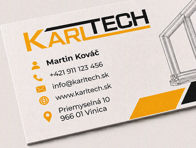
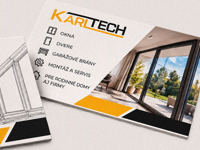
Playful Sparkle developed the complete identity from the ground up, beginning with brand discovery, competitor research, audience analysis and positioning. The project resulted in an original KARLTECH logo, a supporting visual identity system, brand guidelines and coordinated applications for corporate stationery, digital communication, promotional merchandise and vehicle graphics.
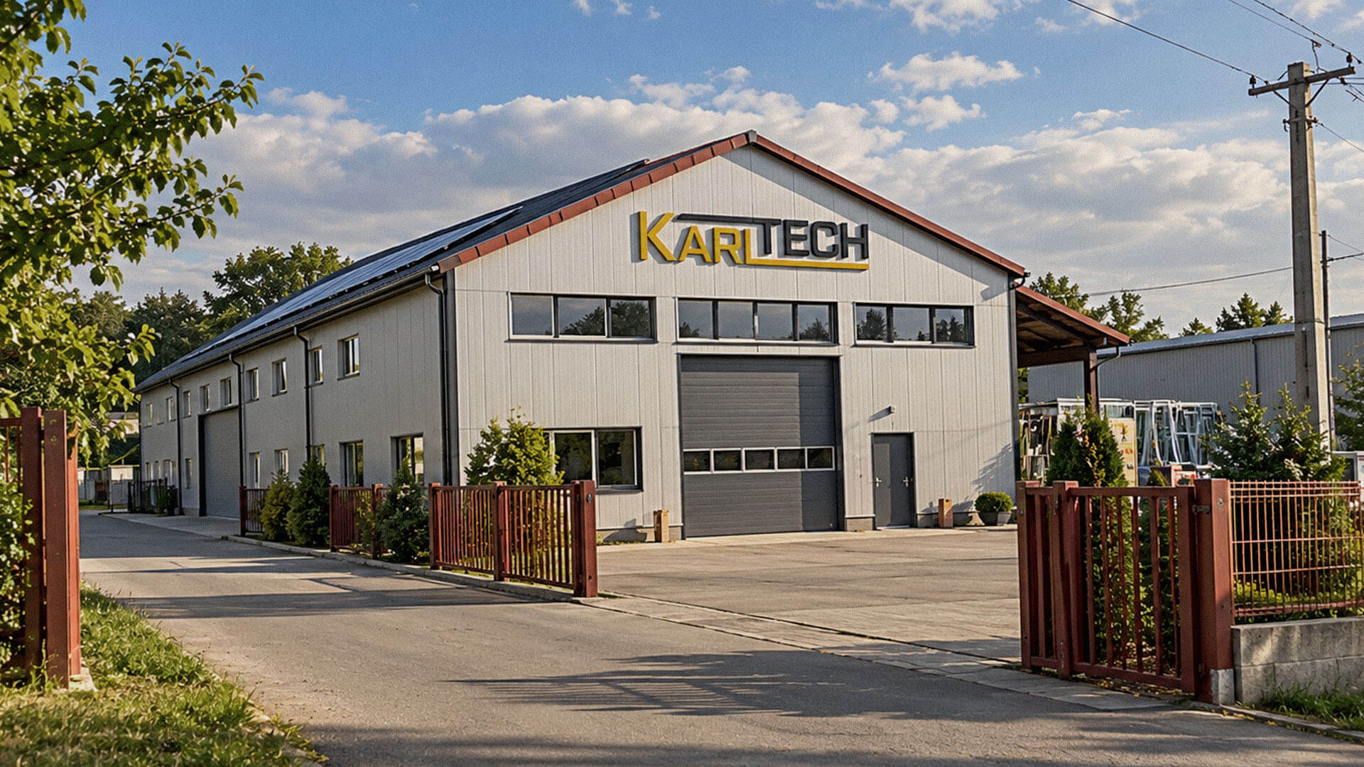
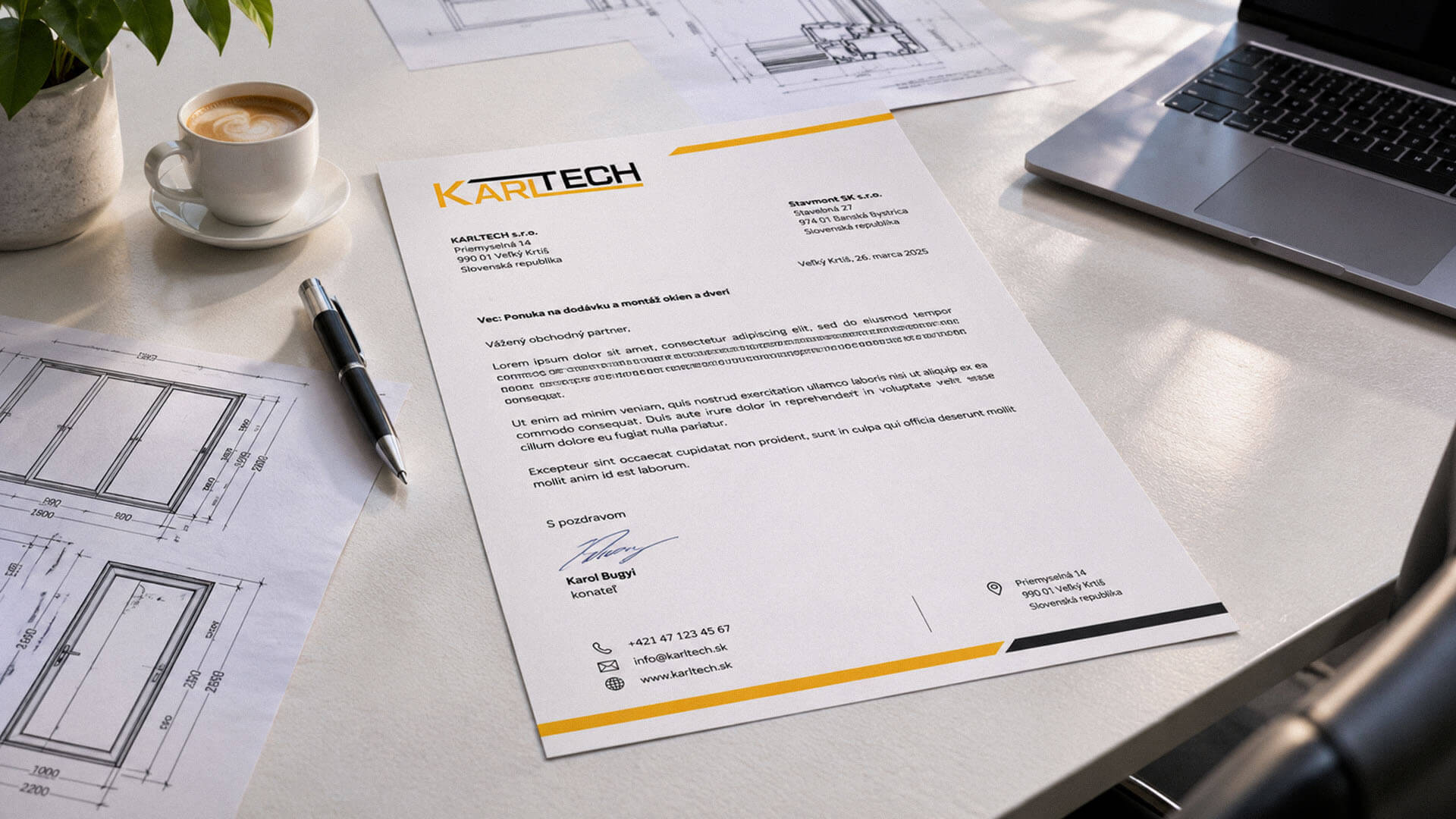
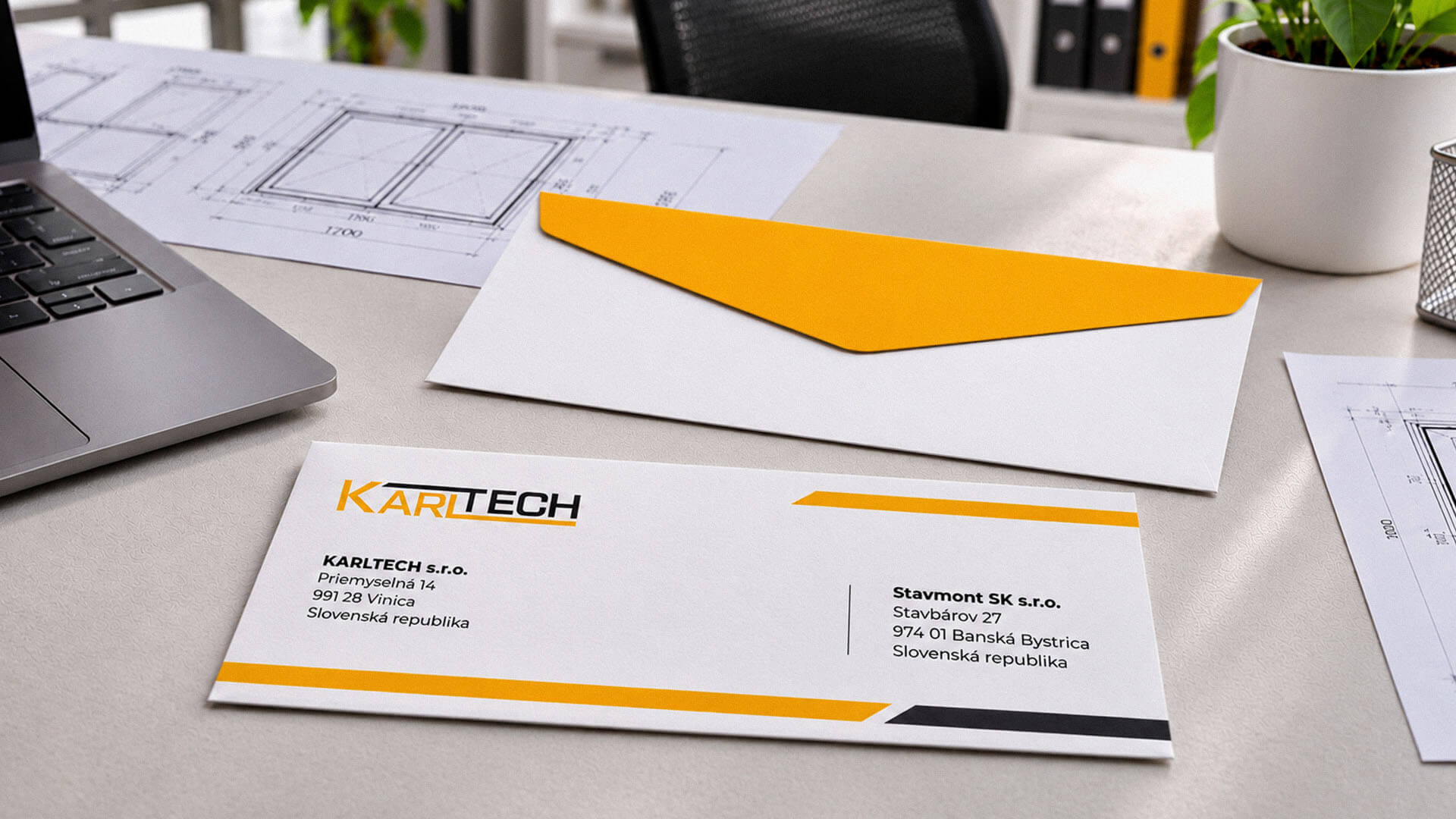
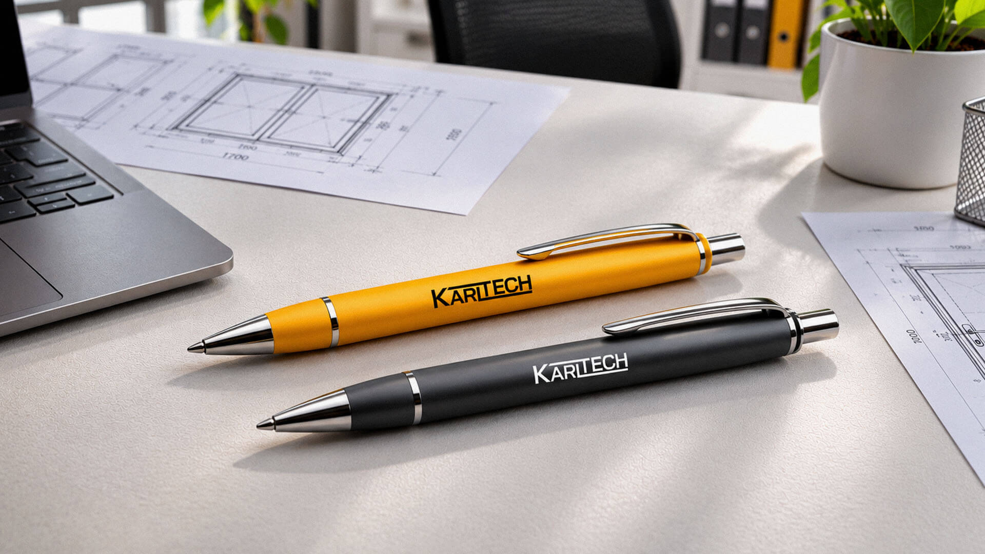
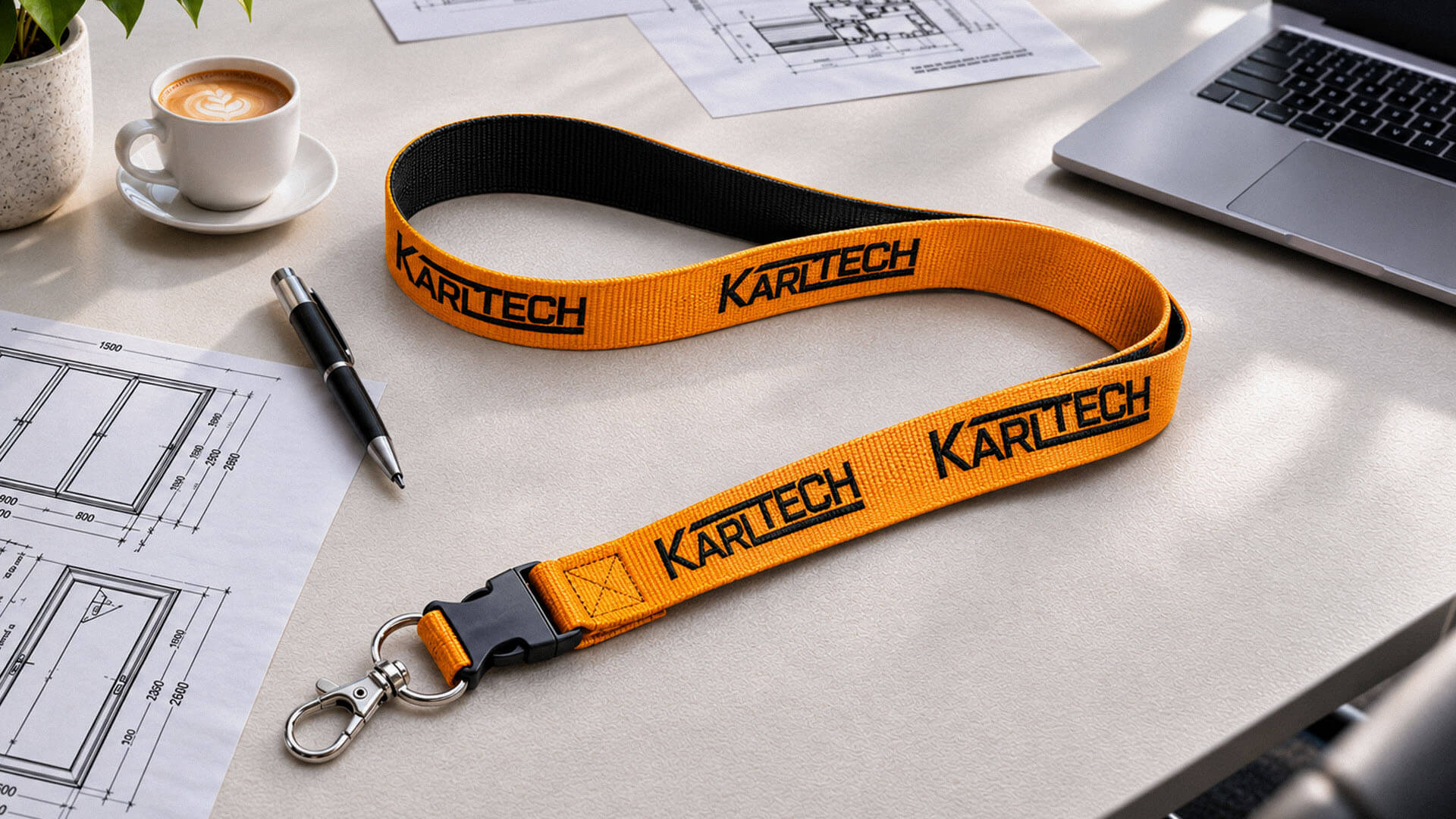
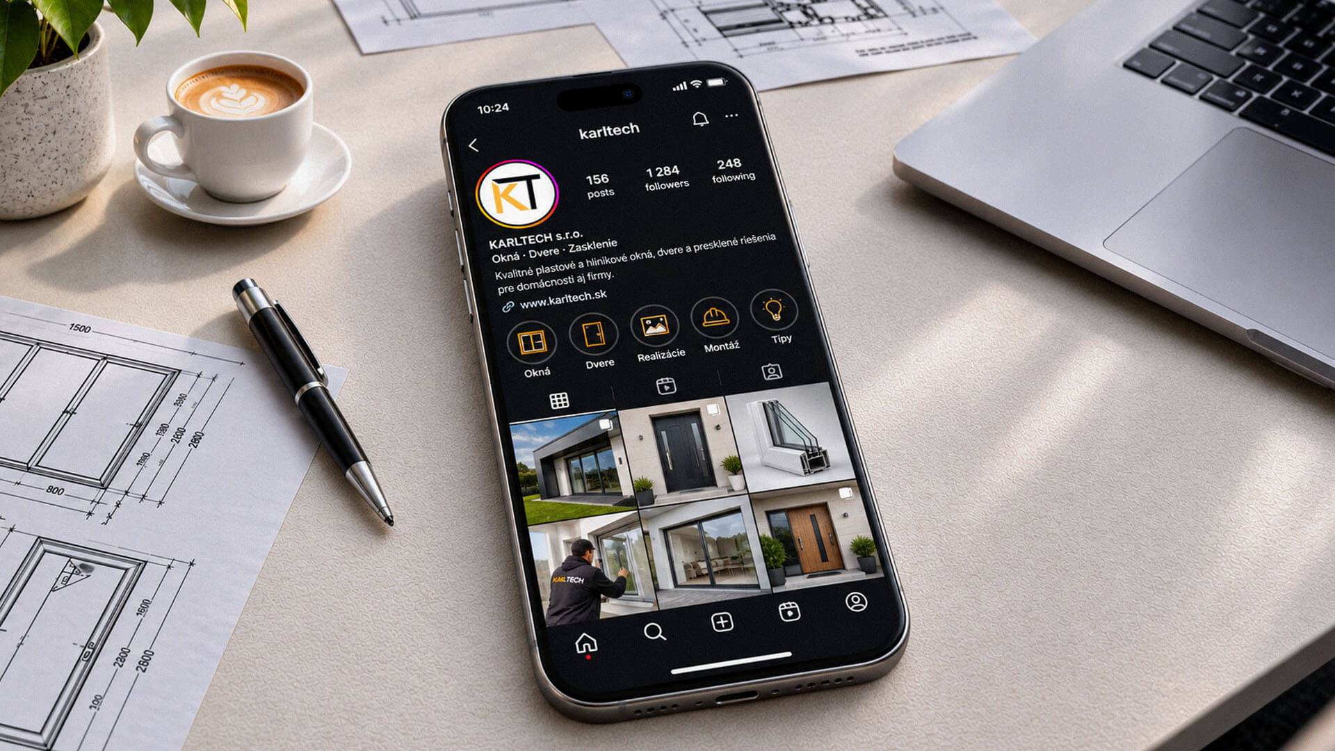
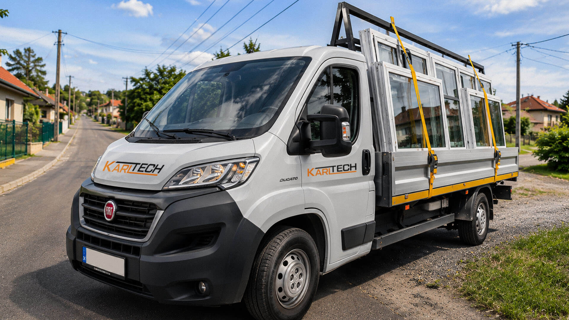
The objective was to establish a recognizable brand that communicates professional service, precision and quality across KARLTECH’s range of window and door solutions. The logo needed to give the company name a distinctive visual presence, while the wider identity had to provide a consistent framework for business communications and promotional materials.
The project also required a practical identity system that could be applied across different formats, from stationery and digital profiles to vehicle graphics and branded merchandise. The client selected yellow, black and white as the brand colours, which needed to work together as a recognizable and versatile visual combination.
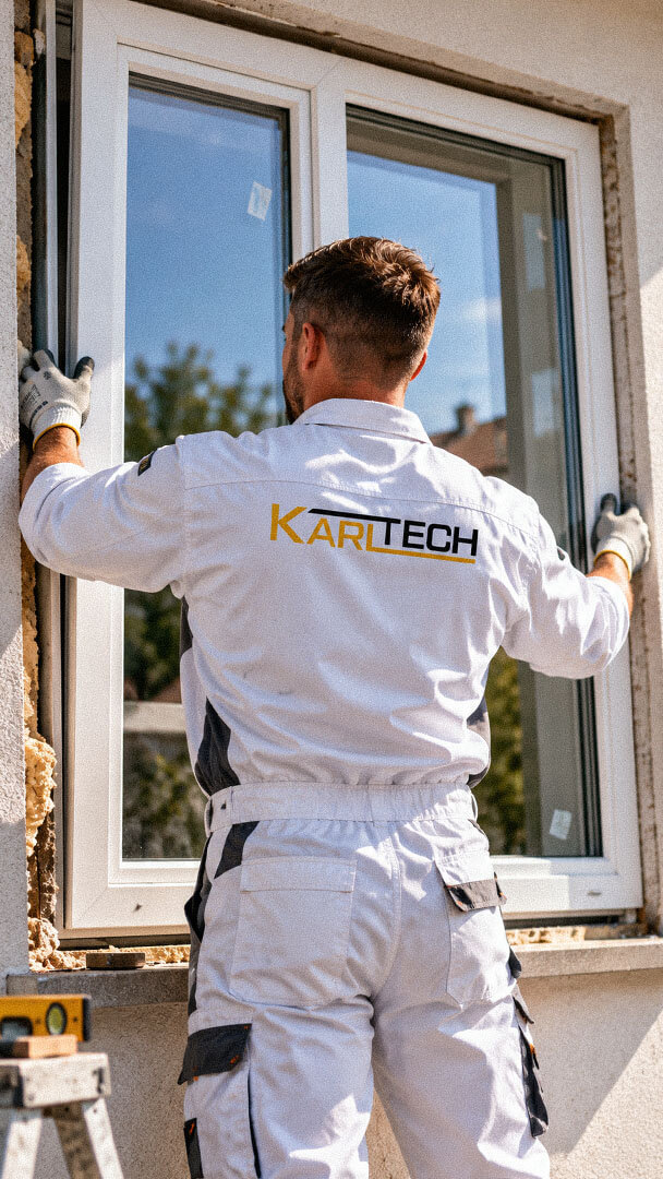
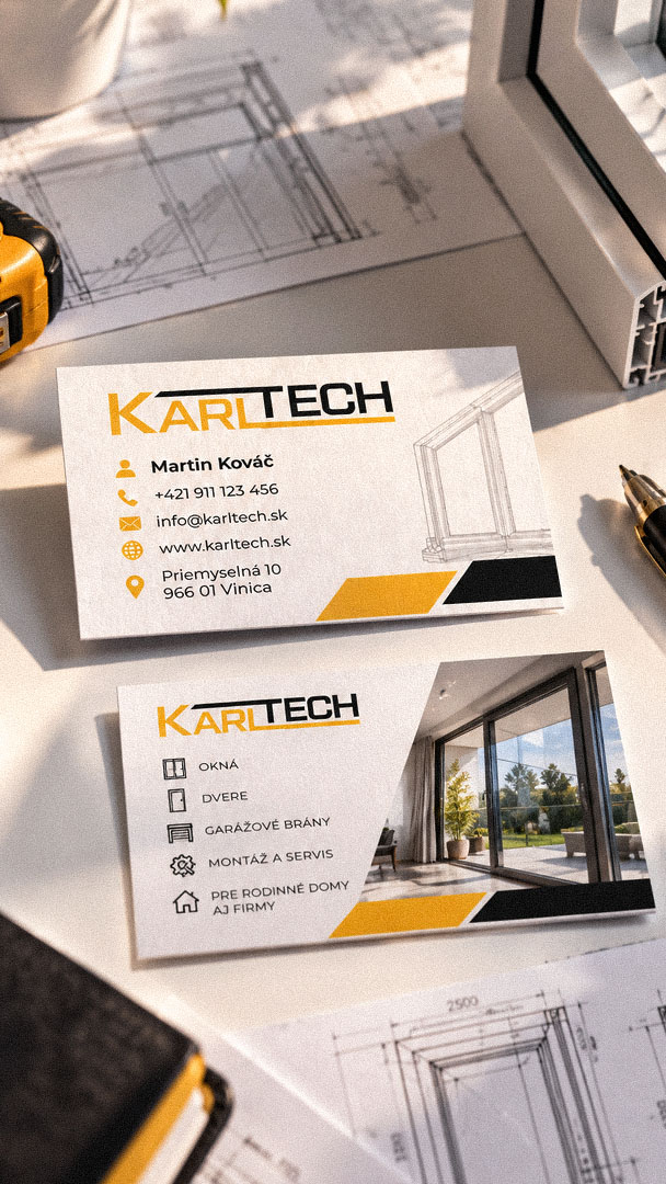
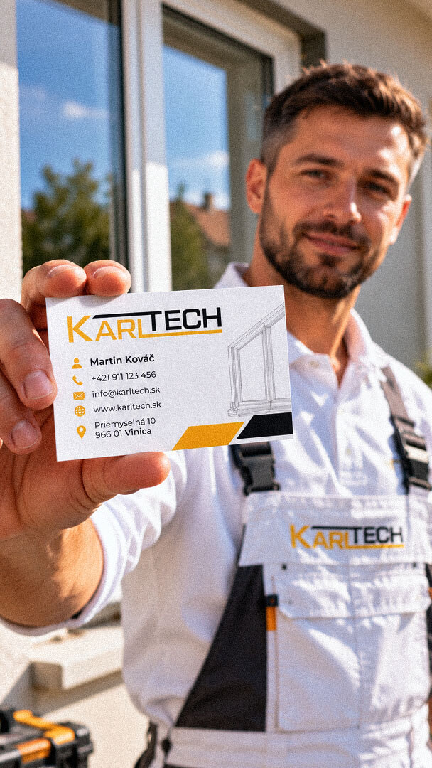
The completed identity gives KARLTECH a complete and recognizable visual foundation, replacing the absence of an established brand system with an original logo, defined visual language and documented usage standards. The customized wordmark and contrasting colour treatment establish a distinctive company signature, while the compact KT monogram provides an additional option for smaller digital applications.
The identity extends across stationery, email communication, social media, vehicle graphics and promotional merchandise. Together with the brand guidelines and editable logo package, these deliverables provide KARLTECH with a consistent set of visual assets for its business communication and future brand applications.
The project began with brand discovery, competitor research and audience analysis to establish how KARLTECH should present itself within the window and door solutions market. The positioning focused on professional service, precision and quality. These requirements informed the visual direction, while the client explicitly selected yellow, black and white as the brand colours. The combination provides strong contrast and works well for a business associated with architectural products, technical detail and installation services.
The selected logo uses a customized uppercase sans-serif typeface, with the lettering structured into two visually distinct parts: KAR in yellow and TECH in black. The extended upper stroke and yellow baseline connect the lettering into a continuous horizontal composition, giving the wordmark a distinctive geometric character. A compact KT monogram was also developed as an additional identity element, particularly for social media profile applications.
The visual system was extended across corporate stationery, digital graphics, promotional merchandise and vehicle branding. Consistent use of the logo, typography, colour placement and geometric accents connects the different applications to the primary identity. Brand guidelines document the system, including logo variations, colour specifications, typography, protective spacing, minimum sizes and application examples. The final asset package includes editable source files and standard export formats for different uses.
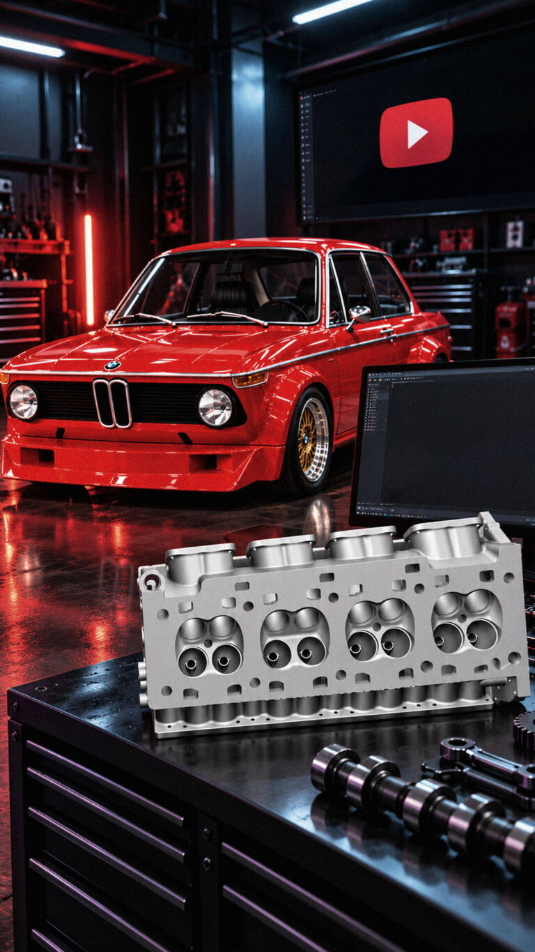
Playful Sparkle established and manages Modul Motorsport’s YouTube channel, combining channel branding, search-optimized video metadata, and 3D product animation. The initial video content includes a branded intro and a product showcase featuring 54 3D models of motorsport components for enthusiasts, specialists, and customers working on historic motorsport projects.
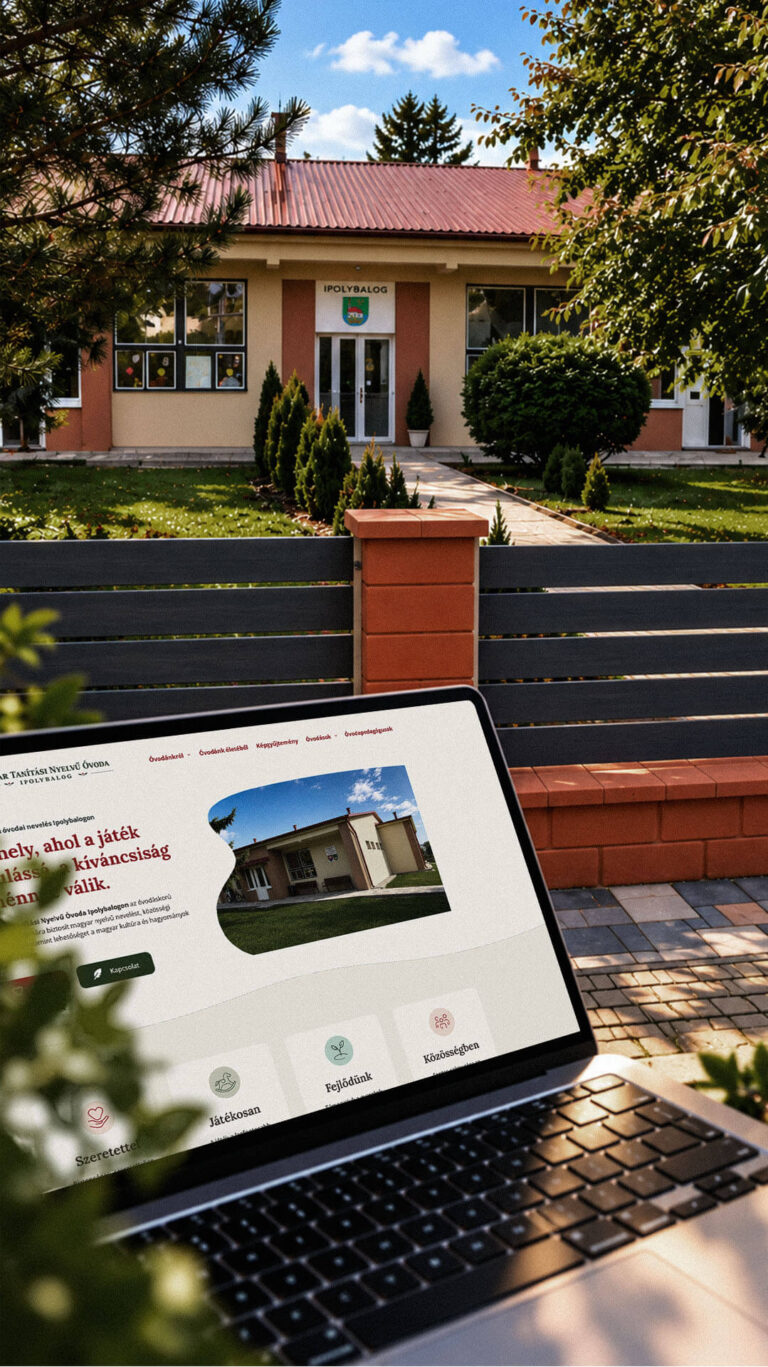
Playful Sparkle created a bilingual WordPress website and a distinctive visual identity for the Hungarian-language kindergarten in Balog nad Ipľom. The project includes Slovak and Hungarian logo variants, published school documents, admissions information, teacher profiles, educational programme details and activity pages, giving parents convenient access to essential information in both...
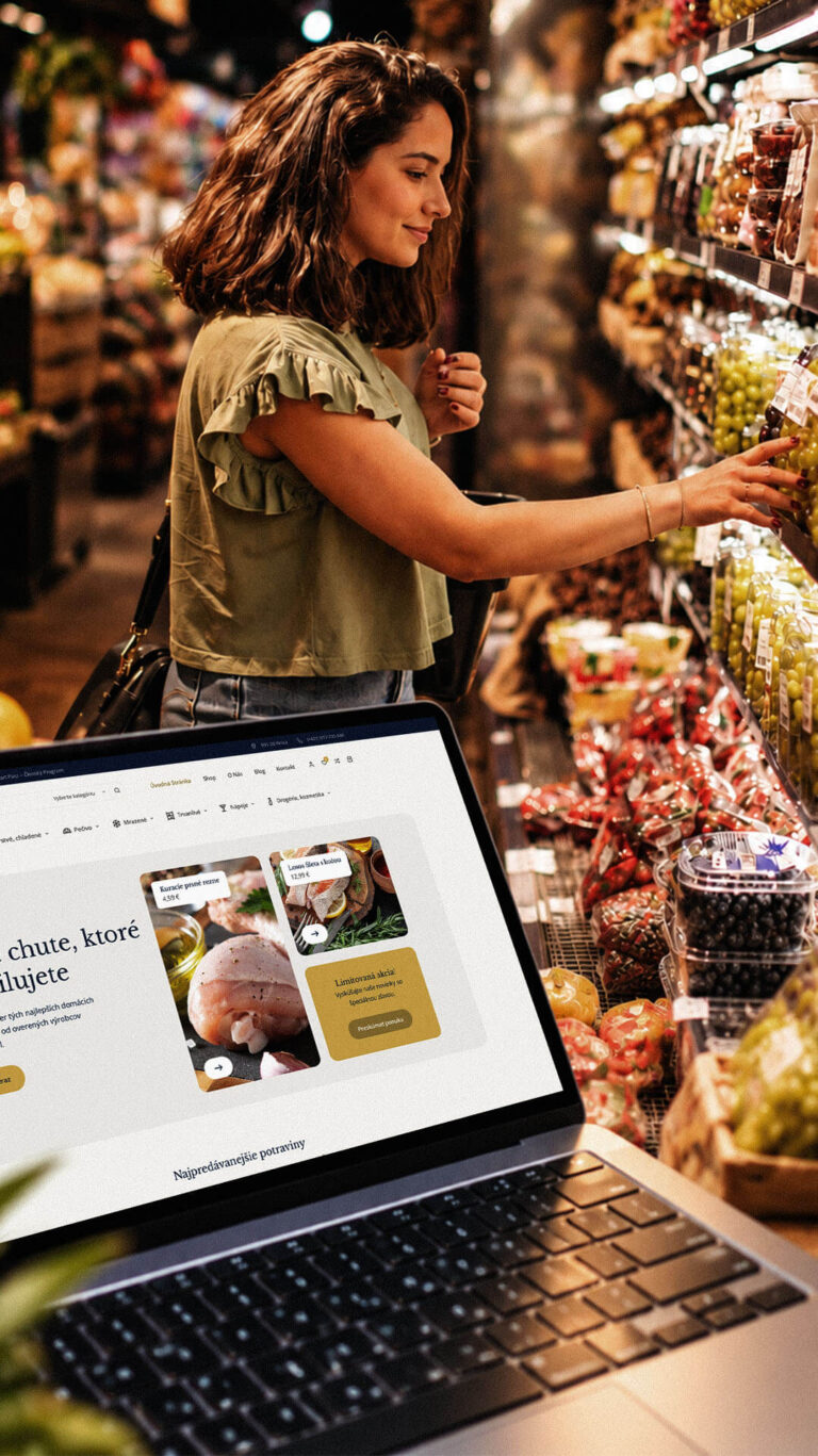
Playful Sparkle developed a WordPress and WooCommerce e-commerce platform for Dirolio Freshbox, bringing fresh and chilled foods, bakery products, frozen goods, pantry essentials, beverages and household care products into one organized catalogue. The store also includes a membership discount system linked to customer purchases, supporting the business’s planned local delivery...
