Let’s Build Something Great
Tell us about your goals and request a free project estimate.

A Natural, Distinctive Brand Identity for NAZEL
NAZEL, owned by Ladislav Nagy, is an agricultural business based in Dolinka, Slovakia, specializing in the cultivation and sale of vegetables, including potatoes, tomatoes, salad cucumbers and root vegetables. The business already had an established logo, but its visual presentation needed a more coherent and professional direction that could be applied consistently across business communications and promotional materials.
Playful Sparkle was commissioned to develop a complete brand identity, beginning with brand discovery, market and competitor research, audience analysis and positioning. The resulting identity replaced the previous logo with a custom-designed wordmark and botanical symbol, supported by a coordinated colour palette, typography, graphic elements and a range of branded applications.
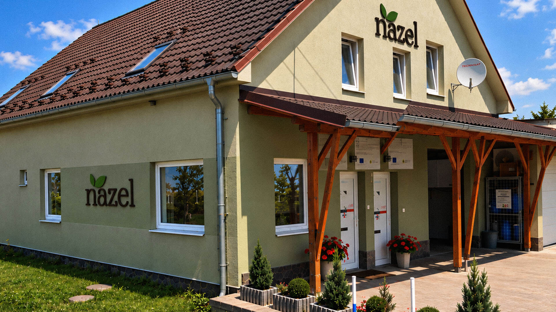
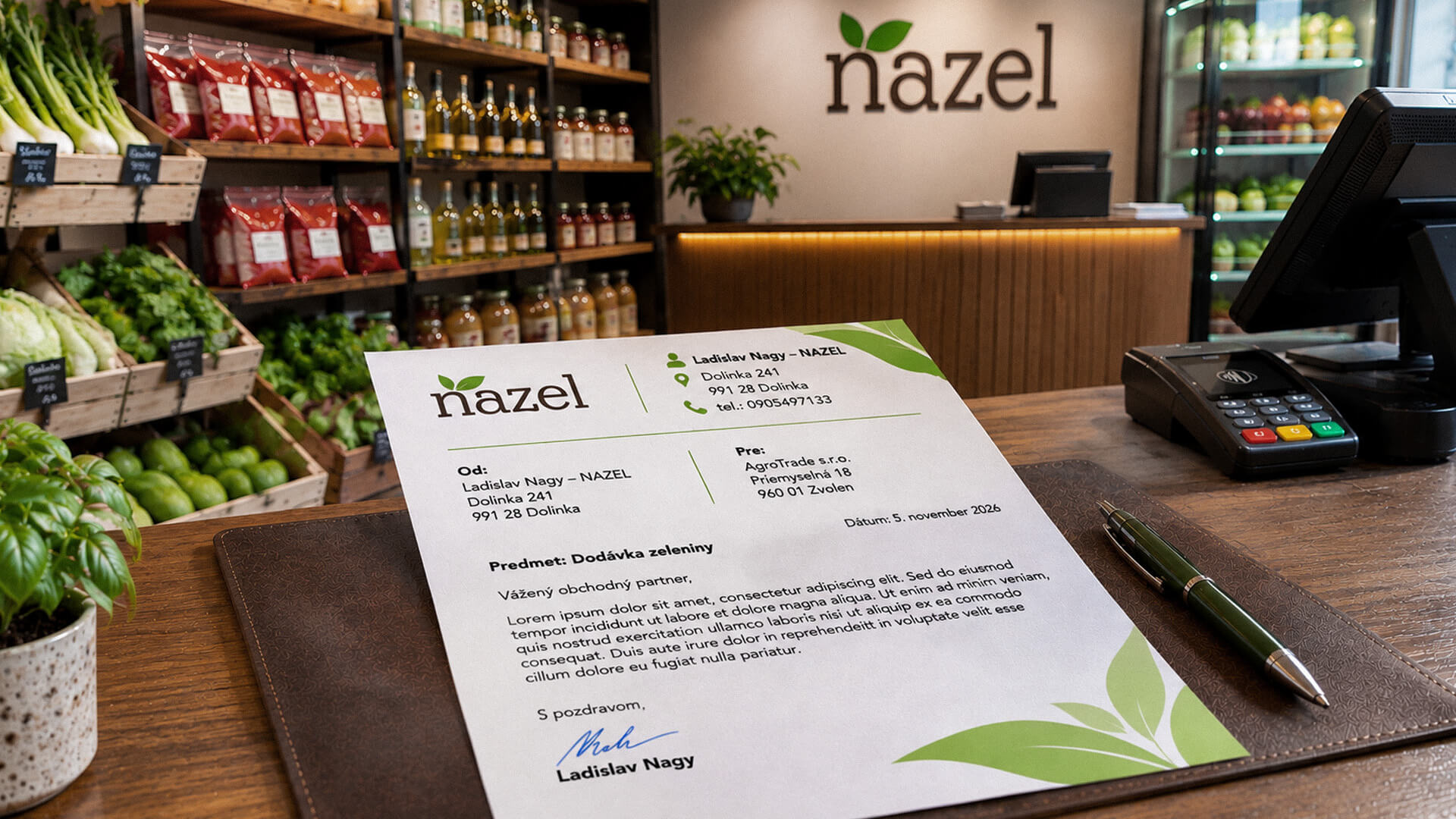
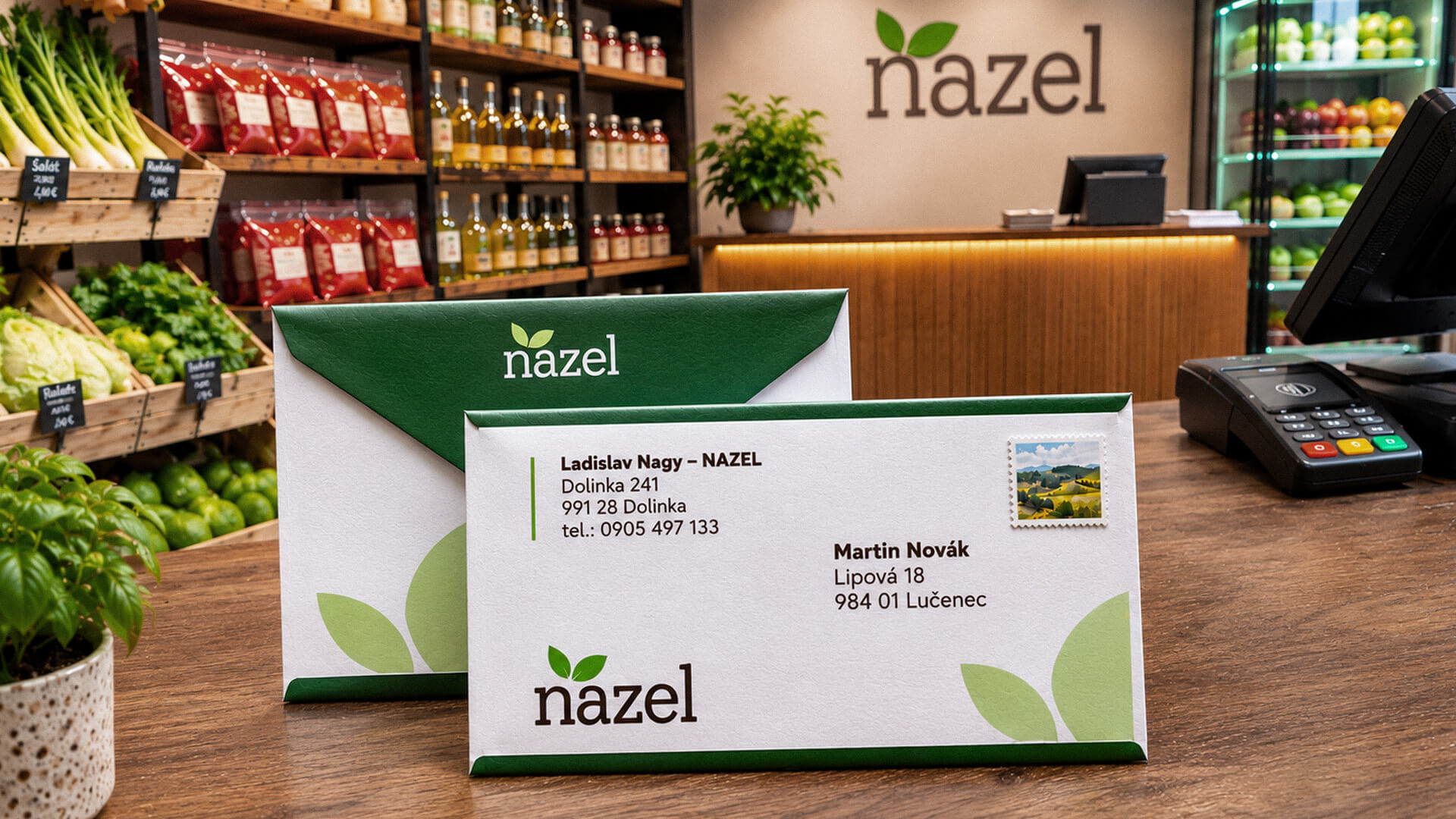
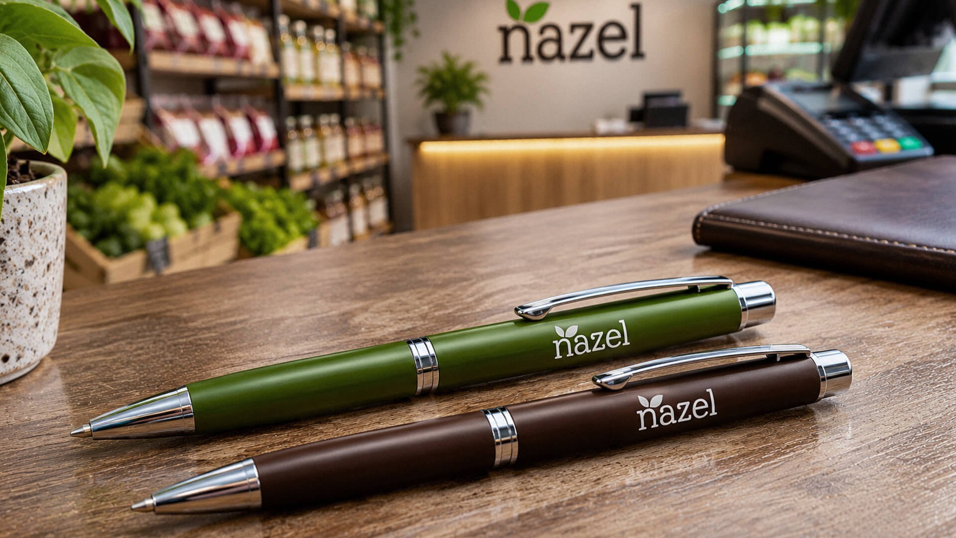
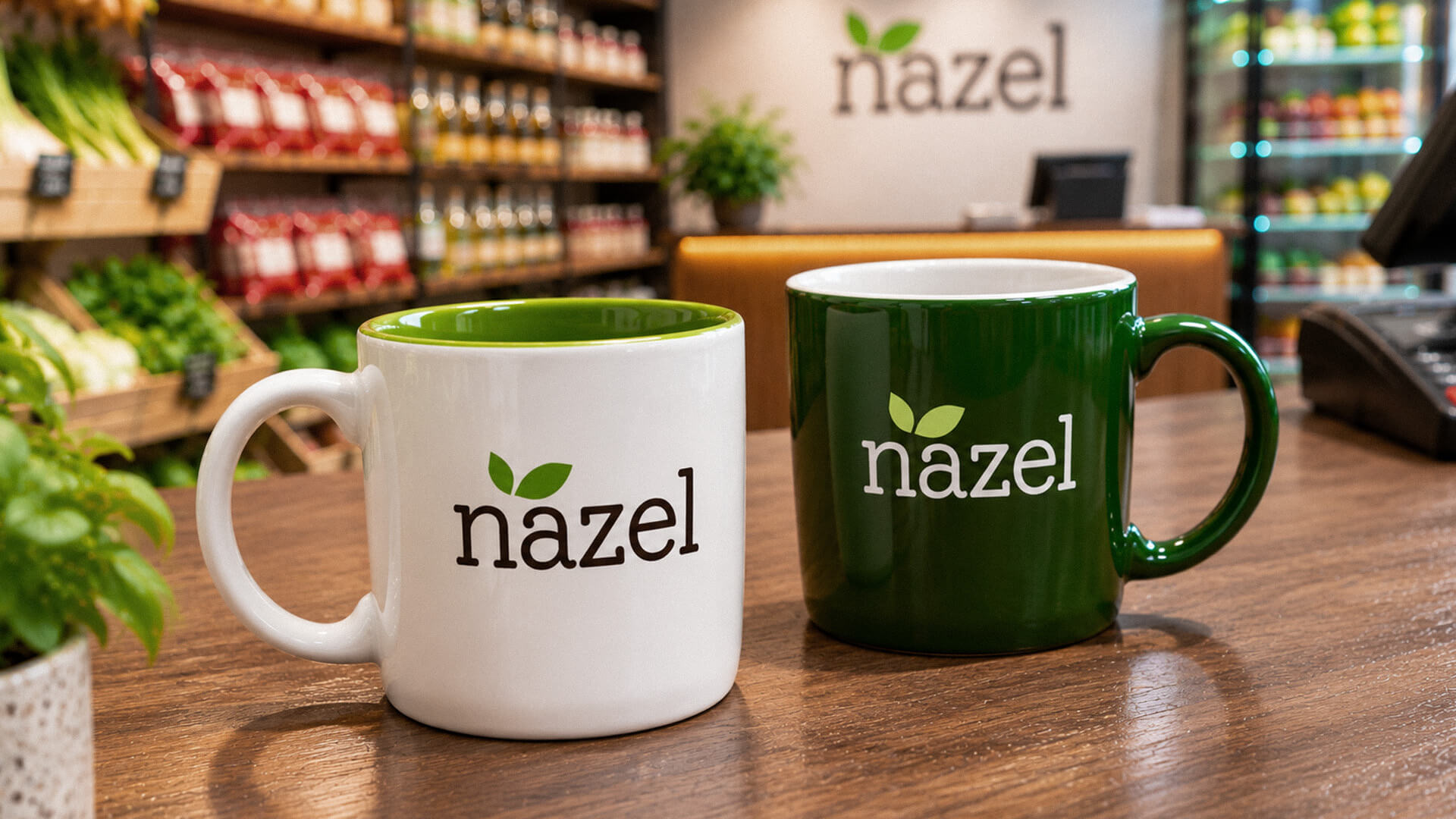
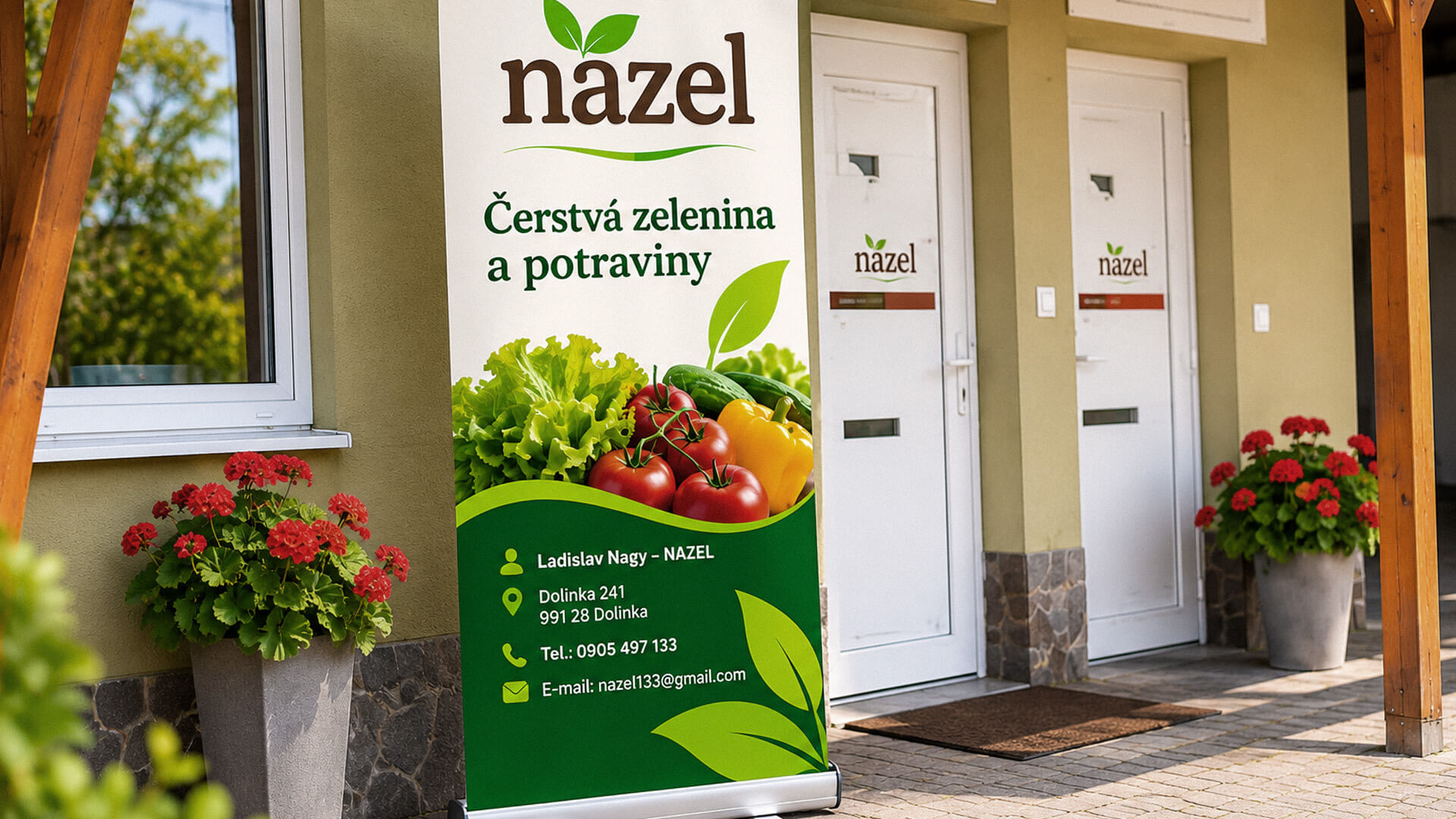
The objective was to establish a recognizable visual identity that communicates NAZEL’s connection with nature and agricultural production without relying on literal illustrations of individual crops. The new identity needed to provide a distinctive logo, a suitable colour system and consistent visual elements that could represent the broader business rather than a single product category.
The project also required extending the identity across practical business stationery, digital communication channels, promotional materials and vehicle graphics. A documented brand system was needed to maintain visual consistency across these different applications.
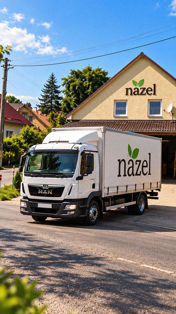
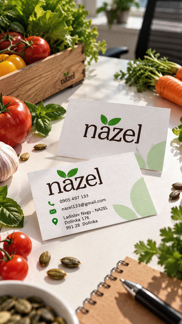
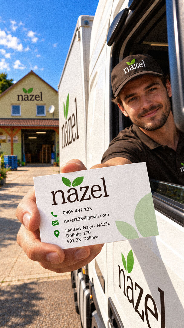
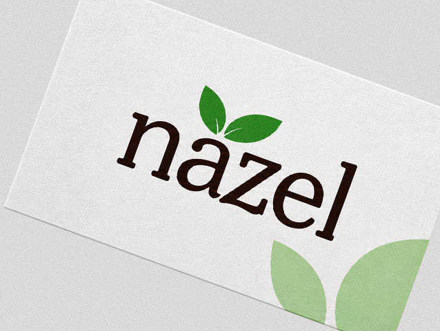
The completed identity replaced NAZEL’s previous logo with a custom-designed visual system that better represents its agricultural activities. The combination of the wordmark, two-leaf emblem, typography and coordinated colours provides a recognizable identity without tying the business to a single vegetable or product category.
The brand system extends across business stationery, digital communications, promotional merchandise and vehicle graphics. Together with the brand guidelines, the completed designs provide NAZEL with a consistent visual foundation for its business communications and future brand applications.
The project began with an assessment of NAZEL’s existing identity and the business’s agricultural activities. Brand discovery, competitor research, audience analysis and positioning informed the visual direction. Rather than illustrating individual crops, we selected a more flexible botanical concept that could represent the company’s wider involvement in vegetable cultivation and agricultural production.
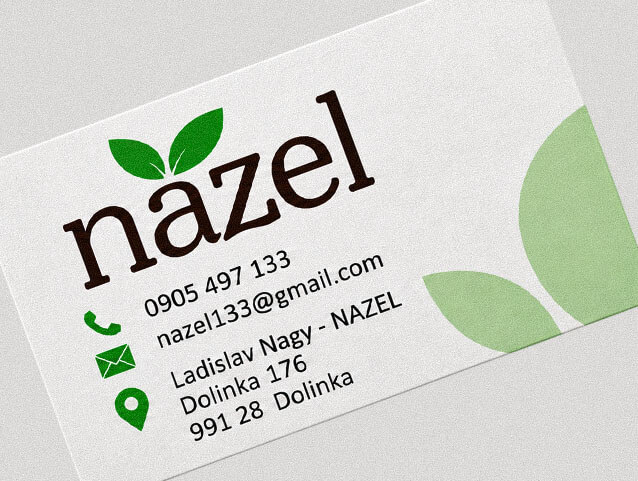
The logo was designed specifically for NAZEL. Its lowercase wordmark uses custom typography, with two asymmetrical leaves positioned above the lettering to form a distinctive botanical symbol. The typography combines substantial serif strokes with curved details, creating a recognizable typographic signature. The leaves communicate plant growth and cultivation without restricting the identity to a specific crop or product.
The visual identity uses botanical green and earthy brown as its principal brand colours, supported by complementary neutral tones. These elements were carried through the business stationery, email signature, social media graphics, vehicle graphics and promotional applications. Brand guidelines were prepared to document the system and provide a consistent reference for its use across different formats.

Playful Sparkle established and manages Modul Motorsport’s YouTube channel, combining channel branding, search-optimized video metadata, and 3D product animation. The initial video content includes a branded intro and a product showcase featuring 54 3D models of motorsport components for enthusiasts, specialists, and customers working on historic motorsport projects.
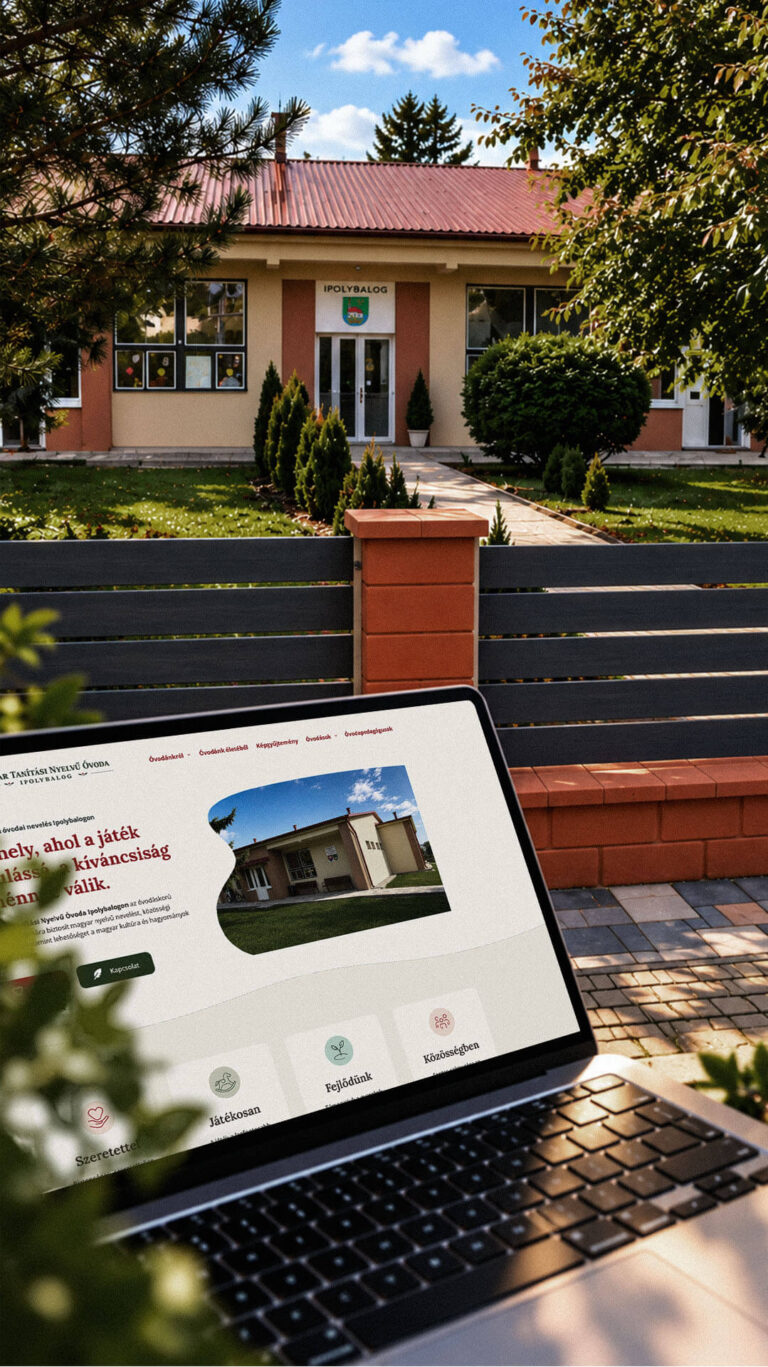
Playful Sparkle created a bilingual WordPress website and a distinctive visual identity for the Hungarian-language kindergarten in Balog nad Ipľom. The project includes Slovak and Hungarian logo variants, published school documents, admissions information, teacher profiles, educational programme details and activity pages, giving parents convenient access to essential information in both...
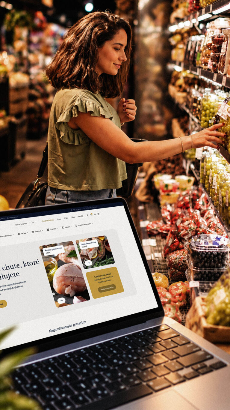
Playful Sparkle developed a WordPress and WooCommerce e-commerce platform for Dirolio Freshbox, bringing fresh and chilled foods, bakery products, frozen goods, pantry essentials, beverages and household care products into one organized catalogue. The store also includes a membership discount system linked to customer purchases, supporting the business’s planned local delivery...
