Let’s Build Something Great
Tell us about your goals and request a free project estimate.

A Distinctive Agricultural Brand Identity for ADOREX
ADOREX, owned by Adrián Nagy, is an agricultural business based in Dolinka, Slovakia. Established in 1998, with active operations beginning in 1999, the business focuses on agricultural production, particularly the cultivation, harvesting, processing and sale of pumpkin seeds. With no established visual identity, ADOREX needed a complete brand development project that would give the business a recognizable and professional identity.
Playful Sparkle handled the branding process from initial discovery and research through logo creation and visual identity development. The result was an original wordmark and emblem supported by a coordinated colour palette, typography, graphic elements and applications across corporate stationery, digital communication, promotional materials and vehicle graphics.
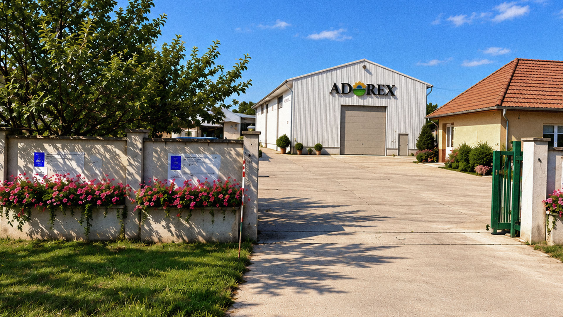
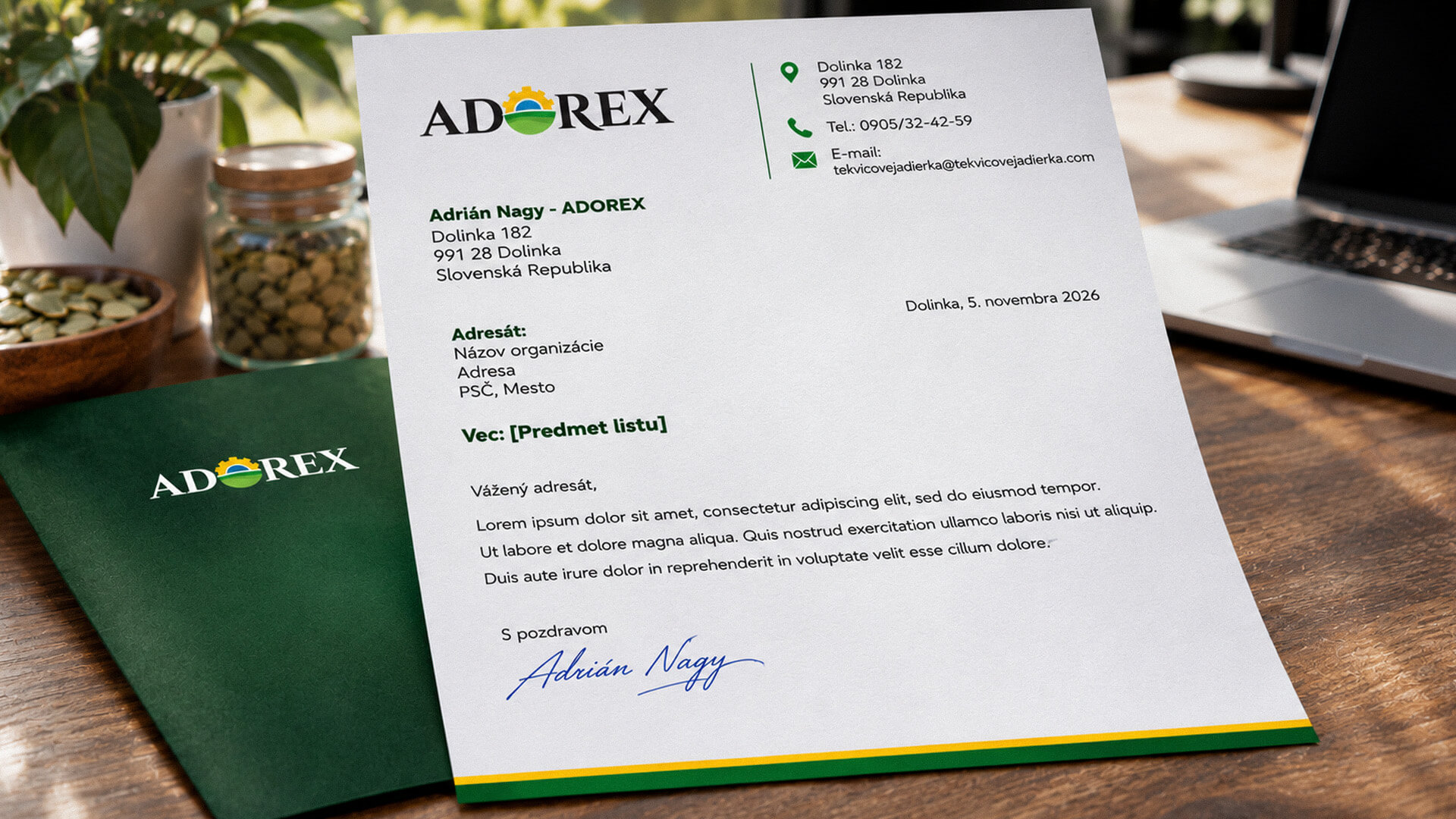
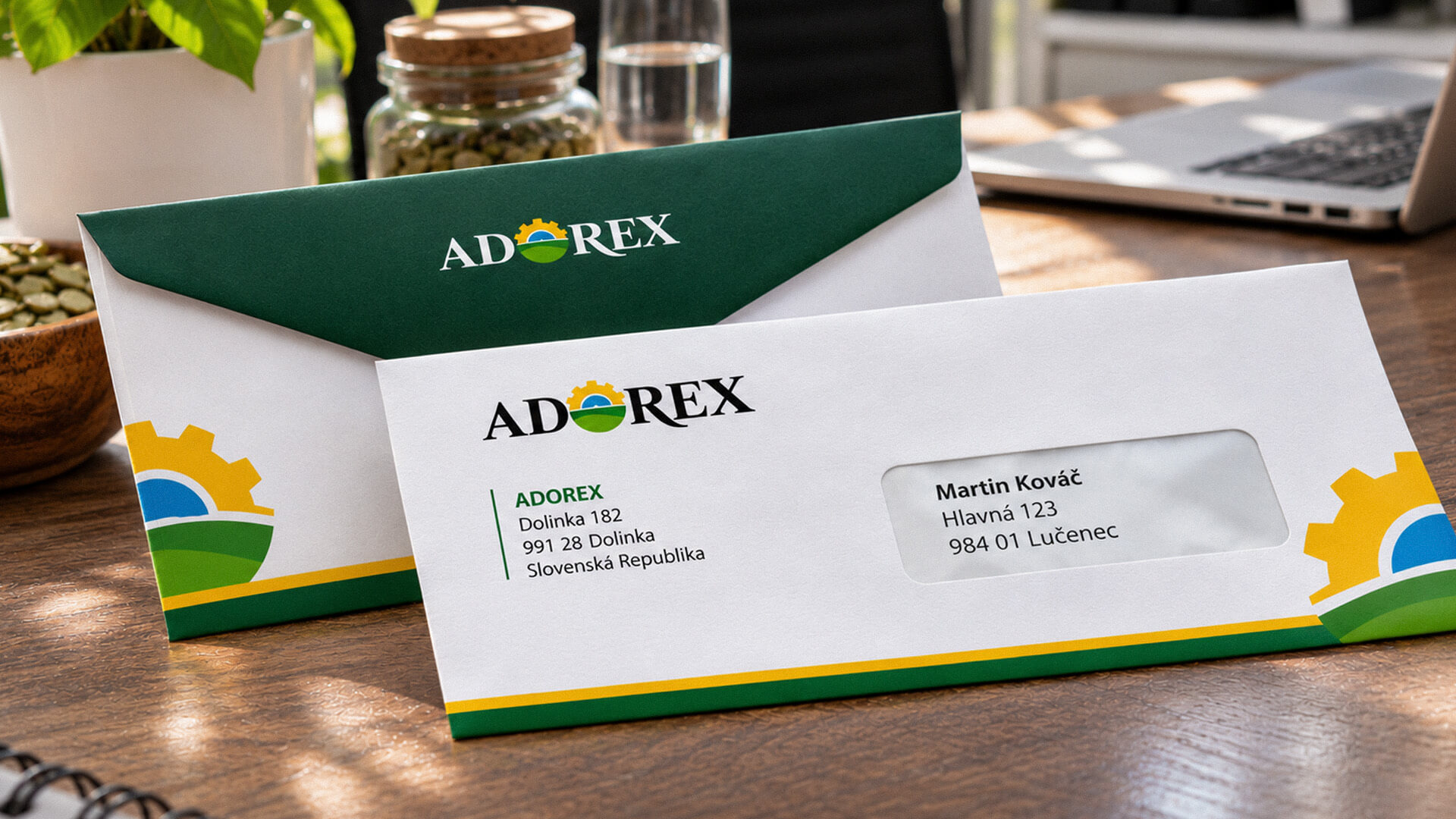
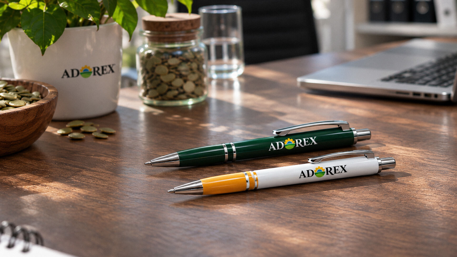
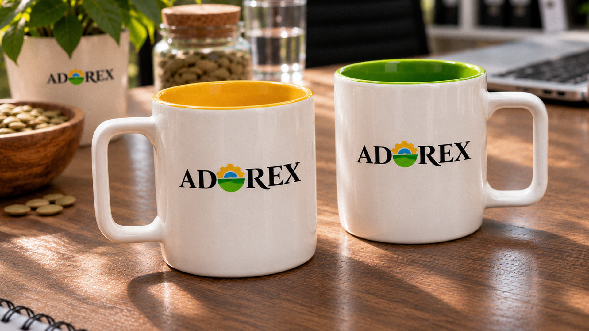
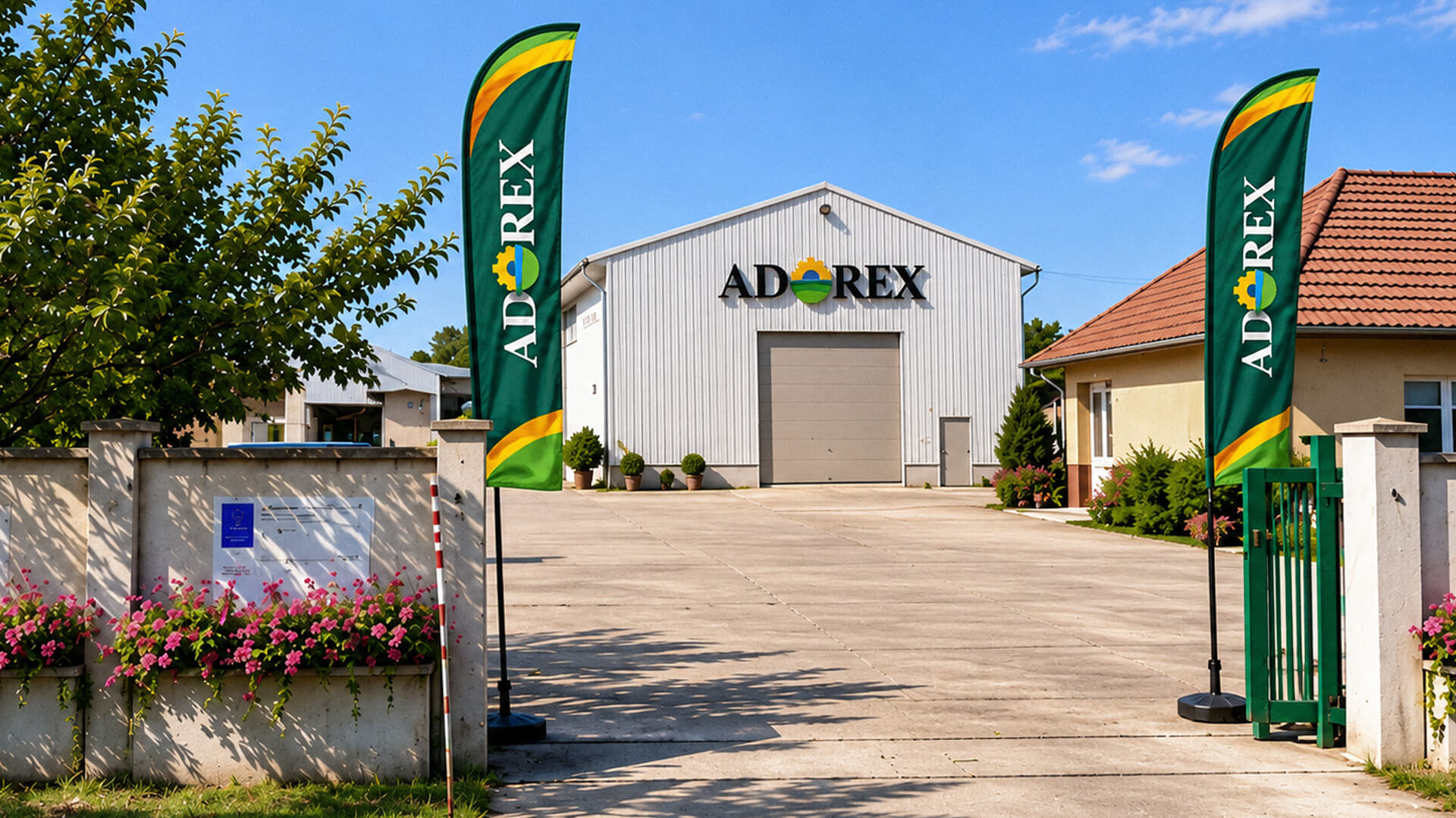
The objective was to establish a distinctive identity that communicates ADOREX’s agricultural activities, with particular emphasis on pumpkin cultivation and pumpkin seed production. The visual concept needed to connect natural growth and cultivated land with the machinery and processes involved in agricultural production, without relying on a literal illustration of a pumpkin or individual product.
The identity also needed to provide a consistent framework for business communications and promotional applications. This included a recognizable logo, a defined colour and typography system, supporting graphic elements and documented guidelines for consistent use across different formats.
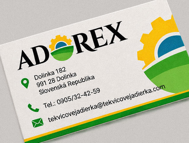
The completed brand identity gives ADOREX a coherent visual foundation built around an original agricultural emblem and a distinctive wordmark. The combination of the rising sun, gear and cultivated-field forms communicates the relationship between natural production and agricultural activity, while keeping the identity broad enough to represent the business beyond a single crop or product.
The visual system extends across corporate stationery, digital communications, promotional merchandise, feather flags, premises branding and vehicle graphics. The accompanying brand guidelines and standard logo variations establish a documented identity system that can be applied consistently across these different communication formats.
The branding process began with an examination of ADOREX’s business activities, target audience, competitive environment and positioning. The research established the need for a visual identity that could represent both the natural and mechanical aspects of agricultural production, with pumpkin seed cultivation and processing forming an important part of the business’s identity.
The central logo concept combines three visual references. A yellow gear forms the upper part of the emblem and suggests both a rising sun and agricultural machinery. Beneath it, a blue-green semicircle and layered green shapes represent the landscape and cultivated fields. Together, these elements form a compact agricultural symbol integrated directly into the ADOREX wordmark, replacing the letter O rather than appearing as a separate decorative graphic.
The wordmark uses high-contrast uppercase serif typography, characterized by strong vertical strokes, delicate connecting lines and sharply defined serifs. Its formal letterforms contrast with the more illustrative emblem, giving the identity a distinctive balance between established typographic character and contemporary graphic symbolism. The colour palette was developed specifically for ADOREX. Yellow represents the sun and acts as a prominent accent, green connects the identity with cultivated land and vegetation, blue-green adds depth to the emblem, and black provides typographic contrast. These elements were then extended across stationery, digital graphics, promotional materials and vehicle applications.
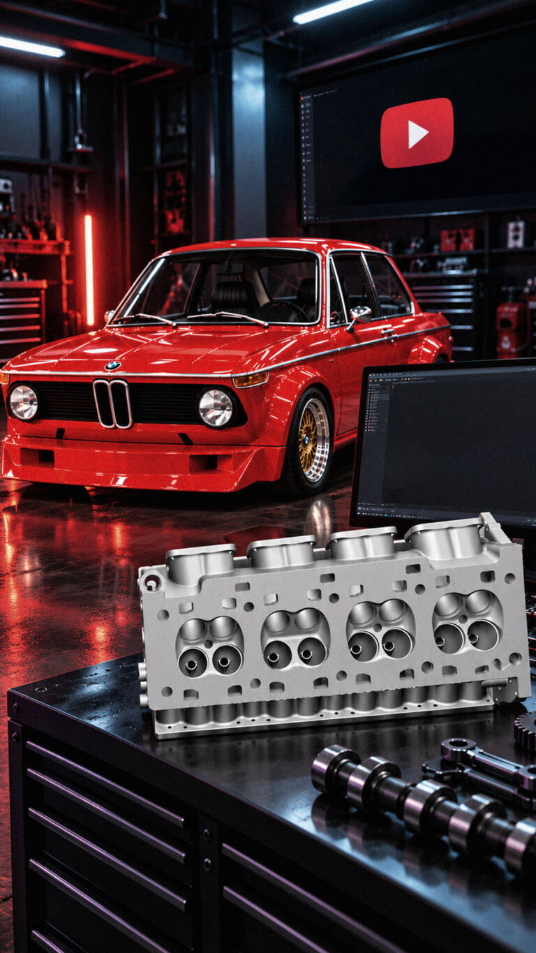
Playful Sparkle established and manages Modul-Motorsport’s YouTube channel, combining channel branding, search-optimized video metadata, and 3D product animation. The initial video content includes a branded intro and a product showcase featuring 54 3D models of motorsport components for enthusiasts, specialists, and customers working on historic motorsport projects.
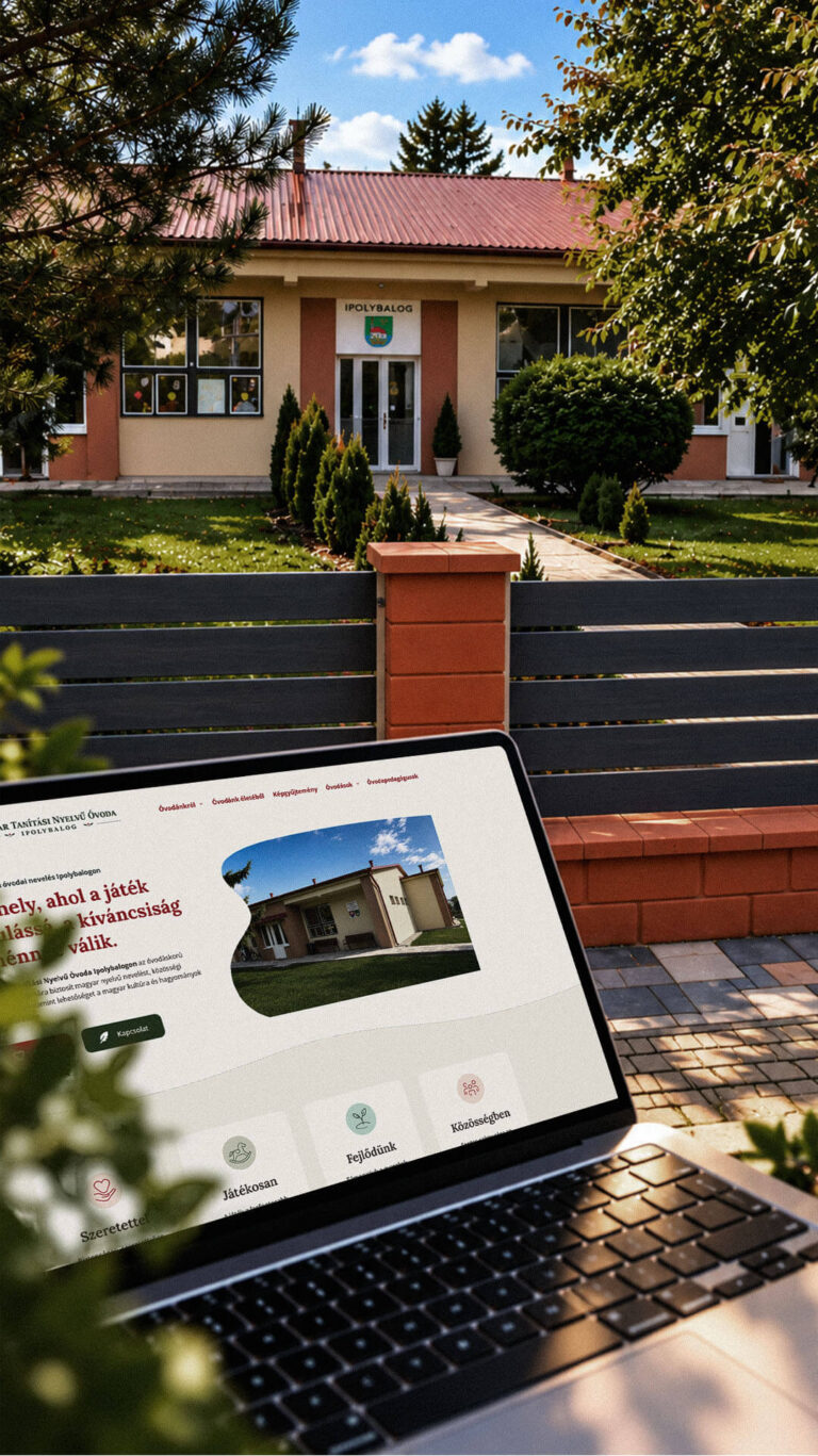
Playful Sparkle created a bilingual WordPress website and a distinctive visual identity for the Hungarian-language kindergarten in Balog nad Ipľom. The project includes Slovak and Hungarian logo variants, published school documents, admissions information, teacher profiles, educational programme details and activity pages, giving parents convenient access to essential information in both...
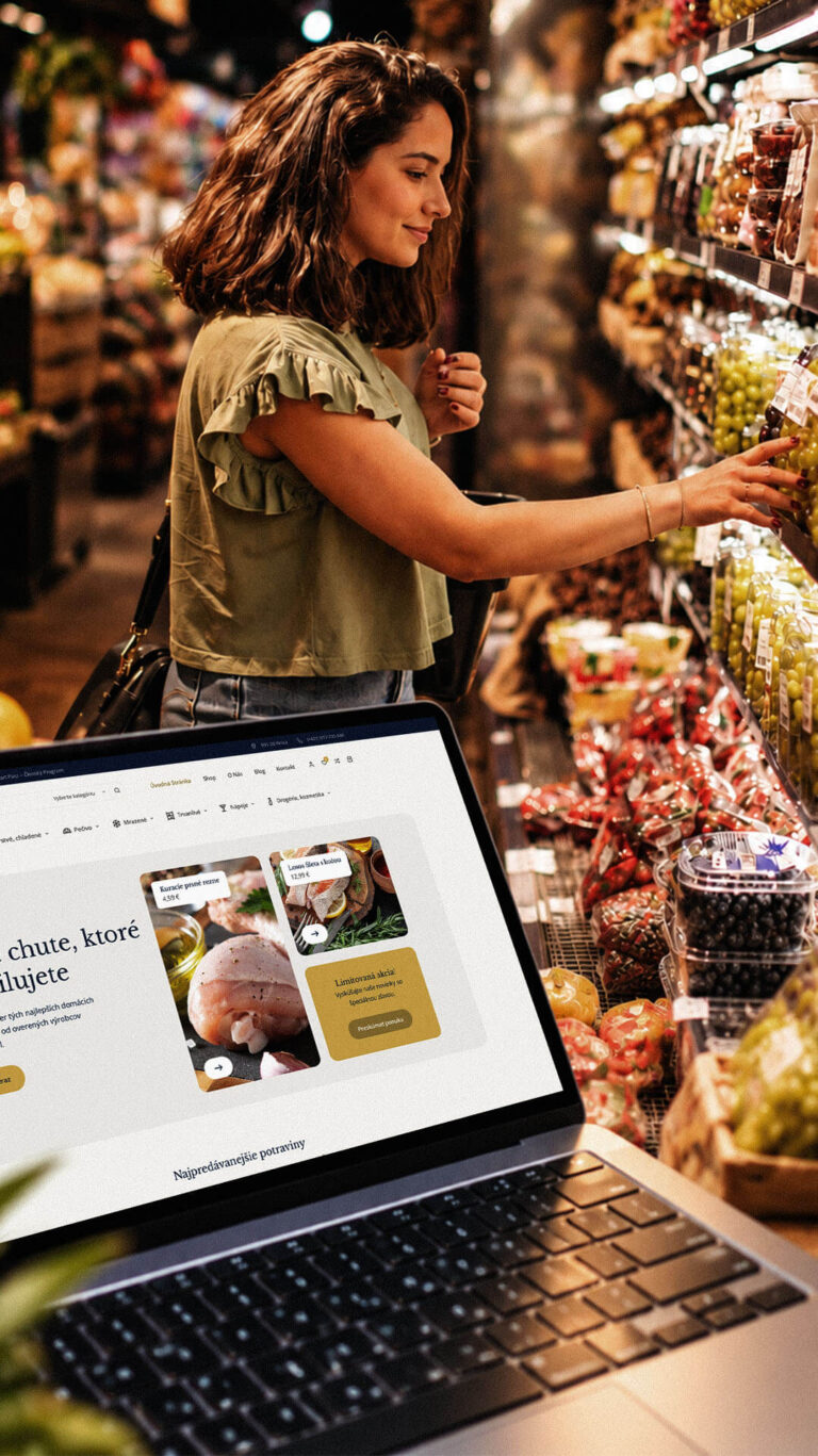
Playful Sparkle developed a WordPress and WooCommerce e-commerce platform for Dirolio Freshbox, bringing fresh and chilled foods, bakery products, frozen goods, pantry essentials, beverages and household care products into one organized catalogue. The store also includes a membership discount system linked to customer purchases, supporting the business’s planned local delivery...
