Let’s Build Something Great
Tell us about your goals and request a free project estimate.


A business card has a small physical format, but its design involves several connected decisions. The designer must organise contact information, apply the brand identity, select suitable typography, prepare colours and artwork, and account for the printing process.
A layout that looks balanced on a large computer monitor may become difficult to read when printed. Fine lines can disappear, small reversed text can fill in, and colours can change depending on the paper and printing technology. Finishing processes introduce further restrictions.
The design process therefore starts before opening a graphic design application. You first need to establish the intended card dimensions, target audience, information requirements, material and production method.
Understanding these constraints helps you create artwork that works as a design and as a physical printed product.
A business card communicates a person’s identity, professional role and contact information. It also represents the visual identity of the organisation behind it.
Its main purpose is practical. Someone should be able to identify the person or company and find the correct contact details without searching through unnecessary information.
The design must establish a clear hierarchy between the most important elements:
The order depends on the intended use. A consultant may prioritise their name and direct contact details. A company representative may place greater emphasis on the organisation’s identity. A photographer or designer may use the reverse side to display a small portfolio selection.
A business card should also work as part of a wider brand system. Its typography, colour palette, logo proportions and graphic elements should remain consistent with the company’s website, stationery and other communication materials.
This does not mean reproducing a website layout at a smaller size. A business card has much less space and is usually viewed from a short distance. The designer must simplify the identity while preserving its recognisable characteristics.
There is no single worldwide business card size. Different countries and printing markets use different formats. The dimensions influence layout, wallet compatibility, cardholders and the amount of space available for contact information.
The following table shows commonly encountered formats. These are regional conventions, not mandatory international standards.
| Region | Finished dimensions |
|---|---|
| Slovakia and Czechia | 90 × 50 mm (3.54 × 1.97 in) |
| UK and much of Europe | 85 × 55 mm (3.35 × 2.17 in) |
| United States and Canada | 88.9 × 50.8 mm (3.50 × 2.00 in) |
| Japan | 91 × 55 mm (3.58 × 2.17 in) |
| Australia and New Zealand | 90 × 55 mm (3.54 × 2.17 in) |
| China, common format | 90 × 54 mm (3.54 × 2.13 in) |
Slovak printing providers identify 90 × 50 mm (3.54 × 1.97 in) as a common local format. The 85 × 55 mm (3.35 × 2.17 in) European format is also available. In the United States, the familiar format is 3.5 × 2 inches (88.9 × 50.8 mm). Japanese business cards commonly use 91 × 55 mm (3.58 × 2.17 in). Slovak printer specifications and VistaPrint’s international size table provide examples of these regional differences.
Consider where you will distribute the cards. A business that primarily operates in Slovakia may prefer the 90 × 50 mm (3.54 × 1.97 in) format. A company preparing cards for international events may choose the format expected by its main target market.
Do not assume that a card prepared for one region will fit every other region’s cardholders or printing templates.
The final dimensions should be confirmed with the selected print provider before you begin designing. A printer’s current product template takes priority over a general online size reference.
The ISO/IEC 7810 ID-1 format is commonly associated with payment and identification cards. Its nominal dimensions are 85.60 × 53.98 mm (3.370 × 2.125 in), with a nominal thickness of 0.76 mm (0.030 in).
Some business cards use similar dimensions, especially plastic cards. However, ISO/IEC 7810 defines identification card characteristics. It does not establish a universal business card size. ISO/IEC 7810:2019.
The card’s proportions influence how the designer organises its content. A conventional rectangular card offers a familiar layout, while alternative formats create different design possibilities and production requirements.
Horizontal business cards provide a wider layout. They work well with company logos, names, job titles and contact details arranged in columns or aligned groups.
Vertical business cards use the same finished dimensions as their horizontal counterparts, with the width and height positions exchanged. This orientation can suit portrait-oriented logos, monograms and compact information structures.
Changing orientation does not automatically create a better design. The decision should follow the logo proportions, amount of content and intended visual hierarchy.
Square business cards can support centred compositions, large logos and simple graphic layouts. They also use wallet space differently from traditional rectangular cards.
Mini cards have a smaller printable area. A common example is 76.2 × 30 mm (3.00 × 1.18 in), although mini formats are not standardised. Their limited space makes them suitable for short contact details, product inserts or compact promotional messages.
Custom shapes can include circles, unusual outlines and die-cut designs. These formats require a cutting path and a production process capable of reproducing the intended shape.
A folded card provides additional space for information. However, the designer must distinguish between the flat artwork dimensions and the finished dimensions after folding.
The layout must account for the fold position, panel widths, folding direction and possible movement during finishing. Important text and logos should not cross a fold unless the design and production method specifically allow it.
Custom formats can make a card more distinctive, but they may increase production complexity and reduce compatibility with standard storage systems.
The content should determine the layout, not the other way around.
Start by collecting the information that must appear on the card. Check the spelling, telephone numbers, email addresses, website addresses and professional titles before beginning the design.
Then divide the information into three groups:
This classification helps prevent unnecessary content from taking up valuable space.
Double-sided printing provides more room without reducing the text size.
A practical arrangement places the logo and company identity on the front, then uses the reverse for contact information. Another approach keeps the front focused on the individual and uses the reverse for a portfolio image, service list or QR code.
Single-sided cards remain suitable when the content is limited or when the reverse side serves another purpose, such as handwritten notes.
Avoid filling every available area. Empty space supports separation between content groups and improves visual clarity.
Typography is one of the most important technical considerations in business card design. The available space is limited, and the printed text must remain readable under ordinary viewing conditions.
Choose typefaces according to the brand identity and the role of each text element.
A display typeface may work well for a company name or headline. Contact details usually need a more readable typeface with clear character shapes and sufficient stroke weight.
Pay attention to:
There is no universal minimum font size for every business card. Printer recommendations provide practical starting points, but actual readability depends on the typeface, printing technology, paper and ink coverage.
MOO recommends text of at least 8 pt and line thickness of at least 0.5 pt for its business card products. VistaPrint also recommends 8 pt as a minimum for ordinary body text. These are provider guidelines rather than universal standards. MOO design guidelines and VistaPrint design rules.
An 8 pt type size is approximately 2.82 mm (0.11 in) as a typographic measurement. It does not mean that every visible letter is 2.82 mm tall. The actual character height depends on the typeface’s proportions and design.
Thin, condensed and decorative fonts can become difficult to read at small sizes. Reversed white text on dark backgrounds also requires attention because fine details may fill in during printing.
Always evaluate typography at actual printed size. Enlarging the design on a monitor can make small text appear more readable than it will be on the finished card.
A print-ready business card design contains three important areas: bleed, trim and safe area.
Trim size defines the final dimensions of the finished card.
Bleed is the area of artwork extending beyond the trim line. It allows backgrounds, colours and photographs to reach the physical edge after cutting.
Safe area is the internal region where essential text, logos and other important information should remain.
The required bleed depends on the printer and product.
For example, a Slovak printer recommends 3 mm (0.12 in) of bleed on every side. A 90 × 50 mm (3.54 × 1.97 in) card therefore requires an artwork area of 96 × 56 mm (3.78 × 2.20 in), including bleed. The same provider recommends keeping text at least 4 mm (0.16 in) inside the finished edge. Vizitky-Tlač artwork guidance.
Other providers use different specifications. Offsetcards, for example, requests 1.5 mm (0.06 in) bleed and a 2.5 mm (0.10 in) safe area. MOO’s US template uses a 3.66 × 2.16 in (92.96 × 54.86 mm) bleed area around a 3.50 × 2.00 in (88.90 × 50.80 mm) finished card. Offsetcards specifications and MOO templates.
These differences show why designers should not rely on one generic bleed value for every order.
Extend edge-to-edge backgrounds through the full bleed area. Keep names, logos and contact details inside the safe area.
Avoid thin borders positioned close to the card edge. Small cutting variations can make a border appear uneven or off-centre.
Rounded corners also require consideration. Important text and graphic elements should remain clear of the corner cutting area.
For custom shapes, use the printer’s cutting template and follow its instructions for the trim path and safe area.
A business card is often part of a company’s wider colour identity. Reproducing those colours accurately requires an understanding of colour spaces and printing conditions.
RGB is an additive colour model used by displays. It combines red, green and blue light to produce colours.
CMYK is a subtractive colour model used in conventional four-colour process printing. It combines cyan, magenta, yellow and black inks.
The colour range available in CMYK printing is smaller than the range available on many displays. Bright blues, greens and oranges can therefore change appearance during conversion.
An ICC colour profile describes how a particular colour space or device reproduces colour. Profiles help maintain predictable colour communication between design software and printing equipment. The paper, ink and printing process all influence the result. Adobe’s commercial printing guidance explains how RGB and CMYK workflows differ and why the printer’s requirements matter.
Do not assume that every printer wants an artwork file converted to CMYK. Some professional prepress workflows accept RGB files with embedded profiles and perform the final conversion themselves. Others request CMYK or a specific PDF/X workflow. Confirm the required colour profile and delivery format before export.
Small black text is commonly prepared using 100% K black. This uses the black printing plate rather than a combination of several process inks, reducing the risk of coloured registration edges around small characters.
Larger black areas may use a rich black construction, which combines process inks to produce a deeper appearance. The exact ink values must follow the print provider’s requirements.
Spot colours use dedicated inks instead of building the colour from CMYK process inks. They are useful when a brand requires a specific colour or when metallic, fluorescent or opaque inks are needed.
Metallic and fluorescent effects cannot be reproduced accurately through ordinary CMYK printing alone. They require suitable special inks or finishing processes.
Paper affects the appearance, colour, texture, stiffness and durability of a business card. The same artwork can produce different results on coated, uncoated, textured or coloured stock.
Common options include:
| Paper type | Typical characteristics |
|---|---|
| Coated | Smooth surface and controlled ink absorption |
| Matte | Reduced surface reflection |
| Gloss | Reflective surface and strong visual contrast |
| Uncoated | Natural texture and greater ink absorption |
| Linen or textured | Visible surface pattern and tactile character |
| Cotton | Soft, distinctive paper surface |
| Kraft | Natural brown appearance |
| Recycled | Manufactured with recycled fibre content |
| Pearl or metallic | Reflective or decorative surface |
| Multilayered | Thick construction with a coloured or contrasting core |
The right stock depends on the brand, printing process and intended use. A textured paper may suit a design that uses restrained typography and simple graphics. A smooth coated stock may be more suitable for detailed photographs and strong colour reproduction.
Paper weight is commonly expressed in grams per square metre (g/m² or GSM). This measures the mass of a square metre of paper.
Physical thickness is measured separately. In the United States, printers often use points (pt), where 1 pt represents 0.001 inch (0.0254 mm) of thickness.
For reference:
| Thickness | Metric equivalent |
|---|---|
| 14 pt | 0.356 mm (0.014 in) |
| 16 pt | 0.406 mm (0.016 in) |
| 18 pt | 0.457 mm (0.018 in) |
| 32 pt | 0.813 mm (0.032 in) |
These are thickness measurements, not direct GSM conversions.
A common commercial business card stock range is approximately 300–400 g/m² (8.85–11.80 oz/yd²). However, this mass-per-area conversion does not establish the actual thickness. Fibre composition, density, coatings and paper construction influence the finished stock.
US basis weights such as lb cover, lb text and lb bond also cannot be compared directly without identifying the paper category and its basis sheet size. OKI’s paper weight explanation describes the differences between basis weight, metric weight and caliper.
When comparing suppliers, request the actual material name, weight and thickness rather than relying on a description such as premium or extra thick.
The printing method influences colour reproduction, supported materials, production quantity and available finishing options.
Digital printing transfers artwork directly from a digital file to the printing system.
Common technologies include toner-based electrophotographic printing and inkjet printing. Toner systems use charged particles that are transferred and fused to the substrate. Inkjet systems place small droplets of liquid ink onto the material.
Digital printing is suitable for shorter runs, personalised cards and jobs that require frequent artwork changes. It also avoids the conventional plate-making stage used in offset printing.
The supported materials and finishing options depend on the specific press. A digital press may not accept every paper stock, plastic material or specialty coating.
Offset lithography uses printing plates to transfer an image through a rubber blanket onto the substrate. The process separates image and non-image areas through the interaction of ink and a dampening solution.
Offset printing involves more production setup than a typical digital job. However, the cost per card can become more favourable at larger quantities. It also supports established process-colour and spot-colour workflows.
The economical production quantity depends on setup costs, paper, finishing and the printer’s equipment. There is no universal quantity at which offset printing becomes the better choice. HP’s digital printing explanation and OSHA’s lithography overview explain the basic differences between these processes.
Screen printing pushes ink through selected openings in a mesh screen onto the printing material. A stencil blocks the areas where ink should not pass.
The process can deposit a relatively heavy layer of ink and is useful for specialty substrates and selected visual effects. However, each colour requires its own screen and registration step. Fine-detail reproduction depends on the mesh, ink, substrate and production setup. OSHA’s screen printing overview explains the process.
Letterpress uses a raised printing surface to transfer ink under pressure. Depending on the equipment, material and setup, the impression can also leave a visible indentation in the paper.
The result is tactile, but the process places restrictions on small details, fine typography and registration. The selected paper must also support the pressure without damaging the intended design.
These methods serve different purposes. Choose the process according to the required appearance, production quantity, substrate and finishing combination rather than assuming one technology is always superior.
Finishing takes place after or alongside the main printing process. It can change the appearance and physical surface of a card, but each technique introduces additional production requirements.
Lamination applies a protective film to the printed surface.
Common options include gloss, matte and soft-touch lamination. Gloss produces a reflective surface, matte reduces reflection, and soft-touch films create a different tactile finish.
Lamination can improve resistance to handling and surface marking. However, some laminated surfaces are difficult to write on, and the film can affect the paper’s recyclability.
Spot UV applies a clear coating to selected parts of the card. It can create contrast between matte and glossy areas, highlight a logo or emphasise a graphic element.
The printer typically needs a separate mask that identifies the areas receiving the coating. The mask must align with the printed artwork.
Very small text and fine details may not reproduce reliably with a spot coating. Avoid placing the effect over QR codes unless the printer confirms that scanning remains reliable. Primoprint’s spot UV mask instructions explain this separate artwork requirement.
Hot foil stamping uses a heated die, pressure and a transfer film to apply a decorative foil layer to the surface.
Available effects include metallic gold, silver and other coloured foils. The result depends on the foil, die, pressure, temperature, contact time and paper surface.
The design normally requires a separate foil mask or vector artwork layer. Very fine elements can fail to transfer cleanly, and registration must be considered when foil is combined with printed graphics.
Paper surface quality also affects the transfer. The technical handbook from Iggesund Paperboard explains the role of heat, pressure, contact time and substrate surface in hot foil stamping.
Embossing creates a raised area by deforming the substrate. Debossing produces a recessed impression.
Both techniques use physical tooling and pressure. The paper’s thickness, fibre structure and surface determine how much detail can be reproduced.
Embossing may be combined with foil stamping to create raised metallic elements. However, combining processes requires accurate alignment and compatible materials.
Business cards can also use:
These options can increase production complexity and cost. They also affect the artwork preparation process. Each printer may require separate masks, cutting paths or named production layers.
QR codes connect a printed business card to digital information. They can lead to a company website, portfolio, booking system, social profile or digital contact card.
A QR code should have a clear purpose. A short link to a maintained contact page is often more practical than embedding large amounts of contact information directly into the code.
A QR code consists of a grid of small square modules. The number of modules depends on the encoded information and the selected QR code version.
DENSO WAVE specifies a clear quiet zone around the code equal to four modules on each side. The quiet zone must remain free from text, graphic elements and other printed content. DENSO WAVE’s QR code production guidance.
There is no single physical QR code size that works for every business card. A short website address requires less data than a full contact record, so the resulting code may contain fewer modules.
For reliable scanning:
Do not evaluate a QR code only from a screen preview. Print it at the intended size and test it on the actual material.
NFC cards contain an electronic component that allows compatible devices to exchange information over a short distance.
Unlike QR codes, NFC does not require the user to open a camera and scan an image. The smartphone must support the relevant NFC interaction, and the card’s chip and destination must be configured correctly.
Metal card construction requires particular attention because metal can interfere with the electromagnetic field used by NFC antennas. A suitable inlay or isolation construction may be necessary.
Both QR and NFC solutions depend on the destination remaining available. A business should maintain its digital contact page, redirect destination or profile service for as long as the physical cards remain in circulation.
Business cards used internationally may need to accommodate different languages, names, scripts and address conventions.
A design prepared for one language may not fit another. Translated company names can be longer, names may follow different ordering conventions, and some languages require characters that are not available in every typeface.
Right-to-left writing systems also affect the layout direction and information hierarchy.
Do not solve every multilingual layout problem by reducing the font size. Instead, consider:
Readability matters regardless of language. Use sufficient contrast, clear typography and a consistent information hierarchy. Do not communicate essential information through colour alone.
Web accessibility standards are not automatically print-design standards, but their underlying principles remain relevant. Clear contrast and legible text help more people understand the information on a physical card.
A completed design is not necessarily ready for commercial production. The artwork must meet the printer’s technical requirements.
Professional graphic design applications such as Adobe Illustrator, Adobe InDesign, Affinity Designer and Affinity Publisher can all be used to prepare business cards.
Vector artwork is made from paths and mathematical descriptions. It can be scaled without losing its geometric sharpness.
Use vector elements for logos, typography, icons and precise geometric graphics whenever possible.
Raster images consist of pixels. Photographs, textures and many complex image effects use this format. Their effective resolution depends on their pixel dimensions and final printed size.
A common target for photographic images is 300 PPI at final output size. However, the requirement depends on the image, printer and production process. Vector graphics do not require a fixed raster resolution.
Check that all fonts are embedded in the exported PDF or converted to outlines when required by the print provider. Outlining protects the appearance of the typography if the printer does not have the original font, but it also makes text harder to edit.
Ensure that placed images are embedded or correctly included in the production package.
Check for missing links, unintended transparency, incorrect colour definitions and unwanted objects outside the artwork area.
PDF is commonly used for professional print delivery. However, the required PDF version and export settings depend on the printer’s workflow.
PDF/X-1a is designed for a CMYK-oriented print workflow and flattens transparency. PDF/X-4 supports live transparency and colour-managed workflows. These formats are not interchangeable for every production environment. Adobe’s PDF preset documentation describes their technical differences.
Before export, confirm:
Some online printers add crop marks through their own production workflow. Others require them in the submitted file. Do not add marks automatically without checking the provider’s instructions.
Foil, spot UV, embossing, debossing and die cutting may need separate production layers or masks.
For example, a foil mask can use solid vector shapes to identify the areas that receive foil. A cutting file can contain the closed vector path used to cut the card.
Keep each production operation clearly identified. Use the printer’s required layer names, spot colour names and file naming conventions. Offsetcards’ artwork specifications provide an example of how specialist finishes and cutting instructions can be separated.
A digital proof helps identify layout errors before production. It does not always reveal how the finished material will look or feel.
A physical sample is particularly useful when the card uses unusual paper, dark backgrounds, textured materials or special finishes.
Check the following before approving the production run:
Pay particular attention to thin borders close to the card edge. Even a small cutting variation can make a border look uneven.
For special finishes, inspect whether the effect aligns with the printed artwork and whether small details have transferred correctly.
The final proof should represent the actual combination of paper, printing process and finishing whenever possible.
Material selection affects the durability, recyclability and environmental characteristics of a business card.
Recycled paper and FSC-certified paper are two options worth investigating, but they represent different claims.
FSC certification covers responsible sourcing and the chain of custody of forest-based materials. Its labels distinguish between FSC 100%, FSC Mix and FSC Recycled. These labels identify different material origins and compositions. Forest Stewardship Council guidance.
Finishing also matters. Lamination adds a polymer layer to paper, which can make the material more difficult to process in standard paper recycling systems. The UK Paper Industry’s Papercycle guidance explains how laminate layers affect the pulping process.
When selecting materials, consider:
Avoid assuming that plastic, metal, wood or bamboo cards are automatically more sustainable than paper. Their overall impact depends on material sourcing, manufacturing, transportation, product lifespan and disposal.
A successful business card combines a clear information structure, consistent brand identity and artwork that can be reproduced accurately.
The design must account for the physical dimensions, paper, printing method and finishing requirements from the beginning. These decisions influence typography, spacing, colours, graphic detail and the preparation of production files.
The most reliable approach is to confirm the printer’s specifications before designing, test critical details at actual size and inspect a physical proof when the material or finishing requires it.
Business card dimensions and artwork specifications
Paper and colour management
Printing and finishing
QR codes and sustainability
Playful Sparkle has been engineering digital products since 2004. Our services include Graphic Design, Branding & Strategy, Web Development and Digital Marketing. We create visual identities and graphic materials that connect brand design with practical production requirements.


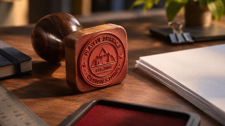
Custom stamp production involves more than preparing a logo or illustration. Learn how stamp types, impression dimensions, typography, line thickness, materials, inks and manufacturing methods affect the final result.

Learn how to build tagged URLs, standardise campaign values and analyse first-user, session and event-scoped traffic data. Explore Google Ads auto-tagging, channel groups, campaign performance metrics and common tracking problems.

Understand how Google Ads conversion tracking measures ecommerce purchases, cart additions, checkout initiations, lead submissions and registrations. Explore GTM implementation, direct gtag.js tracking, conversion attribution, remarketing, consent management and tracking validation.

