Let’s Build Something Great
Tell us about your goals and request a free project estimate.

A Distinctive Cobra Logo for Cobra BAUART
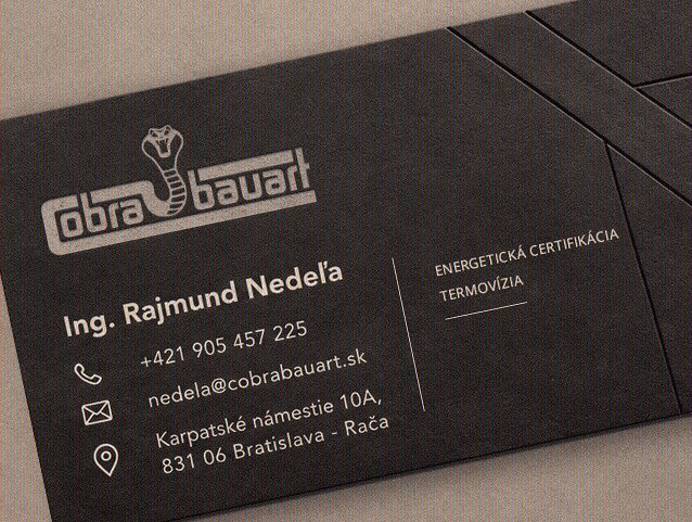
Cobra BAUART s.r.o. operates in construction engineering, energy certification and thermography. The company approached Playful Sparkle to develop a distinctive corporate logo built around one specific requirement: a recognisable cobra had to be at the centre of the design. Working with Ing. Rajmund Nedeľa, we explored how this concept could be translated into a professional graphic identity rather than a conventional animal illustration.
Through an extended consultation and creative exchange, we combined the client’s original idea with our own design direction. The resulting logo integrates a stylised cobra emblem with a bold horizontal wordmark, supported by colour and monochrome variations.
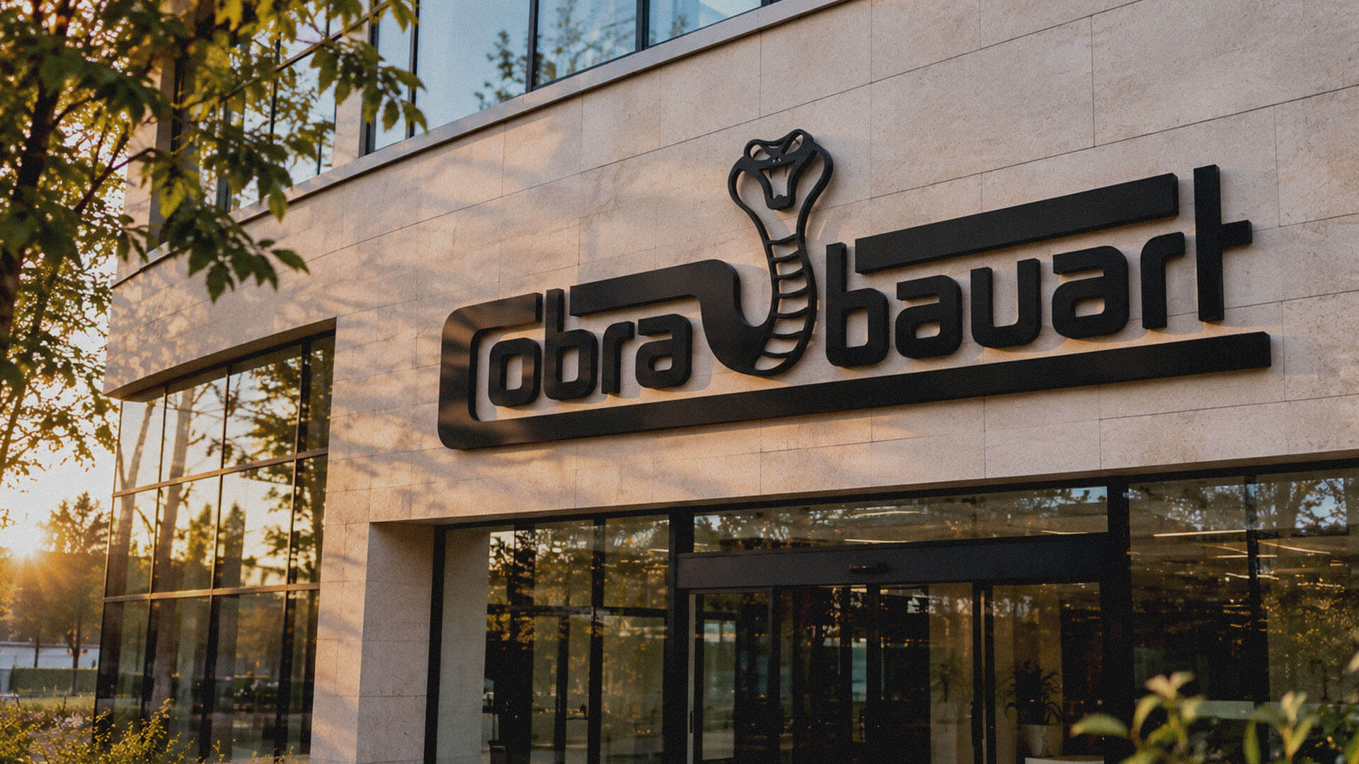
The objective was to create a recognisable corporate logo that reflects the client’s requested cobra concept while establishing a coherent visual relationship between the emblem and the company name. The design needed to balance a distinctive animal symbol with clear typography, controlled proportions and sufficient visual contrast for use across different business communication materials.
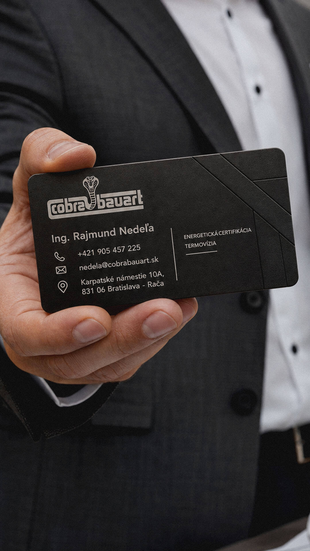
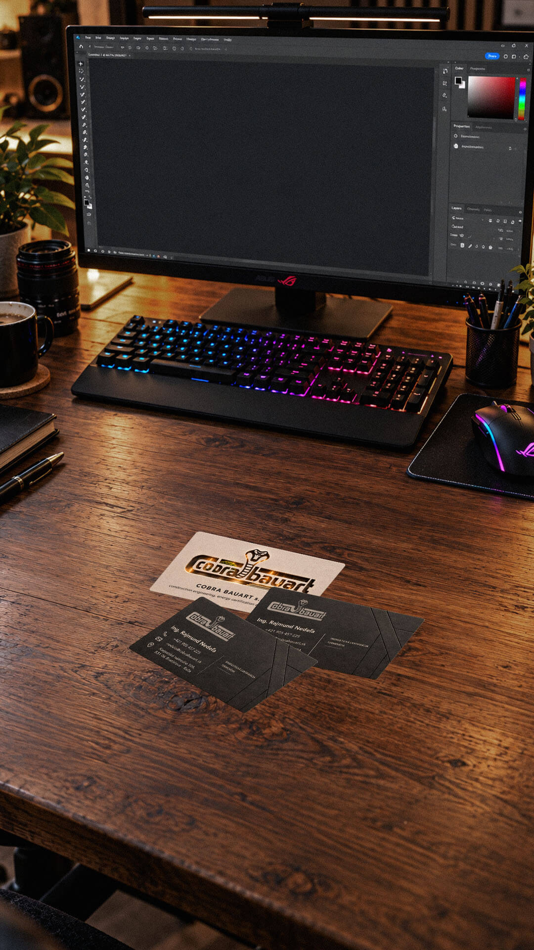
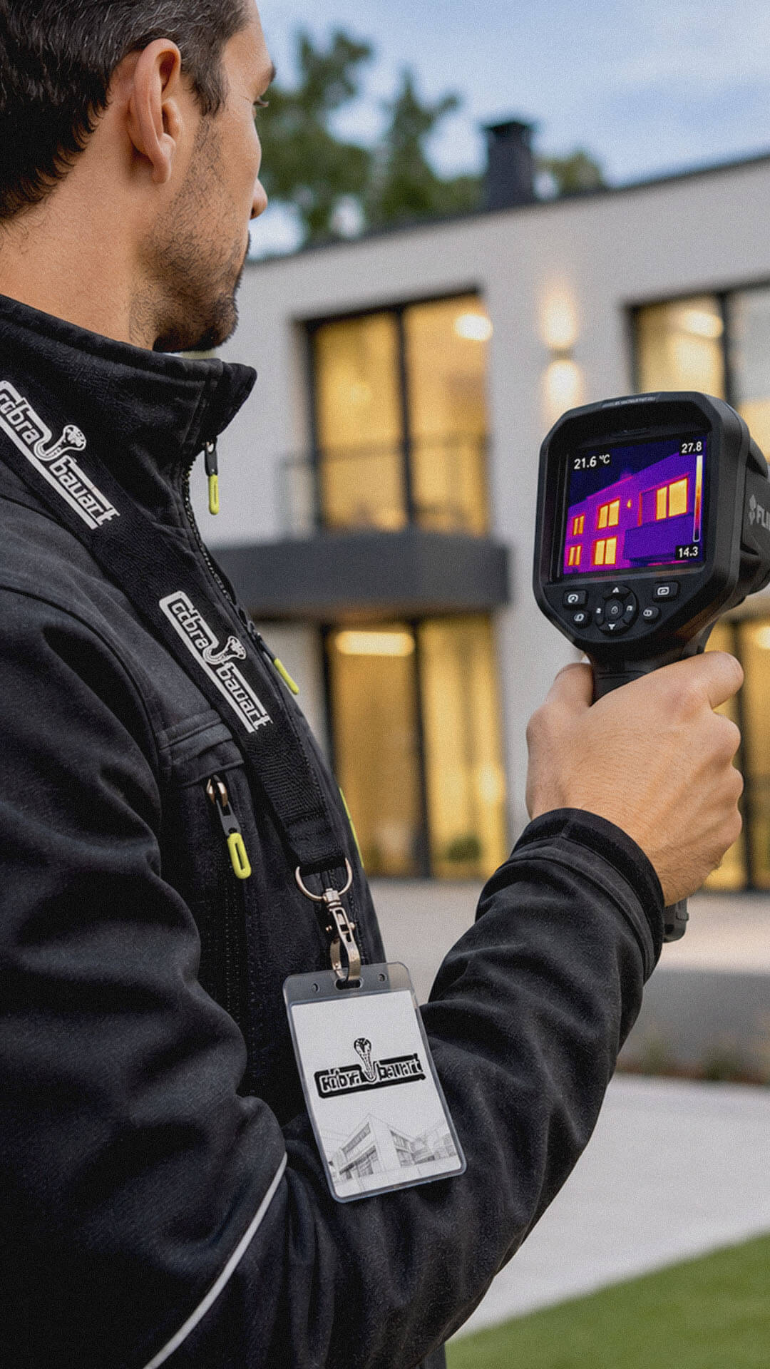
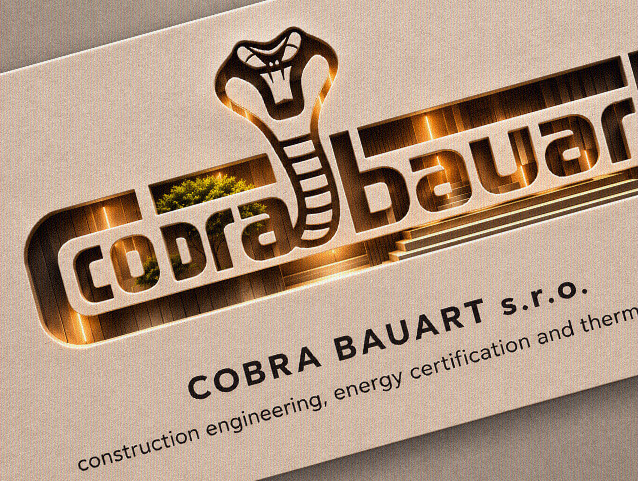
The completed logo transforms the client’s initial request into a structured corporate identity, with the cobra serving as its central visual identifier. The forward-facing head, distinctive eyes, open mouth and segmented body create a recognisable silhouette, while the integrated wordmark connects the graphic symbol directly with the company name.
Two visual treatments present the same core composition: a full-colour version using contrasting yellow, red, burgundy and charcoal details, and a monochromatic version using black and white. This provides flexibility for different reproduction requirements, including digital materials, printed documentation and potential physical applications such as signage or workwear.
The project began with an extended consultation to establish the client’s expectations and understand the importance of the cobra as the primary design element. We explored its visual construction, focusing on the head shape, hood silhouette, facial expression and segmented body. Particular attention was given to how these elements could work together as a cohesive emblem rather than an isolated illustration.
The creative development combined the client’s preferred concept with Playful Sparkle’s graphic design input. We integrated the cobra into the horizontal wordmark, using bold, geometric-looking lowercase typography, substantial letterforms and extended proportions to balance the central emblem. The final design was presented in colour and monochrome treatments, maintaining the same composition and recognisable visual structure across both variations.
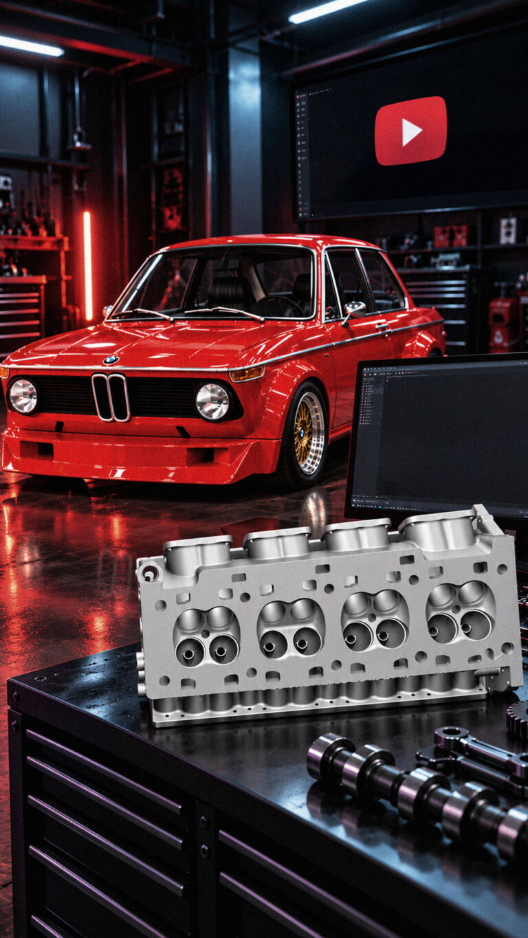
Playful Sparkle established and manages Modul Motorsport’s YouTube channel, combining channel branding, search-optimized video metadata, and 3D product animation. The initial video content includes a branded intro and a product showcase featuring 54 3D models of motorsport components for enthusiasts, specialists, and customers working on historic motorsport projects.
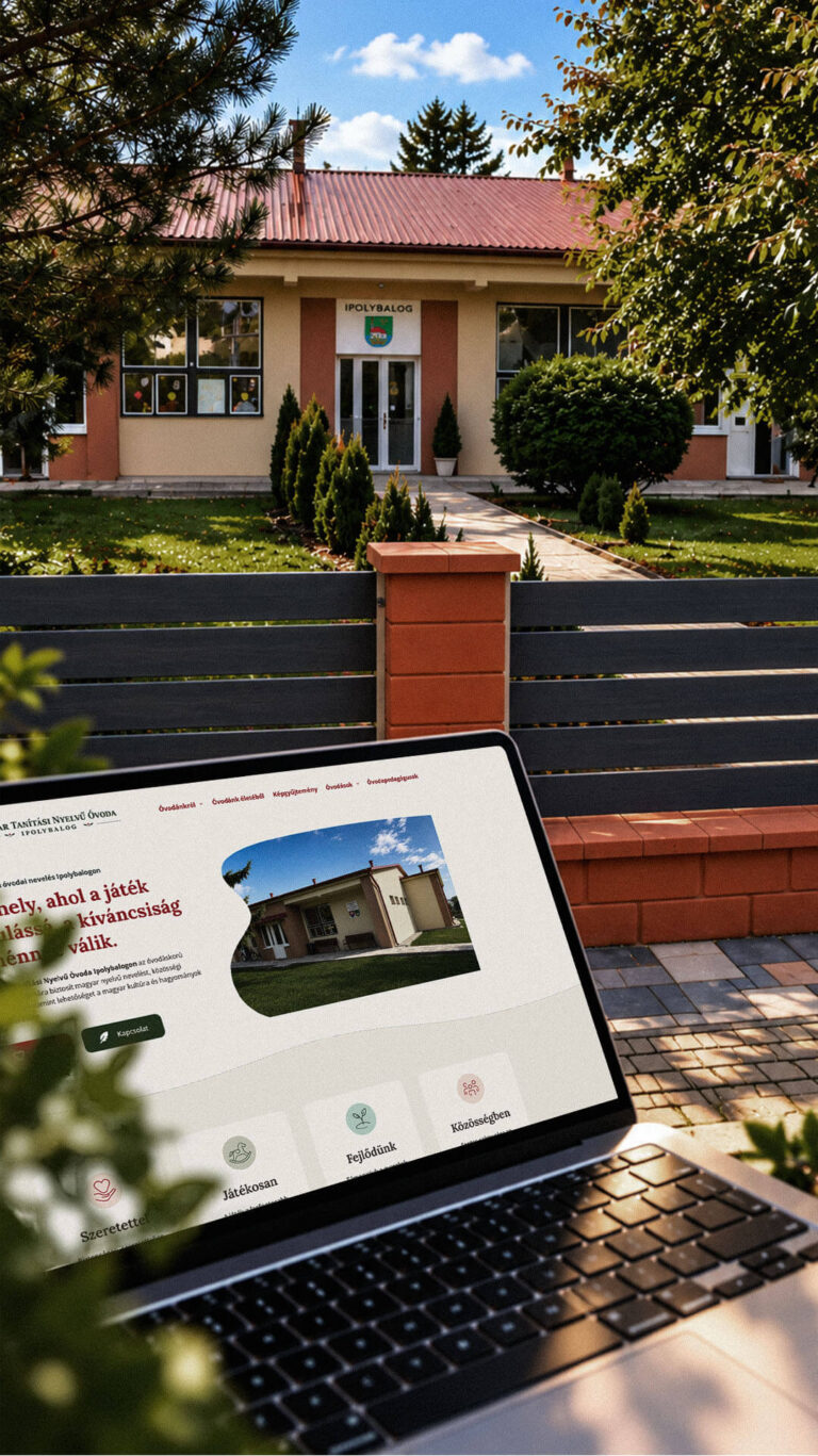
Playful Sparkle created a bilingual WordPress website and a distinctive visual identity for the Hungarian-language kindergarten in Balog nad Ipľom. The project includes Slovak and Hungarian logo variants, published school documents, admissions information, teacher profiles, educational programme details and activity pages, giving parents convenient access to essential information in both...
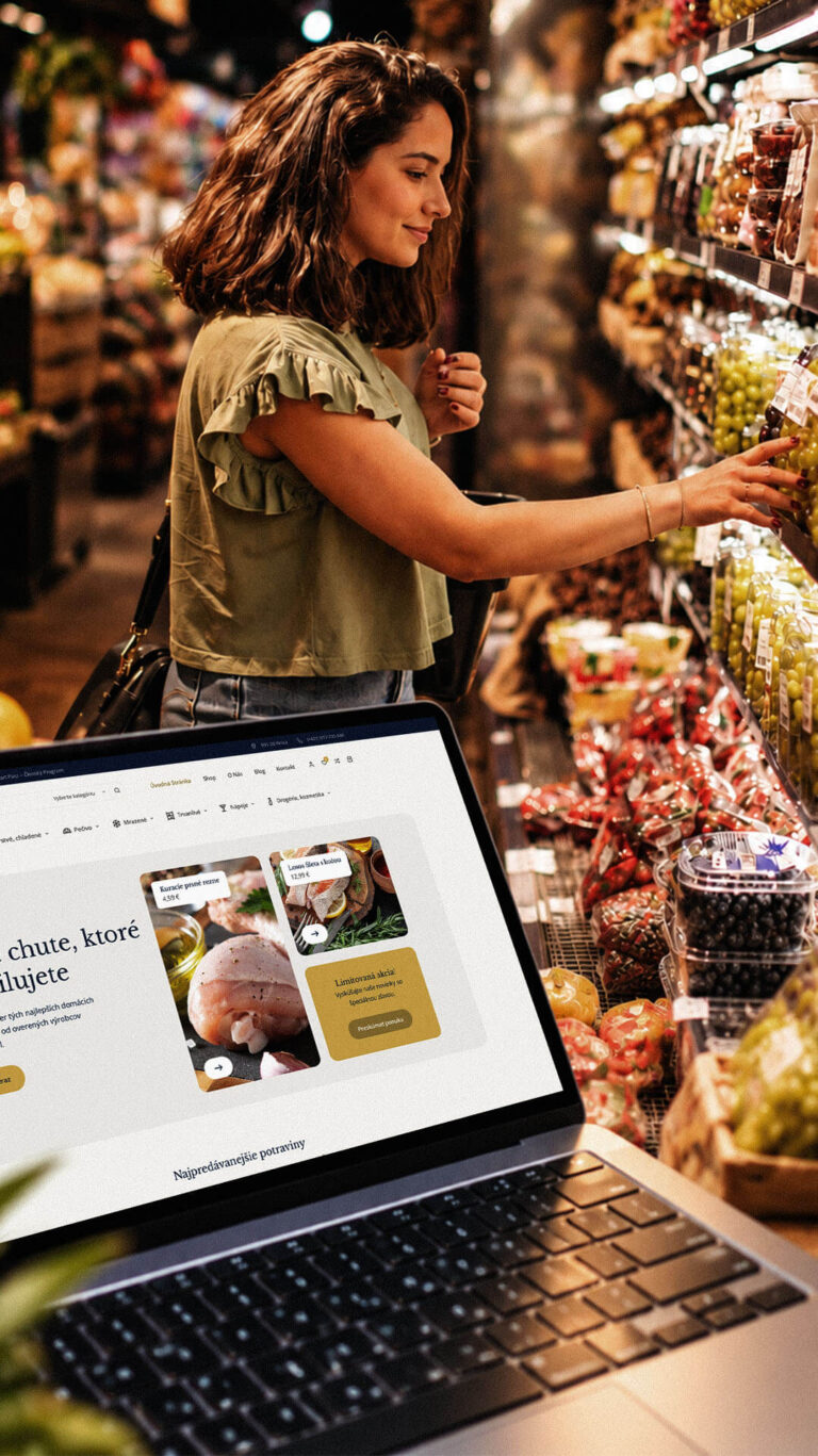
Playful Sparkle developed a WordPress and WooCommerce e-commerce platform for Dirolio Freshbox, bringing fresh and chilled foods, bakery products, frozen goods, pantry essentials, beverages and household care products into one organized catalogue. The store also includes a membership discount system linked to customer purchases, supporting the business’s planned local delivery...
