Let’s Build Something Great
Tell us about your goals and request a free project estimate.


A flyer has limited space to communicate a message. It may need to promote an event, introduce a product, advertise a service or present an offer. Readers should be able to understand its purpose quickly and identify what they should do next.
Designing a flyer involves more than arranging text and images on a page. The format, information hierarchy, typography, colours, paper and printing method all influence the finished result.
A design intended for digital distribution also has different requirements from one prepared for commercial printing. A printed flyer needs correct dimensions, bleed, safe areas and suitable image resolution. A digital version needs to remain readable on different screens and should not rely entirely on an image to communicate essential information.
Understanding these requirements before designing makes it easier to create a flyer that communicates clearly and can be reproduced correctly.
A flyer is a printed or digital communication material designed to deliver a specific message to an audience. It usually uses a single page or sheet and combines text, images and graphic elements to present information.
The terms flyer and leaflet are sometimes used interchangeably. Their meaning varies between countries and printing providers. In general, a flyer often refers to a single-sheet promotional item, while leaflet can also describe folded printed material with several panels. These are common usage patterns, not universal technical definitions.
Flyers serve different purposes depending on the organisation, audience and distribution method.
| Flyer type | Primary purpose | Typical content |
|---|---|---|
| Promotional flyer | Advertise an offer | Product, discount, price and conditions |
| Event flyer | Generate attendance | Event name, date, time, location and registration |
| Product flyer | Present a product | Product images, features, benefits and price |
| Service flyer | Generate enquiries | Service description, benefits and contact details |
| Retail flyer | Promote a shop or sale | Products, offers, location and opening hours |
| Restaurant flyer | Promote food and services | Menu highlights, prices and ordering information |
| Community flyer | Share local information | Activities, schedules and contact details |
| Recruitment flyer | Attract applicants | Position, requirements and application details |
| Informational flyer | Explain a subject | Main information, supporting details and references |
The purpose determines which information deserves the most attention.
An event flyer needs to make the event name, date, time and location easy to find. A promotional flyer may prioritise the offer and price. A service flyer should communicate what the business provides and how readers can make contact.
These differences should influence the design from the beginning.
The flyer dimensions determine how much space is available for information, how the design can be structured and which printing formats are suitable.
There is no single worldwide flyer size. European printers commonly offer ISO A-series formats, while North American printing providers frequently use US Letter and related formats.
The following table shows common commercial formats. Dimensions refer to the finished size before bleed is added.
| Format | Metric dimensions | Imperial dimensions |
|---|---|---|
| A3 | 297 × 420 mm | 11.69 × 16.54 in |
| A4 | 210 × 297 mm | 8.27 × 11.69 in |
| A5 | 148 × 210 mm | 5.83 × 8.27 in |
| A6 | 105 × 148 mm | 4.13 × 5.83 in |
| DL | 99 × 210 mm | 3.90 × 8.27 in |
| US Letter | 215.9 × 279.4 mm | 8.50 × 11.00 in |
| US Half Letter | 139.7 × 215.9 mm | 5.50 × 8.50 in |
| US Tabloid | 279.4 × 431.8 mm | 11.00 × 17.00 in |
The A-series dimensions follow ISO 216, which specifies trimmed paper sizes used for administrative, commercial and technical applications. The standard does not define every possible flyer or poster format. Custom dimensions remain available through individual printing providers.
Different formats provide different amounts of space and suit different distribution methods.
A3 is useful for large promotional material, display flyers and information intended to be read from a distance. It is also commonly used for posters.
A4 provides more space for detailed information, schedules, product listings and structured promotional content. It can also be folded into smaller formats.
A5 is a practical choice for general promotional campaigns, event announcements, retail advertising and handouts. Its proportions provide enough room for a headline, image, supporting information and contact details without requiring a large sheet.
A6 is suitable for compact promotional messages, discount offers, event invitations and product inserts. Its smaller area requires more careful content selection.
DL is a narrow format commonly used for leaflet distribution and display racks. Its proportions support vertical information layouts and folded materials.
US Letter is a familiar format in North American printing. Although it is close to A4, the dimensions are different. Artwork should not be resized between these formats without checking the layout and printable area.
The intended distribution method should also influence the choice. A flyer handed directly to someone has different requirements from one displayed on a noticeboard, placed inside packaging or delivered through a mailbox.
Most flyers use portrait or landscape orientation.
Portrait formats suit vertically arranged information and are common for event announcements, promotional offers and product advertising. Landscape formats provide a wider composition and may work better for panoramic photography, horizontal product arrangements or specific display locations.
Square flyers and custom proportions are also available. However, an unusual format may require a different cutting setup and may not fit standard display racks or storage systems.
Always confirm the final dimensions with the selected printer before designing.
The design should begin with the message, not with decorative elements.
Before opening a graphic design application, establish what the flyer needs to communicate, who should receive it and what response the business expects.
A practical content structure includes:
Not every flyer needs all five elements. A simple discount flyer may require only the offer, expiry date and website. A conference flyer needs more detailed information about the programme, venue and registration.
A call to action (CTA) tells readers what to do next.
Examples include:
Use one primary action wherever possible. Several equally prominent CTAs can compete for attention and make the intended response less clear.
Supporting actions can still appear on the flyer, but they should not distract from the main objective.
A flyer is not a complete company brochure. It should provide enough information to encourage the intended response, not attempt to explain every product or service.
Long paragraphs, unrelated descriptions and excessive contact details make the layout harder to scan.
A useful approach is to identify which information readers need immediately and which information can be accessed through a website or QR code.
Visual hierarchy determines the order in which readers notice information.
A well-structured flyer establishes a relationship between the headline, main image, supporting content and call to action. Each element should have a clear role.
A common hierarchy uses:
This is a starting structure rather than a fixed template. A retail promotion may place its price near the top, while an event flyer may prioritise the event name and date.
Alignment helps readers understand which elements belong together. Related information should share a consistent alignment and spacing system.
Common layout approaches include:
A grid provides structure, but it should not restrict the design unnecessarily. The content and intended reading order should determine how elements occupy the available space.
White space is the area between visual elements. It does not need to be white. It can be any unused part of the composition.
Adequate spacing separates information groups and prevents the flyer from becoming visually crowded.
Increasing the amount of content does not automatically make a flyer more informative. Sometimes removing unnecessary elements improves the communication more than adding another graphic or paragraph.
Adobe’s graphic design principles and layout guidance provides additional context on hierarchy, balance, alignment and visual organisation.
Typography influences how quickly readers can identify the message and understand the supporting information.
Flyers often contain several information levels, so the type system should distinguish headlines, subheadings, body text and secondary details.
Choose fonts according to their intended role. A distinctive display typeface may suit a headline, while body text usually needs a more readable design.
Consider:
There is no universal minimum font size for every flyer. The required size depends on the amount of information, printing process, paper, viewing distance and intended audience.
MOO recommends a minimum text size of 8 pt for its flyer products. Virginia Tech recommends 12–15 pt for short flyer descriptions in its particular event communication guidance.
These are different recommendations for different contexts. They should not be treated as universal print standards.
References: MOO Flyer Design Guidelines and Virginia Tech flyer design guidance.
For reference, 8 pt corresponds to approximately 2.82 mm (0.11 in) as a typographic measurement. A 12–15 pt range corresponds to approximately 4.23–5.29 mm (0.17–0.21 in). These values describe typographic point sizes, not the actual visible height of the letters.
The typeface’s x-height, proportions and stroke weight influence the apparent size of the text.
Small contact details may be appropriate on a handout, but they can become difficult to read when the same flyer is displayed on a wall.
Using too many unrelated typefaces can make the flyer inconsistent.
A practical starting point is to use one typeface for headings and another for body text. Hierarchy can then be established through font size, weight and spacing.
Decorative and script fonts should generally be reserved for short elements. Long paragraphs in complex typefaces are harder to read.
Text placed over photographs requires sufficient contrast. A photograph with many contrasting details can interfere with readability.
A solid background panel, subtle overlay or carefully selected image area can provide a more consistent reading surface.
Do not rely on shadows or outlines to compensate for an unsuitable background.
Images can communicate information faster than long descriptions, especially when a flyer promotes a product, venue, service or event.
The visual material should support the message rather than serve as decoration.
Depending on the project, suitable assets may include:
Use images that relate directly to the flyer content. A product flyer should show the relevant product accurately. An event flyer should use imagery that represents the activity or subject being promoted.
Check that the image has sufficient pixel dimensions for the final printed size. Enlarging a small web image can produce visible pixelation.
Vector graphics use paths and mathematical descriptions. They can be scaled without losing their geometric sharpness. This makes them suitable for logos, icons, typography and illustrations.
Raster images consist of pixels. Photographs and many complex textures use this format. Their effective resolution depends on their pixel dimensions and final printed size.
A common target for photographs is 300 PPI at final output size. However, the appropriate resolution depends on the printing equipment and image content. PRINTING United Alliance identifies 300 PPI as a useful estimate for many digital presses while advising print providers to confirm the actual requirements.
PPI describes image pixels per inch at a given physical output size. DPI describes the dots an output device uses to reproduce the image.
A digital press may use many printing dots to reproduce one image pixel. Therefore, a printer’s output resolution does not mean the source photograph must have the same number of PPI.
For print artwork, check the effective image resolution at the final size rather than relying on the resolution value shown in the original image file.
Colours displayed on a monitor do not always reproduce exactly on paper.
Digital displays use RGB, an additive colour model that combines red, green and blue light. Conventional four-colour process printing uses CMYK, which combines cyan, magenta, yellow and black inks.
The two colour spaces have different gamuts. Some bright RGB colours cannot be reproduced accurately using ordinary CMYK printing.
An RGB design may contain colours outside the reproducible CMYK range. When converted for print, those colours may become less saturated or change hue.
The correct conversion workflow depends on the print provider. Some providers request CMYK files with a specified ICC profile. Others accept RGB artwork and perform colour conversion through their own prepress system.
Do not convert every file to an arbitrary CMYK profile. Ask the printer which profile, PDF settings and colour workflow it requires.
Small black text is generally prepared using 100% K black. This avoids building small characters from several colour plates, which could create coloured edges if registration is imperfect.
Large black areas may use a rich black construction containing additional CMY inks. This produces a deeper appearance, but the exact values should follow the printer’s specifications.
Do not use registration black for ordinary artwork. Registration black is intended for printing marks and similar production elements.
Spot colours use dedicated inks instead of reproducing the colour through CMYK process printing.
They can be useful when a particular brand colour needs consistent reproduction or when the design requires metallic, fluorescent or opaque inks.
Metallic and fluorescent effects cannot be reproduced accurately using ordinary CMYK printing alone. They require appropriate specialist inks or finishing techniques.
The paper surface influences the final appearance.
Coated stocks generally provide a smoother surface and more controlled ink absorption. Uncoated paper absorbs ink differently and may produce a more muted appearance.
The paper’s natural whiteness and colour can also influence how printed colours appear.
For colour-critical projects, request a suitable proof or sample using the intended paper and production method.
Paper selection affects the flyer’s appearance, stiffness, handling, print quality and production cost.
The correct material depends on the intended use. A flyer distributed in large quantities may use a lighter stock, while a promotional piece intended for repeated handling may benefit from a heavier material.
| Paper type | Characteristics | Typical use |
|---|---|---|
| Gloss-coated | Smooth, reflective surface | Photography and promotional graphics |
| Matte-coated | Reduced reflection | Text and image combinations |
| Silk or satin | Moderate surface sheen | General commercial printing |
| Uncoated | Absorbent, non-reflective surface | Informational flyers and writable material |
| Recycled | Contains recycled fibre | Projects with specified recycled content |
| Coloured paper | Uses a coloured base stock | Designs requiring a non-white background |
| Textured paper | Distinctive surface | Selected premium or tactile applications |
Paper weight is commonly measured in grams per square metre (g/m² or GSM). It represents the mass of a square metre of paper.
Typical commercial flyer examples include:
| Paper weight | Possible application |
|---|---|
| 115–130 g/m² | Lightweight, high-volume distribution |
| 130–170 g/m² | General promotional flyers |
| 200–250 g/m² | More substantial promotional pieces |
| 250–300 g/m² | Premium flyers and postcard-like material |
These ranges are examples, not universal quality categories. Printing providers offer different stocks, and the same GSM can feel different depending on paper construction.
GSM also does not directly specify physical thickness. Fibre composition, density and coatings influence the material’s stiffness and caliper.
Some flyers use additional finishing to change their appearance or physical properties.
Gloss lamination creates a reflective protective surface.
Matte lamination reduces surface reflection and produces a less glossy appearance.
Soft-touch lamination provides a distinct tactile finish.
UV coating applies a cured coating to selected or entire printed areas.
Spot UV applies the coating selectively, creating contrast between treated and untreated areas.
Foil stamping uses heat, pressure and a transfer film to apply a decorative foil layer.
These techniques add production requirements and may not be appropriate for high-volume, low-cost distribution. Special finishes should be selected according to the flyer’s purpose and expected handling.
Digital printing and offset lithography are two important technologies used for commercial flyer production.
They differ in setup, equipment, workflow and production economics.
Digital printing transfers artwork from a digital file to the printing system.
Common technologies include toner-based electrophotographic presses and inkjet printing systems.
Digital printing is useful for short production runs, frequent design changes and personalised content. It typically avoids the conventional plate-making stage used in offset printing.
The available paper stocks, sizes and finishing options depend on the press. Not every digital system supports every material.
Offset lithography uses printing plates to transfer the image through a rubber blanket onto the paper.
The process involves more initial setup than many digital workflows. However, it can become economically attractive for larger production runs, depending on setup costs, materials and finishing.
Offset printing also supports established CMYK and spot-colour workflows.
The choice depends on more than quantity.
| Consideration | Digital printing | Offset printing |
|---|---|---|
| Setup | Generally simpler | Requires plate and press setup |
| Short runs | Often suitable | May involve higher initial setup costs |
| Personalisation | Supports variable data workflows | Requires a specialised workflow |
| Larger quantities | Depends on equipment and pricing | Can offer favourable unit economics |
| Special colours | Depends on press capabilities | Established spot-colour workflows |
| Materials | Limited to supported substrates | Depends on press and material compatibility |
There is no universal quantity at which offset automatically becomes cheaper. The economical crossover depends on the complete job specification, including paper, setup, press capabilities, finishing and turnaround requirements.
Ask the printer to compare the available production options using the same finished specification.
A folded flyer provides more information space without requiring the finished item to remain as large as the original printed sheet.
However, folding introduces additional layout and production constraints.
Common folding methods include:
A single fold divides the sheet into two panels on each side, creating four printed pages.
It is suitable for invitations, menus, basic information sheets and simple promotional material.
The sheet folds inward in the same direction, creating panels that close over one another.
A common example is an A4 sheet folded into a DL-style leaflet. The finished panel dimensions depend on the printer’s template.
The panel that folds inside generally needs to be slightly narrower than the other panels. If all panels have identical widths, the inner panel may buckle or prevent the leaflet from closing flat.
The sheet folds in alternating directions, producing a concertina-style layout.
It is useful for maps, timelines and information that readers may want to open in stages.
Two outer panels fold towards the centre. This creates a central panel that becomes visible when the flyer is opened.
The outer panels need to be sized to close correctly without colliding.
The sheet is folded in two directions, creating a compact finished format. It is often used for maps and larger information sheets.
Do not automatically divide every folded leaflet into equal-width panels.
Roll folds and gate folds usually require panel compensation. The exact measurements depend on the sheet size, paper thickness and folding equipment.
Keep essential text and logos away from fold lines. Background graphics can cross folds where appropriate, but text placed directly over a fold can become difficult to read or distort during finishing.
Heavier stocks may require creasing or scoring before folding to reduce cracking along the fold.
References: Printlogik’s leaflet panel guidance and Fretwell’s leaflet folding guide.
Before submitting a complex folded design, produce a physical mock-up. This helps verify the panel order, orientation, cover position and reading sequence.
A completed design is not automatically ready for printing. The file must meet the production requirements of the selected provider.
Professional applications such as Adobe Illustrator, Adobe InDesign, Affinity Designer and Affinity Publisher can all be used to prepare flyer artwork.
The trim size is the finished physical size after cutting.
Bleed extends the artwork beyond the trim line. It prevents unwanted white edges when small cutting variations occur.
The safe area protects essential content from being cut off.
Adobe identifies 0.125 in (approximately 3 mm) as a common industry bleed recommendation, but explicitly advises designers to verify the printer’s requirements.
Reference: Adobe InDesign, Print bleed and slug areas.
Consider an A6 flyer with a finished trim size of 105 × 148 mm (4.13 × 5.83 in).
A printer requesting 2 mm (0.08 in) of bleed on every side would require an artwork area of 109 × 152 mm (4.29 × 5.98 in).
The trim and safe area are different from the full artwork dimensions. Essential text and logos should remain within the provider’s safe area.
MOO publishes these dimensions for one of its A6-style flyer templates. Other providers may request different bleed and safe-area values.
Reference: MOO Flyer Design Guidelines.
Ensure that fonts are embedded or converted to outlines where the printer requires it. Check that linked image assets are included and that no elements are missing.
Images should have sufficient effective resolution at their final printed size. Logos, icons and other scalable elements should preferably use vector artwork.
PDF is a common delivery format for commercial printing.
However, the required PDF settings depend on the printer’s workflow. Some providers request a PDF/X format, a specific colour profile or particular transparency settings.
Before exporting, confirm:
Crop marks should not be added automatically. Some online printers add them in their own production workflow. Others require marks or specific template settings.
Adobe’s printer’s marks documentation explains the purpose of crop marks, bleed marks, registration marks and other production indicators.
A QR code can connect a printed flyer to an online destination.
Common uses include:
The destination should be relevant to the flyer and work properly on mobile devices.
A QR code is built from small square elements called modules. Its total size depends on the number of modules and the physical size assigned to each one.
A quiet zone is the clear area around the QR code. DENSO WAVE specifies a margin of at least four modules on every side.
This space must remain free from text, graphics and other printed elements.
Reference: DENSO WAVE QR Code production guidance.
There is no single physical QR code size suitable for every flyer. A short URL generally requires less encoded data than a complex contact record. The resulting code can therefore have a different module count.
For reliable scanning:
A QR code should not be treated as a replacement for essential printed information. Include a readable website address or another way to access the destination.
A QR code can also support campaign measurement.
A dedicated landing page, campaign URL, discount code or registration form can help identify responses generated by a specific flyer distribution.
A scan alone does not establish that the reader completed the intended action. Campaign measurement should distinguish scans, visits, enquiries, registrations and completed transactions.
Flyers may reach people with different visual abilities, language requirements and levels of familiarity with the subject.
The design should use readable text, clear contrast and a logical information structure.
Avoid relying entirely on colour to communicate important information. A reader should still be able to understand the message if they cannot distinguish a particular colour combination.
Translated content may take up more or less space than the original text. Some languages use longer words, different sentence structures or writing systems with different visual characteristics.
Right-to-left languages also require changes to the layout and reading direction.
Do not solve every multilingual layout problem by reducing font sizes. Consider separate language versions, bilingual layouts or QR-linked pages that provide additional language options.
A digital flyer should not rely exclusively on a graphic image to present essential information.
When publishing a flyer online, provide meaningful alternative text for images and ensure that important information is available as readable text.
A downloadable PDF should use appropriate document tagging, a logical reading order and selectable text where possible.
The W3C guidance for tagged PDF reading order explains why the order of content matters for assistive technologies. The University of Manchester’s accessible document guidance also explains how document structure and alternative text should be considered during production.
The distribution method affects the format, material and content of a flyer.
Common distribution channels include:
A flyer intended for direct handouts may use a smaller format that is easy to carry. A flyer placed in a display rack needs dimensions that fit the available space. A door-to-door campaign may require materials compatible with the distributor’s packaging and delivery requirements.
A flyer campaign should have a defined objective and a way to identify responses.
Possible measurement methods include:
| Method | What it can measure |
|---|---|
| Unique QR code | Scans associated with a particular flyer |
| Campaign landing page | Visits from the printed campaign |
| Promotional code | Redemptions associated with the offer |
| Dedicated telephone number | Calls generated by the campaign |
| Registration form | Event or service registrations |
| Enquiry form | Submitted business enquiries |
The tracking method should match the campaign objective.
For example, an event flyer may use a dedicated registration page, while a retail promotion may use a unique discount code.
Do not assume that a high number of QR scans automatically indicates a successful campaign. Measure the actions that matter to the business.
Many production problems originate during the initial design stage rather than during printing.
The most common mistakes include:
The most reliable way to prevent these problems is to obtain the printer’s specification before designing and check the final file before submission.
A flyer needs to communicate its message clearly and meet the technical requirements of its intended production method.
The design should begin with the audience, purpose and distribution channel. These decisions influence the format, content, visual hierarchy, typography and imagery.
Print preparation then determines whether the design can be reproduced accurately. Correct dimensions, bleed, colour management, image resolution, paper selection and folding specifications all contribute to the final result.
A digital preview can help identify layout problems, but it cannot fully represent the physical paper, print finish or final cutting. When the material or production method introduces uncertainty, a physical proof provides a more reliable basis for approval.
The most effective workflow connects communication, graphic design and production requirements from the beginning. This reduces avoidable corrections and helps ensure that the finished flyer communicates the intended message.
Paper sizes and flyer artwork
Design and readability
Folding and production
QR codes and digital accessibility
Legal and sustainability considerations
Playful Sparkle has been engineering digital solutions since 2004. Our work includes Graphic Design, Branding & Strategy, Web Development and other areas of digital product development. We approach visual production with attention to technical specifications, implementation requirements and the final output. Learn more about our services.


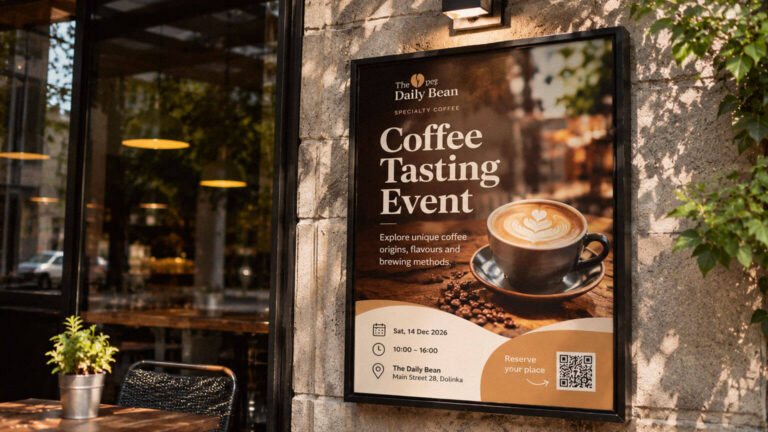
Learn how to design a poster that communicates its message clearly and works in its intended display environment. Explore poster sizes, visual hierarchy, typography, imagery, viewing distance, printing materials and artwork preparation.
Learn how to design a Business Card that prints correctly. Explore card dimensions, information layout, typography, paper selection, printing methods, special finishes, and the preparation of print-ready artwork.
Custom stamp production involves more than preparing a logo or illustration. Learn how stamp types, impression dimensions, typography, line thickness, materials, inks and manufacturing methods affect the final result.

