Let’s Build Something Great
Tell us about your goals and request a free project estimate.


A book cover is more than a front-cover design. It is a production layout that must account for the physical construction of the finished book, including its front cover, back cover, spine, trim dimensions, bleed, folds and finishing operations.
A design can look correct on screen but still produce problems during printing and binding. An incorrectly calculated spine, missing bleed, unsuitable colour settings, low-resolution images or misplaced text can affect the finished result. Even a correctly exported PDF can require adjustments when its layout does not match the manufacturing process.
Preparing a book cover therefore involves two connected tasks. The first is designing the visual identity and content of the cover. The second is preparing the artwork and production files so that the printing team can reproduce, trim, fold, bind and finish the book as intended.
This article explains the complete process, from planning the design and determining the cover dimensions to preparing the production files and handing them over to the printing team. It covers paperback and hardcover construction, dust jackets, CMYK colour management, image resolution, Photoshop and InDesign workflows, special finishes, print-ready PDFs, proof approval and common prepress problems.
The most effective way to avoid production problems is to establish the book’s specifications before creating the artwork.
Designing first and asking for printing dimensions afterward can result in unnecessary adjustments. A changed spine width, binding method or cover construction may require the entire layout to be repositioned.
Before starting the design, confirm the following information:
| Specification | Information required |
|---|---|
| Book format | Paperback, hardcover, dust jacket or another format |
| Reading direction | Left-to-right or right-to-left |
| Finished trim size | Final width and height of the book |
| Page count | Final interior page count |
| Interior paper | Paper type, thickness and weight |
| Binding method | Perfect binding, sewn binding, saddle stitching, case binding or another method |
| Cover material | Coated paper, cover board, fabric or another material |
| Spine width | Calculated or supplied production measurement |
| Printing process | Intended printing technology and colour conditions |
| Cover finish | Lamination, varnish, foil, embossing or other treatment |
| Barcode | Whether the artwork must contain the barcode or leave a reserved area |
| File requirements | PDF standard, dimensions, bleed, colour profile and additional files |
Some of these values can only be confirmed by the printing team. For example, the designer should not calculate a hardcover wraparound area using a standard paperback bleed value.
The cover should not be considered ready for final artwork until its text and publishing information have been approved.
Check the following:
A small wording change can affect the layout, particularly on a narrow spine or a text-heavy back cover.
Proofread the final text before completing the production layout. Avoid making untracked changes after the cover has been approved.
Every photograph, illustration, logo, font and other external asset must be suitable for the intended publication.
Check that the applicable licences permit the required use, including:
Owning a copy of an image or font does not automatically grant permission to reproduce it on a commercial book cover.
Keep relevant licence information with the project documentation so that the rights can be verified later.
The cover should have a clear reading order.
The title, author name, subtitle, illustration and supporting information should have distinct visual roles.
Consider:
A cover should also remain recognizable when displayed as a small digital thumbnail.
The design should be evaluated at its actual physical size as well. A title that looks readable at 300% zoom may be too small on a finished book.
Before creating a print document, identify the physical parts of the book and determine how the artwork will be applied to them.
The structure depends on the binding method. A paperback, hardcover and dust jacket do not use identical layouts.
The front cover is the primary visible surface of the book.
It normally contains:
The front cover establishes the visual identity of the publication. Its typography, imagery, colour and composition should work together and remain legible at both full print size and small digital thumbnail sizes.
The back cover is the exterior panel opposite the front cover.
It can contain:
The barcode requires a suitable reserved area when it is included in the artwork. Its position, size, contrast and surrounding clear space must follow the applicable barcode and production specifications.
An ISBN identifies a particular publication. The ISBN should match the edition and product form being prepared. The International ISBN Agency explains where an ISBN should be displayed and how its placement relates to the printed publication.
Some production workflows insert the barcode during printing. Others require the designer to include it. Establish this before finalizing the layout.
The spine connects the front and back covers. It becomes visible when the book is placed upright on a shelf.
It can contain:
The available space depends on the actual spine width. A thin book may not provide enough room for readable spine typography.
Do not estimate the spine width from the finished book’s height or width. It depends primarily on the thickness of the book block and the construction of the binding.
Hardcover books introduce additional construction areas. A hinge is the flexible area where the cover board connects to the spine construction. It allows the book to open.
Important text, logos and other essential elements should not cross a hinge unless the design and production method specifically accommodate it. Artwork positioned across this area can bend or become visually distorted when the book opens.
Hardcover covers use rigid boards covered with printed material or another cover material.
The material extends beyond the visible board dimensions and folds around the edges. The excess is attached to the inside of the board. This is commonly referred to as the wrap or turn-in area.
It is not the same as ordinary paperback bleed.
A hardcover production layout may contain:
The dimensions of these areas depend on the physical construction. They must come from the production template rather than being added using a generic paperback calculation.
A dust jacket is a removable printed cover that wraps around a hardcover book.
It normally contains five main sections:
The flaps fold inward and may contain an author biography, synopsis, publisher information or additional promotional content.
Their dimensions depend on the book format and manufacturing requirements. A dust-jacket layout therefore needs its own measurements and fold guides.
Not all books use perfect binding or case binding.
| Binding method | Cover-layout considerations |
|---|---|
| Perfect binding | Continuous back, spine and front cover spread |
| Sewn binding | Spine construction and cover attachment depend on the binding design |
| Saddle stitching | Folded cover sheet; page creep and the central fold affect the layout |
| Case binding | Rigid boards, spine, hinges and turn-in areas |
| Wire or spiral binding | Binding edge and punching area must remain clear |
| Dust jacket | Additional front and back flaps with fold allowances |
Saddle-stitched publications do not have a conventional separate spine panel in the same way as perfect-bound books. The layout must account for the central fold and any movement or creep created by the nested sheets.
For wire or spiral binding, the punched or bound edge requires clearance. Important text and design elements should not enter this area unless the production method allows it.
| English term | Meaning |
|---|---|
| Front cover | The front exterior panel |
| Back cover | The back exterior panel |
| Spine | The section connecting the front and back covers |
| Trim size | Final dimensions of the finished book |
| Bleed | Additional artwork extending beyond the trim line |
| Safe area | Area in which important content should remain |
| Trim line | Boundary where the finished material is cut |
| Hinge | Flexible area where a hardcover opens |
| Wraparound | Material extending around a hardcover board |
| Turn-in | Material folded onto the inside of a hardcover |
| Dust jacket | Removable printed cover surrounding a hardcover |
| Flap | Folded extension of a dust jacket |
| Slug | Additional area for production information outside the bleed |
Understanding these terms helps designers and printers discuss the same physical boundaries without confusing design margins with manufacturing allowances.
The finished book size alone is not enough to calculate the complete cover layout.
The following specifications can affect the artwork:
| Specification | Why it matters |
|---|---|
| Finished trim width | Determines the width of the front and back panels |
| Finished trim height | Determines the height of the cover panels |
| Page count | Influences the spine width |
| Paper thickness | Determines the physical thickness of the book block |
| Paper type | Different paper stocks can have different thicknesses |
| Binding method | Determines folds, hinges, wrapping and other construction areas |
| Cover material | Affects manufacturing and finishing requirements |
| Printing method | Influences colour handling and output specifications |
| Special finishes | May require additional artwork or production separations |
Two books with the same finished dimensions can have different spine widths.
The difference may result from:
The spine is determined by the physical thickness of the finished book block, not simply by the number of pages.
A book’s page count also does not necessarily tell the designer the exact thickness of its paper. Different stocks can have different calipers, even when their grammage is similar.
The most reliable approach is to obtain the spine measurement after the interior page count and paper specification have been finalized.
Changing the paper stock or page count after preparing the cover can invalidate its dimensions. Even a small change in spine width affects the position of the front and back panels.
Where the production process provides a spine-calculation formula, use the formula for the exact paper stock and binding method. Do not reuse a formula from an unrelated book or production system.
These four terms describe different areas of a print document. Understanding their purpose is essential when preparing a cover for production.
Bleed is the area extending beyond the final trim dimensions.
It allows background colours, photographs and graphic elements to continue beyond the cutting boundary. This compensates for small variations during printing and trimming.
Without sufficient bleed, a slight shift during cutting can expose an unwanted white edge.
A bleed of approximately 3 mm is a common starting point for many commercial print layouts. However, this is not a universal requirement. The actual amount depends on the printing and binding process.
The important distinction is that bleed must contain the continuation of the actual artwork.
Extending the document canvas while leaving the background image at the trim boundary does not create a correct bleed. Photographs, background colours and other elements intended to reach the finished edge must extend into the bleed area.
The trim line defines the boundary where the printed material will be cut.
The area inside this line becomes part of the finished cover.
For a standard paperback spread, the trim layout identifies the finished back cover, spine and front cover dimensions. The bleed extends beyond the outer trim boundaries.
For a hardcover, the trim line may be only one of several important boundaries because the manufacturing layout also includes board edges, hinges and wrap areas.
The safe area is the region inside the trim boundary where important content should remain.
It normally includes:
The safe area reduces the risk of important content being cut off or placed too close to folds, hinges or binding boundaries.
Bleed and safe margins serve opposite purposes.
A background image can extend 3 mm beyond the trim line, while essential text must remain sufficiently far inside it.
There is no universal safe-margin measurement for every book. The required clearance depends on the binding method, trimming tolerance and specific production instructions.
A designer may also use a larger internal margin for aesthetic reasons. That is a design decision, not automatically a production requirement.
The slug area extends beyond the bleed area.
It can contain production information such as:
The slug is not part of the finished book cover.
It is also not the same as bleed. Bleed contains printable artwork that must extend beyond the trim boundary. Slug contains production information outside the bleed.
A slug area is not required for every print submission. Include it only when the production specification requests it.
Crop marks indicate the intended trim boundaries.
Other printer’s marks can include:
These marks support commercial printing workflows, but they are not automatically required in every submitted PDF.
Some workflows expect marks outside the bleed area. Others require a PDF without manually added marks because the production system uses the document dimensions or applies its own imposition settings.
Follow the required PDF specification rather than selecting every printer’s mark by default.
A paperback and a hardcover may contain the same title, author and artwork, but their physical construction requires different production layouts.
For a paperback, the spine is the narrow central panel between the back and front covers.
The artwork must account for:
Spine typography should be centred within the usable spine area. The geometric centre of the complete PDF is not necessarily the correct reference point if the template includes additional construction areas.
The spine can also be too narrow for readable typography. In that situation, omitting spine text is preferable to forcing an unreadable title into a limited space.
A hardcover uses rigid boards to create the front and back covers.
The printed cover material wraps around these boards and is attached to their inner surfaces.
A hardcover production template may therefore contain:
The finished artwork must account for both the visible cover surface and the material that disappears around the boards.
A photograph or background colour intended to cover the entire outer surface must continue through the appropriate wrap area. Important text and logos should not be placed there.
The hinge is where the cover bends when the book opens.
It affects how the front and back boards move relative to the spine.
The designer should treat the hinge as a separate construction area rather than as ordinary artwork space.
Important typography should normally remain on the stable cover-board area unless the production template specifically permits another arrangement.
A dust jacket has front and back flaps that fold around the inside of the hardcover.
The complete layout normally includes:
| Panel | Content |
|---|---|
| Back flap | Author biography or additional information |
| Back cover | Synopsis, reviews, ISBN and barcode |
| Spine | Title, author and publisher identification |
| Front cover | Main cover artwork and title |
| Front flap | Additional description or author information |
The design must account for fold locations and the distance between important content and those folds.
A dust jacket is printed and folded as a separate component. Its dimensions should not be calculated using a conventional paperback cover formula.
A template is more than a visual reference. It defines the physical boundaries required for a particular construction process.
It may identify:
Different template lines may look similar on screen. The designer must know which ones represent trim, fold, glue, bleed or safety boundaries.
Never assume that every coloured line in a template has the same meaning across different production workflows.
If a template does not contain a legend, request clarification before creating the final artwork.
Colour preparation affects the visual appearance of the finished book. A cover that looks vibrant on a monitor can appear different when printed.
This is partly because monitors emit light, whereas printed materials reflect light. Their colour reproduction systems have different capabilities.
CMYK represents four printing colour channels:
These inks combine to reproduce a wide range of colours.
CMYK is widely used in full-colour commercial printing. However, selecting CMYK as the document colour mode does not automatically guarantee accurate colour reproduction.
The actual result also depends on the printing process, paper, ink characteristics and output profile.
An ICC colour profile describes the colour characteristics of a particular device or output condition.
It helps applications translate colours between working spaces and the intended printing environment.
Relevant factors include:
The same CMYK values can produce different results under different printing conditions.
For this reason, the designer should establish the intended output profile before the final colour conversion.
Common professional workflows use printing-condition profiles such as FOGRA-based profiles, but the correct profile must match the intended production process.
Do not select an ICC profile simply because it is commonly used in another project.
These Photoshop operations have different purposes.
Assign Profile changes how existing colour values are interpreted. It does not convert the actual numerical values.
Convert to Profile changes the colour values to represent the appearance in a different colour space as closely as possible.
This distinction matters because assigning an unrelated profile can change how the artwork looks without performing a proper colour conversion.
When preparing artwork for a different output space, use an appropriate conversion workflow and review the result. Preserve the original editable file before making changes.
RGB can represent colours that a particular CMYK printing process cannot reproduce.
When converting RGB artwork to CMYK, some highly saturated colours may lose intensity or change appearance.
This is particularly noticeable in:
Colours outside the destination printing gamut must be remapped during conversion. The resulting printed colour may therefore differ from the original screen appearance.
Review the converted artwork rather than assuming every colour will remain unchanged.
An important distinction is that a print-ready file does not always have to contain only CMYK objects. Some controlled print workflows accept colour-managed RGB content. The printing team must confirm whether the supplied file should be converted before submission or processed through its own prepress colour workflow. ISO print-production guidance distinguishes between process-dependent and process-independent workflows and identifies the required colour information for each.
Black can be produced using different combinations of CMYK inks.
For small text, fine lines, barcodes and QR codes, 100% black ink (K100) is commonly preferred.
Using several colour channels for small typography can increase the risk of registration problems. If the printing plates do not align perfectly, coloured edges may become visible around small text.
Large black areas can use rich black, which combines black ink with other CMYK channels to produce a deeper appearance.
However, there is no single rich-black formula suitable for every printing process.
The total ink coverage limit also depends on the paper and printing conditions. Excessive ink coverage can cause drying and reproduction problems.
Ask for the required black build and maximum total ink coverage before preparing large solid-black areas.
Spot colours use separate inks rather than combinations generated from the standard CMYK channels.
They can be used for:
A finishing operation may also use a spot-colour definition to identify the exact areas that require treatment.
Do not automatically convert every spot colour to CMYK. Some workflows require the spot-colour separation to remain intact.
The correct treatment depends on the selected printing and finishing process.
A calibrated monitor and a correct ICC profile improve colour evaluation, but a screen preview cannot guarantee the exact appearance of the printed cover.
For colour-critical projects, request a physical proof using the intended paper and production process.
A proof is particularly useful when the cover contains:
A physical proof allows the designer to evaluate the actual printed result before approving a larger production run.
A proof should represent the intended printing condition. A generic office printout is not automatically a colour-accurate production proof. Print-production standards distinguish between validation prints and contract proofs, with the proofing system and simulated printing condition affecting how reliably the proof predicts the final result.
A correctly sized document can still produce poor print results when its images do not contain enough detail.
Resolution requirements depend on the image type, physical output size and printing process.
PPI means pixels per inch. It describes the pixel density of a digital image at a particular physical output size.
DPI means dots per inch. It describes the number of dots a printer or imaging device can produce.
They are related but do not describe the same measurement.
For metric-oriented workflows, image resolution can also be expressed in pixels per centimetre.
| Resolution | Approximate equivalent |
|---|---|
| 300 PPI | 118 pixels/cm |
| 240 PPI | 94 pixels/cm |
| 200 PPI | 79 pixels/cm |
| 150 PPI | 59 pixels/cm |
A resolution of 300 PPI, approximately 118 pixels per centimetre, is a common target for photographic artwork intended for high-quality print.
The important measurement is the effective resolution at the final placed size, not simply the resolution value stored in the original image.
For example, a photograph with a resolution of 300 PPI that is enlarged to 200% in a layout application has an effective resolution of approximately 150 PPI, or 59 pixels per centimetre.
The image contains the same number of pixels, but those pixels must cover twice the physical width and height.
The required resolution depends on the printing process, image type and viewing conditions. Do not treat 300 PPI as an absolute requirement for every raster element.
Raster artwork contains pixels.
Typical examples include:
Vector artwork uses mathematical paths and shapes.
Typical examples include:
Vector graphics can be scaled without the same pixel-resolution limitations as raster images.
A book cover often combines both formats. Photographs and textured artwork can remain raster images, while logos, typography and geometric elements can remain vector objects.
Increasing an image’s physical dimensions does not create additional original detail.
Image interpolation can estimate new pixels, but it cannot reliably restore detail that was never present in the source.
Before placing an image in a cover layout, check:
Avoid relying exclusively on the resolution number displayed in an image’s file properties. The final placement size determines its effective resolution.
Typography must remain readable and render correctly during production.
Important considerations include:
When exporting a PDF, embed the required fonts where permitted.
If the print workflow specifically requires outlined fonts, convert the text to vector outlines in the appropriate application before export.
Outlined text is no longer editable as ordinary text, so preserve the original editable document.
For small black text, use the requested black build. Avoid four-colour black for fine typography unless the production specification explicitly requires it.
An ISBN and its barcode are related but different things.
The ISBN identifies the publication. The barcode encodes the identifier so that it can be scanned.
When the cover includes an ISBN barcode:
The barcode’s quiet zones, which are the clear areas around the symbol, are part of its scanning requirements. GS1 guidance warns against placing barcodes and their quiet zones across folds, edges, seams, die-cuts or textured surfaces.
Where should a barcode be placed?
The designer should use the barcode artwork supplied or approved for the publication rather than attempting to recreate the bars manually.
Very thin lines, small text and fine decorative details may not reproduce consistently on all materials.
The result depends on:
Details that appear clear at high magnification on a monitor may become weak or disappear in the finished print.
Review fine elements at their actual physical output size.
A book cover can include additional finishing operations beyond ordinary CMYK printing.
These treatments change the surface appearance, texture or physical structure of the cover. Some require separate production artwork.
Lamination applies a protective film to the printed cover.
Common options include:
Gloss lamination creates a reflective surface and can increase the visual intensity of some colours.
Matte lamination reduces reflections and creates a less reflective appearance.
Soft-touch lamination provides a smooth, tactile surface.
The selected finish can affect colour perception, contrast, fingerprints and the appearance of dark areas.
The material and finishing process should be selected before final colour approval.
Spot UV applies a glossy coating to selected areas rather than covering the entire surface.
Typical applications include:
The finishing artwork identifies exactly where the coating should be applied.
A separate file or a dedicated production separation may be required. It normally needs to match the dimensions and alignment of the main cover artwork.
Foil stamping transfers metallic or coloured foil onto the cover using heat and pressure.
Common applications include:
The foil artwork normally identifies the exact areas to be stamped.
Depending on the process, it may require:
A gold-coloured CMYK object is not the same as gold foil. The former is printed ink; the latter is a separate physical finishing operation.
These techniques create physical relief.
The process generally uses a specially manufactured die.
The artwork must identify the exact areas that require treatment. Fine details and very small text may not reproduce reliably because the material needs sufficient space to form the relief.
The designer should check the minimum feature sizes and material restrictions before creating the finishing file.
Die-cutting removes selected parts of the cover material to create openings or custom shapes. It requires a defined cutting path.
The cutting artwork must align precisely with the printed design and account for the material, cover construction and any folding or creasing requirements.
Cutting paths and crease lines should be clearly separated from the printable artwork.
Special finishes are production operations, not ordinary colour adjustments.
Depending on the selected process, the finishing artwork may require:
Layers help organize the document, but the print-production system must also be able to identify the actual finishing separations.
The required file structure should be established before the artwork is prepared. Do not assume that a single finishing workflow applies to every process.
Photoshop and InDesign serve different purposes in print production. Both can prepare book covers, but the choice depends on the artwork and the level of layout control required.
Photoshop is primarily designed for raster image editing.
It is particularly suitable for:
A complete cover can be created in Photoshop when the layout and production requirements permit it.
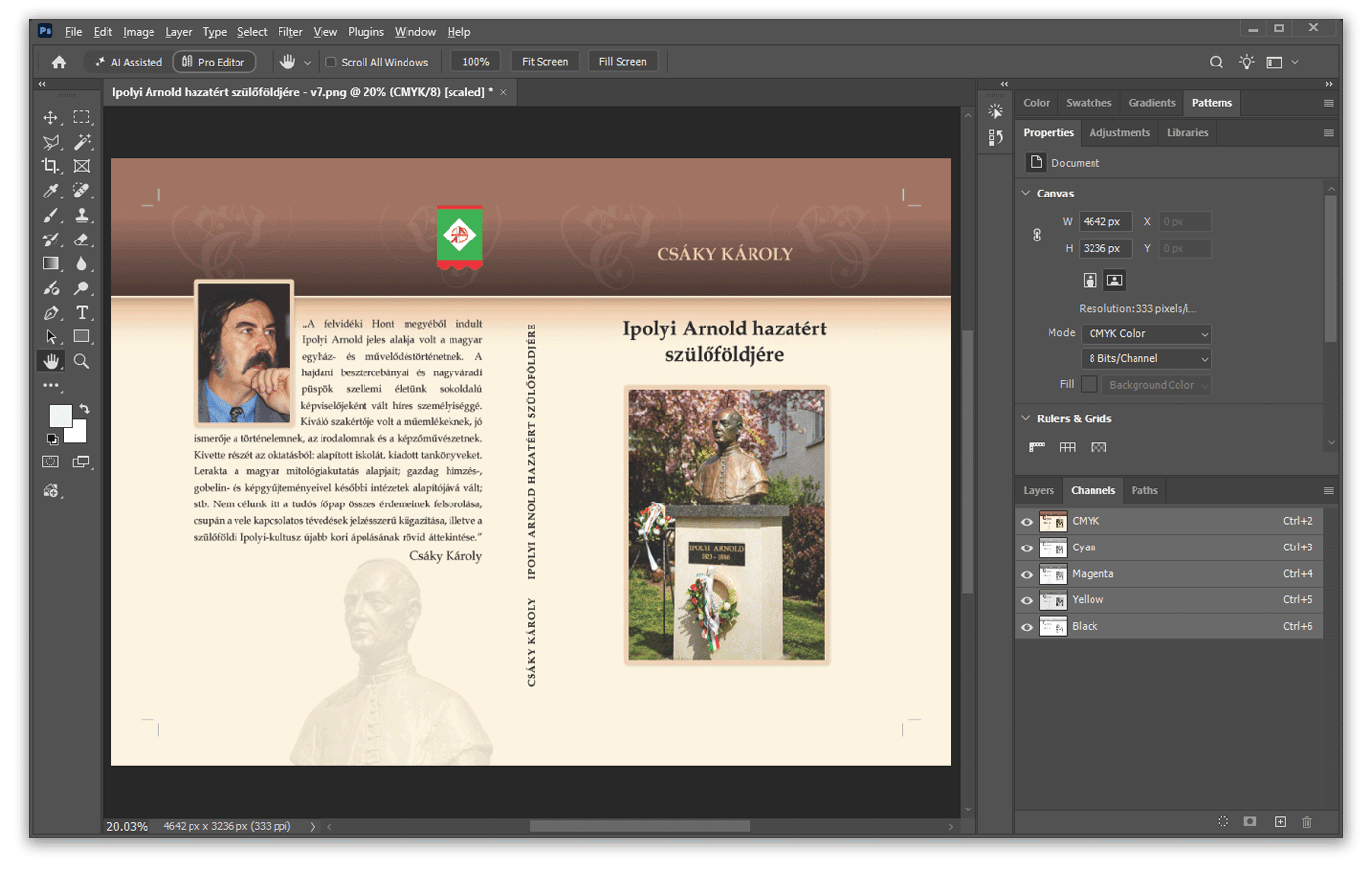
However, a Photoshop document is fundamentally pixel-based. Typography, vector shapes and detailed layout elements may lose flexibility when rasterized.
Photoshop supports PDF export, including options for colour profiles and document output. However, the designer must verify the PDF dimensions, image resolution and output settings before submission.
InDesign is designed for page layout and print publishing.
It is particularly suitable for book covers containing:
It provides direct control over document dimensions, bleed, slug, margins and PDF export settings.
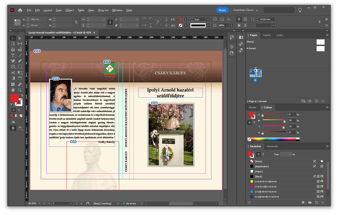
For a conventional book cover, InDesign is generally more practical for assembling the complete print layout.
| Requirement | Photoshop | InDesign |
|---|---|---|
| Detailed photo editing | Excellent | Limited |
| Image compositing | Excellent | Limited |
| Complex typography | Possible | Excellent |
| Multi-panel cover layout | Possible | Excellent |
| Bleed and slug management | Limited | Built in |
| Vector-based layout elements | Limited compared with dedicated layout tools | Excellent |
| Print-ready PDF export | Supported | Supported |
| Editable publishing layout | Less suitable for complex layouts | Excellent |
A practical workflow is to prepare and retouch photographs in Photoshop, then place the finished images into an InDesign cover document.
This separates image editing from the final page layout.
Use separate layers for the main design elements and production-specific artwork.
For example:
| Layer | Contents |
|---|---|
| Background | Main artwork and full-bleed background |
| Front Cover | Title, subtitle, author and artwork |
| Spine | Spine title, author and publisher logo |
| Back Cover | Description, author biography and publisher details |
| Barcode Area | Reserved barcode space or supplied barcode |
| Special Finish | Foil, embossing or Spot UV artwork |
| Production Guides | Trim, bleed, fold, hinge and safe-area guides |
Keep production guides separate from the printable artwork.
Remove or hide non-printing guides before exporting unless the production specification explicitly requests them.
The final PDF should not be the only copy of the project.
Keep the original working document with its layers, linked images, editable typography and production guides.
This makes later corrections easier, particularly when:
Avoid destructive edits to the only editable source file.
The PDF is normally the final production file sent to the printing team.
However, the required document structure and export settings depend on the binding method and production workflow.
For many paperback production workflows, the printer expects one PDF page containing the complete cover spread.
For a book using left-to-right reading direction, the usual arrangement is:
For right-to-left books, the panel arrangement may be reversed according to the binding and reading direction.
Other production configurations can require different file arrangements, including:
The cover and interior are normally separate production documents, even when the cover itself is supplied as one complete spread.
Do not split the front cover, spine and back cover into separate files unless the production instructions specifically request it.
Professional printing workflows commonly use print-ready PDF files. Some require a PDF/X standard, such as PDF/X-4.
PDF/X is a family of standards for exchanging digital printing data. PDF/X-4 supports colour-managed CMYK, grayscale, RGB and spot-colour content, as well as live transparency. Its suitability depends on the receiving production workflow.
When a PDF/X file is used, its output intent identifies the intended printing condition. This is important because a PDF standard alone does not specify the exact paper, ink and printing conditions for the job.
A PDF/X-4 file is not automatically correct for every printing job. Document dimensions, bleed, colour settings and content must still meet the production specification.
Before exporting, verify the following:
| Setting | What to verify |
|---|---|
| PDF standard | Required PDF or PDF/X version |
| Page dimensions | Exact dimensions from the approved template |
| Page arrangement | Complete spread or requested file structure |
| Bleed | Correct values for the production method |
| Slug | Included only when requested |
| Printer’s marks | Included or excluded according to instructions |
| Colour conversion | Correct output profile and conversion method |
| Output intent | Intended printing condition, when required |
| Font handling | Fonts embedded or outlined as requested |
| Image resolution | Sufficient effective resolution |
| Transparency | Supported by the selected PDF standard |
| Security | No password protection unless specifically requested |
A PDF intended for printing should contain all necessary font information.
Missing fonts can lead to substitutions that change the appearance and position of text.
InDesign also uses linked external graphics. When supplying an editable InDesign project, include the required linked images and fonts where licensing permits.
Its packaging function can gather the document, linked graphics, available fonts and a report into a handoff folder.
Run preflight checks before packaging or exporting. Check for missing fonts, modified links, low-resolution images, overset text and other production warnings. Adobe documents these checks in its InDesign preflight and print-export workflows.
A printing team requesting only the final PDF does not necessarily need the complete editable InDesign package.
Transparency, blending modes and layered artwork may require additional handling during PDF export and prepress processing.
Some workflows accept modern PDF files with live transparency, while others specify restrictions or require flattened elements.
Do not flatten every project automatically.
Follow the requested PDF standard and transparency requirements. Preserve an editable master document before applying destructive operations.
InDesign provides separate controls for bleed, slug and printer’s marks.
A common mistake is selecting all printer’s marks without checking whether they are required.
Before exporting:
The PDF page size should correspond to the intended production dimensions, including any bleed or additional areas that must be present in the file.
Preparing a cover is not complete when the PDF has been exported. The printing team needs enough information to identify the correct artwork, verify its technical properties and understand any additional production requirements.
A clear handoff package prevents confusion between the final printable document, design previews, finishing files and editable source material.
The exact contents depend on the agreed production workflow, but a professional handoff normally considers the following deliverables.
This is the primary production file.
It should contain the approved cover artwork in the required structure and dimensions.
The file should have:
It should be clearly identified as the final print file.
Do not send a screenshot, JPEG preview or an ordinary PDF exported for screen viewing as a substitute for the print-ready file.
If the project includes special finishes, provide the necessary production artwork.
Depending on the manufacturing process, this may include:
Each file should identify the correct finishing elements and align with the main cover document.
The filenames should identify the intended operation. For example:
These are examples of a naming convention, not mandatory file extensions or a universal file structure. The printing team must confirm whether each finish should be supplied as a separate PDF, a spot-colour separation or another format.
A separate visual reference helps the printing team understand the approved appearance of the cover.
It can show:
This document should be clearly labelled as a reference or proof, not as the production file, unless it is itself the approved print-ready PDF.
A reference image can make communication easier, but it must not replace the actual production document.
A short specification sheet should accompany the artwork. It records the technical conditions under which the cover was prepared.
| Information | Example of what to provide |
|---|---|
| Project | Book title and edition |
| Binding | Perfect-bound paperback |
| Finished size | 151 × 216 mm |
| Page count | Final interior page count |
| Paper stock | Confirmed paper type and thickness |
| Spine width | Approved spine measurement |
| Complete artwork size | PDF page width and height |
| Bleed | Required horizontal and vertical values |
| Colour | CMYK or agreed colour workflow |
| ICC profile | Exact output profile or output intent |
| PDF standard | Requested PDF or PDF/X version |
| Image resolution | Effective resolution at final size |
| Barcode | Supplied, generated during production or reserved area |
| Finishes | Lamination, foil, Spot UV or other operations |
| Additional files | Finishing separations or special production artwork |
| Approval status | Final approved version and approval date |
This document reduces the risk of a production team interpreting an undocumented design decision as a technical setting.
The printing team may need only the final PDF. However, an editable source package can be required for further prepress work or later revisions.
Depending on the application, the package may include:
| Application | Source deliverables |
|---|---|
| Adobe InDesign | INDD document, linked images and required supporting assets |
| Adobe Photoshop | Layered PSD document and linked or embedded assets |
| Illustrator | Editable AI document and placed graphics |
| Other software | Native source file and necessary supporting assets |
The designer should include the fonts and assets only when their licences permit redistribution.
An editable source file is not automatically a print-ready file. The final production PDF must still be checked independently.
A preflight report records the results of the technical inspection.
It can identify:
A report does not replace the PDF itself, but it gives the receiving team additional information about the checks performed.
The handoff should identify which file is approved for production.
Record:
Avoid sending multiple files with ambiguous names such as final.pdf, final-new.pdf and final-corrected.pdf.
A clear version number and approval status help prevent the wrong artwork from entering production.
A practical folder structure keeps production files separate from supporting material.
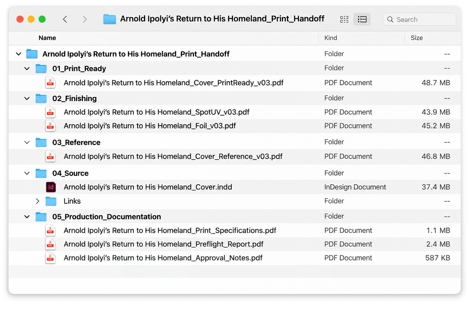
Include only the folders and files applicable to the project. Do not create empty finishing files for operations that were not ordered.
The designer prepares the artwork and communicates its specifications. The printing team verifies that the supplied files can be processed by the intended production workflow.
The responsibilities can be divided as follows:
| Designer’s responsibility | Printing team’s responsibility |
|---|---|
| Prepare the cover artwork | Verify the submitted production files |
| Use approved dimensions and templates | Confirm compatibility with the manufacturing process |
| Extend artwork into the required bleed | Check trim and bleed requirements |
| Prepare image and colour data as agreed | Check colour handling and output conditions |
| Supply finishing artwork when required | Validate finishing separations and manufacturing feasibility |
| Check typography and text content | Identify technical risks affecting reproduction |
| Deliver the approved print-ready PDF | Prepare printing forms or plates as required |
| Provide agreed source files and documentation | Report prepress issues and request necessary corrections |
| Review and approve the proof | Produce the agreed proof and final printed material |
The precise division of work depends on the project agreement. Some printing teams handle colour conversion, trapping, imposition and additional prepress operations. Others expect the designer to provide more tightly controlled production files.
Do not impose pages, add trapping or alter the print layout unless those tasks are part of the agreed workflow.
The phrase print-ready describes the intended state of the supplied artwork. It does not mean that the printing team must skip technical inspection.
The ISO/TC 130 print-production workflow distinguishes design, prepress, printing and postpress. Design supplies preflighted press-ready files. Prepress validates those files and prepares the printing forms. Printing produces the unfinished printed material, while postpress performs the operations that create the finished product.
This distinction is important because a PDF can be correctly exported but still contain an incorrect spine width, unsuitable finishing artwork or production dimensions that do not match the physical book.
The handoff should therefore make the designer’s responsibilities and the printing team’s responsibilities clear.
Proofing is the final opportunity to identify visual and production problems before the complete print run.
There are different types of proof, and they should not be treated as interchangeable.
A digital proof is a PDF or image used to review the artwork on screen.
It is useful for checking:
A screen proof does not guarantee the final printed colour or physical appearance.
A printed validation proof provides a physical representation of the intended design.
It can help assess:
Its accuracy depends on the proofing equipment, paper, ink and colour settings.
A contract proof is intended to provide a more controlled colour reference for the production run. Its reliability depends on an agreed printing condition and a proofing system that meets the relevant requirements.
ISO 12647-7 addresses contract proofing, while ISO 12647-8 addresses validation printing. These standards distinguish the purpose and expected control of different proof types. An ordinary office printout should not be treated as a contract colour proof.
Before approving the cover, review:
The proof should be reviewed using the intended viewing conditions whenever colour accuracy is important.
Approval should identify the exact version of the artwork being accepted. If a correction is made after proof approval, the updated version should be checked again.
Do not assume that a minor change to text, positioning or colour cannot affect the final production result. The printing team should receive an unambiguous confirmation of which file is authorized for production.
A printing team has legitimate reasons to reject artwork or request technical corrections. It is responsible for producing the physical book according to the agreed manufacturing specifications.
However, a technical correction is different from an aesthetic preference. This distinction is particularly important when a designer has intentionally positioned text, images or other elements close to the edge of a cover.
A printing team should identify whether the issue concerns:
These are measurable production requirements. By contrast, moving an element simply because the printing team prefers a different visual arrangement is an aesthetic recommendation.
The designer should remain responsible for the composition, visual hierarchy and positioning of elements, provided the approved design complies with the actual production requirements.
An element positioned near the edge is not automatically incorrect. The important question is whether it remains within the permitted production area. Consider three different situations.
1. Background artwork reaches the edge.
This is normal when the design uses full-bleed artwork. The background should extend into the required bleed area.
2. Important text is close to the trim boundary.
This may create a genuine production risk. Small trimming variations can make the text appear uneven or reduce the visible margin.
The printing team should identify the minimum required safe distance.
3. An element sits near a hinge or fold.
This can create a production issue, especially on a hardcover or dust jacket. The printing team should identify the affected area and explain how the construction affects the element.
The designer can then decide how to adjust the composition without changing its intended visual hierarchy unnecessarily.
A statement such as “the cover margin is incorrect” is not sufficiently precise for a production correction.
The printing team should identify:
For example, a useful correction would be:
“On the front cover, the subtitle is 4 mm from the trim boundary. Our production requirement is a minimum 6 mm safe distance. Please move the subtitle at least 2 mm inward.”
That statement gives the designer a measurable problem and a specific correction. It also avoids unnecessary changes to unrelated elements.
The designer should communicate the intended composition and ask whether the placement violates a documented technical requirement.
If the element remains within the approved safe area, the printing team should explain why it still presents a production risk before requesting a change.
If the element crosses a mandatory safety boundary, the printing team has a legitimate reason to request a correction.
A printer cannot guarantee that artwork outside its specified safety area will remain unaffected during trimming or binding.
The relevant question is not whether a designer or printer prefers a particular position. It is whether the design complies with the production requirements and the agreed tolerances.
A useful production workflow distinguishes two types of approval:
| Approval | What it confirms |
|---|---|
| Design approval | The composition, typography, colours and visual arrangement are accepted |
| Technical prepress approval | The file meets the requirements for the intended production process |
A technically acceptable PDF does not automatically mean the cover design has been aesthetically approved.
Likewise, a visually approved design is not necessarily ready for printing. Both checks are necessary, and they should not be confused.
The following table summarizes frequent problems that can delay production or produce unexpected results.
| Problem | Possible cause | Appropriate correction |
|---|---|---|
| White edges after trimming | Missing or insufficient bleed | Extend the background into the specified bleed area |
| Incorrect cover dimensions | Wrong trim size or template | Use the approved production dimensions |
| Spine artwork shifted | Incorrect spine width or positioning | Recalculate using the final paper and page count |
| Text cut off | Content outside the safe area | Move important elements inside the permitted area |
| Distorted hinge artwork | Elements cross a flexible or folding area | Follow the hardcover template’s hinge boundaries |
| Incorrect cover colour | Wrong or missing output profile | Use the specified ICC profile |
| Weak or muddy black | Unsuitable CMYK black build | Follow the required black-ink recommendations |
| Blurry photographs | Insufficient effective resolution | Replace with higher-resolution artwork |
| Missing fonts | Fonts not embedded or available | Embed or outline fonts as required |
| Missing images | Broken links in the source document | Relink assets and export again |
| Unexpected transparency effects | Unsupported export or flattening workflow | Use the required PDF standard |
| Barcode overlaps artwork | Incorrect reserved area | Use the approved barcode position |
| Foil or Spot UV misalignment | Incorrect finishing file dimensions | Align the separate finishing artwork with the main cover |
| Crop marks rejected | Marks included contrary to submission requirements | Follow the specified PDF settings |
| Production guides appear in print | Template elements were exported | Remove non-printing guides before final export |
| Wrong artwork enters production | Multiple files or unclear approval status | Use clear filenames and identify the approved version |
| Special finish omitted | Missing or unclear finishing files | Include the required finishing separations and instructions |
Many of these problems are preventable when production specifications are established before artwork preparation and the handoff package is checked before submission.
Preparing a book cover for print requires coordination between the designer’s artwork and the physical manufacturing process.
The front cover, back cover and spine establish the visual structure, but the final document must also account for trim dimensions, bleed, safe areas, paper thickness, binding construction, colour management and finishing requirements.
The most important step is obtaining the correct production specification before designing the final layout. This avoids unnecessary changes and reduces the risk of submitting artwork that cannot be processed as intended.
A complete production handoff should contain more than a PDF. The printing team needs the approved artwork, relevant finishing files, technical specifications, reference material and a clear record of the approved version. Editable source files and preflight reports should also be included when required by the project agreement.
Printers should communicate technical problems using clearly identified boundaries, measurements and production requirements. Designers should follow genuine manufacturing constraints while retaining control over the visual composition of the cover.
A reliable print-production workflow depends on clearly defined responsibilities, technically verified artwork and approval at the appropriate stages. The objective is to preserve the intended design while ensuring that the physical book matches the approved specifications.
Print production standards and colour management
Adobe print preparation
ISBN and barcode information
Playful Sparkle has been engineering digital solutions since 2004. Our work includes Graphic Design, Branding & Strategy, Web Development and other areas of digital product development. We approach visual production with attention to technical specifications, implementation requirements and the final output. Learn more about our services.



Discover which ChatGPT business features are available to Slovak and Hungarian companies, what restrictions apply, and how to improve your visibility in AI-powered search. The article also covers technical SEO, ecommerce product feeds, EU legal considerations and referral tracking.

Learn how to structure ecommerce data-layer events and configure GTM triggers and GA4 Event tags. The guide covers product interactions, checkout, purchases, refunds, discounts, promotions, lead-generation events, file downloads, and validation with GTM Preview and GA4 DebugView.

Follow the direct JavaScript workflow for sending GA4 ecommerce events with gtag(). The guide covers the items array, transaction IDs, item discounts, promotions, lead-generation events, file downloads, custom item parameters, and validation with Tag Assistant and DebugView.

