Let’s Build Something Great
Tell us about your goals and request a free project estimate.

Creating a Consistent Label System for Two Sports Nutrition Products
LAGOMSTORE is an in-house supplement brand sold through the LagomStore online shop, which also offers products from other sports nutrition manufacturers. The brand’s positioning emphasizes straightforward products, accessibility, and value, making clear product communication an important part of how its supplements are presented.
The brand owner approached Playful Sparkle to design product labels for two products: LAGOMSTORE Whey Protein and LAGOMSTORE PRE-WORKOUT. The existing packaging provided a visual direction to follow, but the original graphic designer’s brand guidelines were unavailable. Without a formal specification documenting the established identity, we needed to develop the new label designs from scratch while maintaining visual continuity with the brand’s existing product packaging.
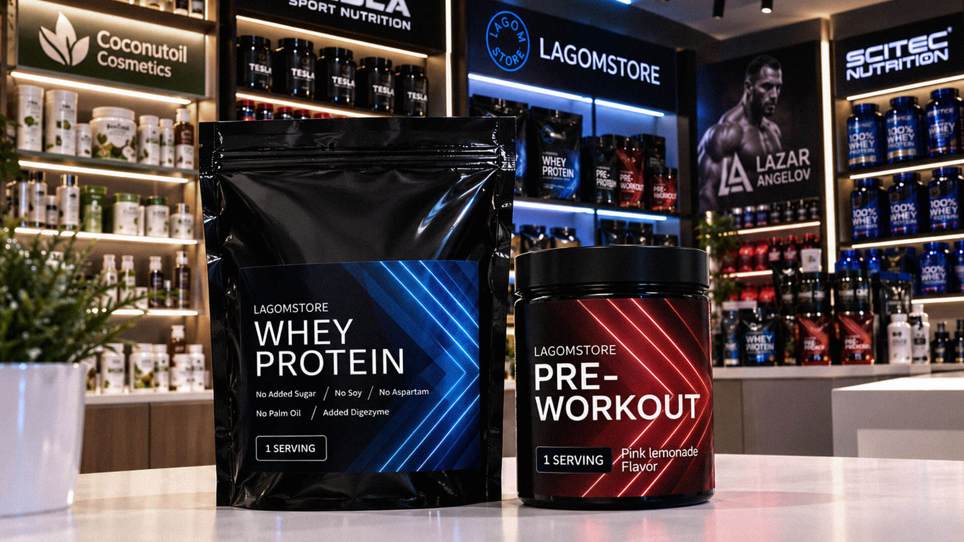
The objective was to create two modern, product-specific labels that fit the established LAGOMSTORE visual identity without relying on the original brand guidelines. Each design needed to communicate the product name and relevant product information clearly, establish an appropriate visual character for its product category, and maintain a recognizable connection between the Whey Protein and PRE-WORKOUT products.
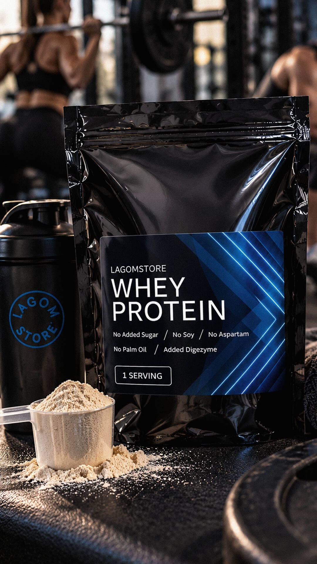
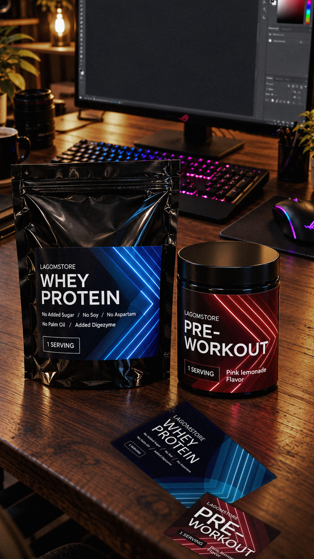
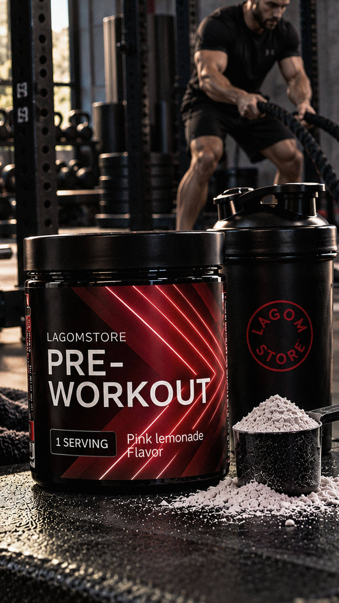
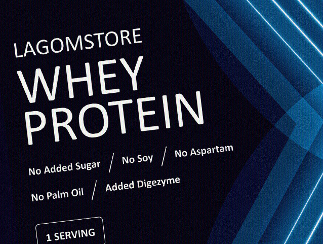
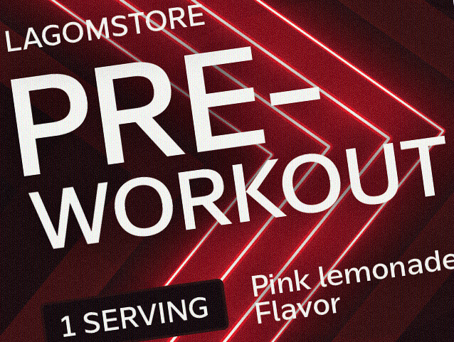
The completed label designs establish a consistent visual direction across two LAGOMSTORE products while giving each one a distinct appearance. Whey Protein uses a dark navy palette with bright blue accents, while PRE-WORKOUT features a red-and-charcoal scheme. Both designs use bold product naming, directional geometric graphics, and clearly separated information areas to maintain a coherent relationship between the products without making them visually identical.
The Whey Protein label incorporates the supplied front-of-pack messages concerning added sugar, soy, aspartame, palm oil, and DigeZyme. The PRE-WORKOUT design highlights the product name, serving information, and Pink Lemonade flavour. These elements help organize the information around each product’s intended presentation while preserving the common visual language developed for the LAGOMSTORE range.
Because the original brand guidelines were unavailable, the design process began by establishing the visual direction from the available packaging references and the client’s requirements. Rather than attempting to recreate undocumented specifications, we developed a practical label layout that carried the LAGOMSTORE identity, product naming, and supporting information in a clear hierarchy. The aim was to retain the character of the existing product packaging while creating a contemporary treatment for both labels.
We then developed separate colour treatments for the two products while retaining a related graphic approach. The Whey Protein label combines a dark base with blue diagonal shapes and illuminated linear accents, creating a technical, performance-oriented appearance. The PRE-WORKOUT label uses red diagonal graphics against a charcoal background, giving it a more intense visual character suited to the product’s positioning. In both designs, the directional motifs connect the layouts, while differences in colour and composition distinguish the individual products. Product-specific details were incorporated into the layouts, and the label artwork was prepared for production.
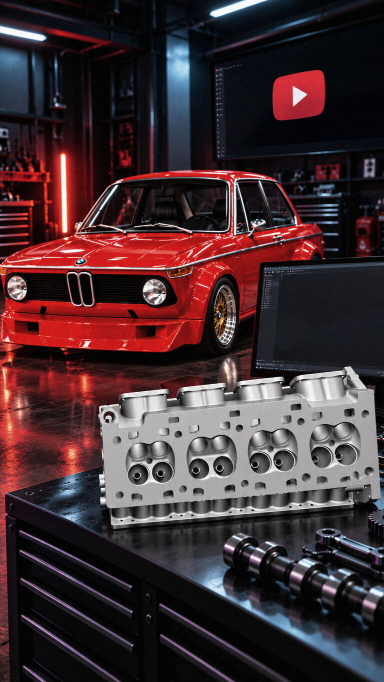
Playful Sparkle established and manages Modul Motorsport’s YouTube channel, combining channel branding, search-optimized video metadata, and 3D product animation. The initial video content includes a branded intro and a product showcase featuring 52 3D models of motorsport components for enthusiasts, specialists, and customers working on historic motorsport projects.
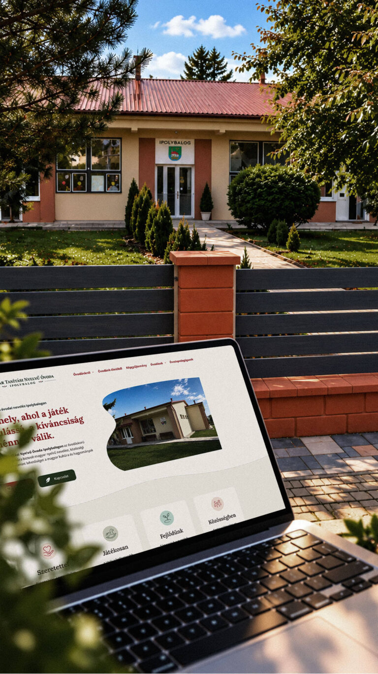
Playful Sparkle created a bilingual WordPress website and a distinctive visual identity for the Hungarian-language kindergarten in Balog nad Ipľom. The project includes Slovak and Hungarian logo variants, published school documents, admissions information, teacher profiles, educational programme details and activity pages, giving parents convenient access to essential information in both...
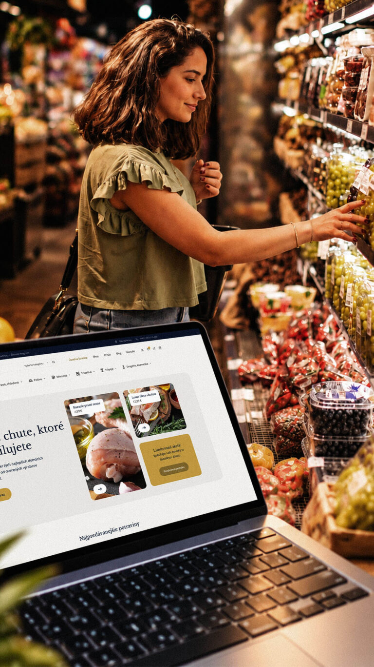
Playful Sparkle developed a WordPress and WooCommerce e-commerce platform for Dirolio Freshbox, bringing fresh and chilled foods, bakery products, frozen goods, pantry essentials, beverages and household care products into one organized catalogue. The store also includes a membership discount system linked to customer purchases, supporting the business’s planned local delivery...
