Let’s Build Something Great
Tell us about your goals and request a free project estimate.

A Distinctive Brand Identity for a Family-Owned Winery
Farkas Winery is a family-owned wine producer based in Vinica, Slovakia. Owner László Farkas approached Playful Sparkle to develop a complete brand identity that could represent the winery consistently across digital and physical applications, from its website and business cards to wine labels and vehicle graphics.
The project focused on creating a recognizable visual identity rooted in the winery’s name, its connection to grape growing and winemaking, and the character of a family-owned business. The resulting identity combines a distinctive emblem with elegant typography and a set of practical guidelines for consistent use across different materials.
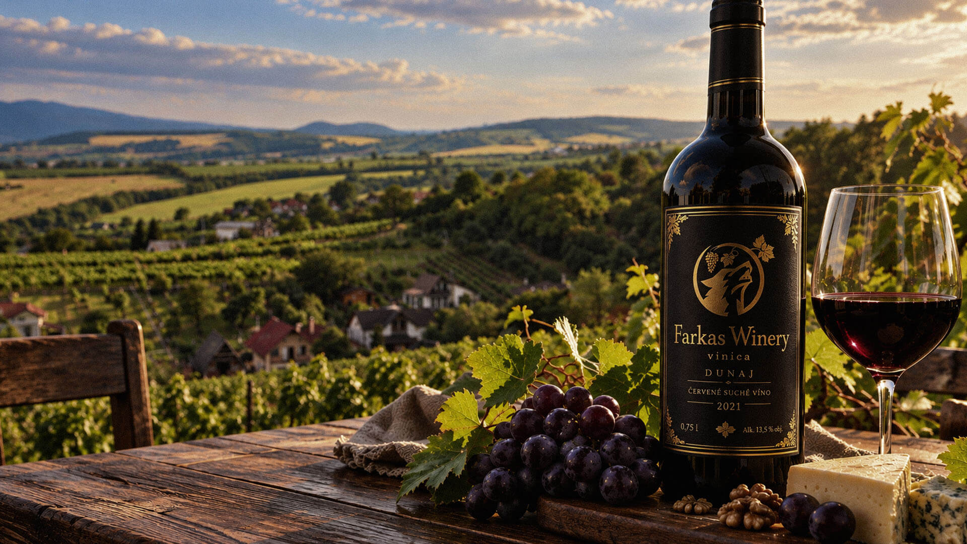
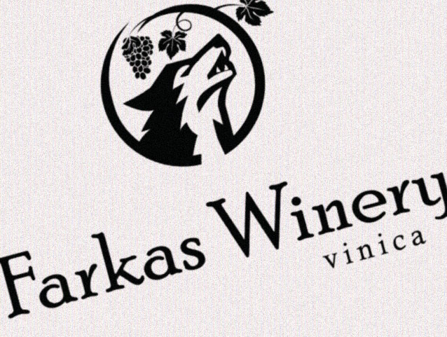
The objective was to create a distinctive and adaptable brand identity that connects the Farkas name with the winery’s vineyard heritage. At the client’s request, the logo needed to feature a wolf symbol, complemented by grape and vine elements that establish a visual connection to winemaking. The typography had to balance the emblem with an elegant, traditional character, while the overall design needed to remain legible and recognizable across digital platforms, printed materials and larger surfaces such as vehicle graphics.
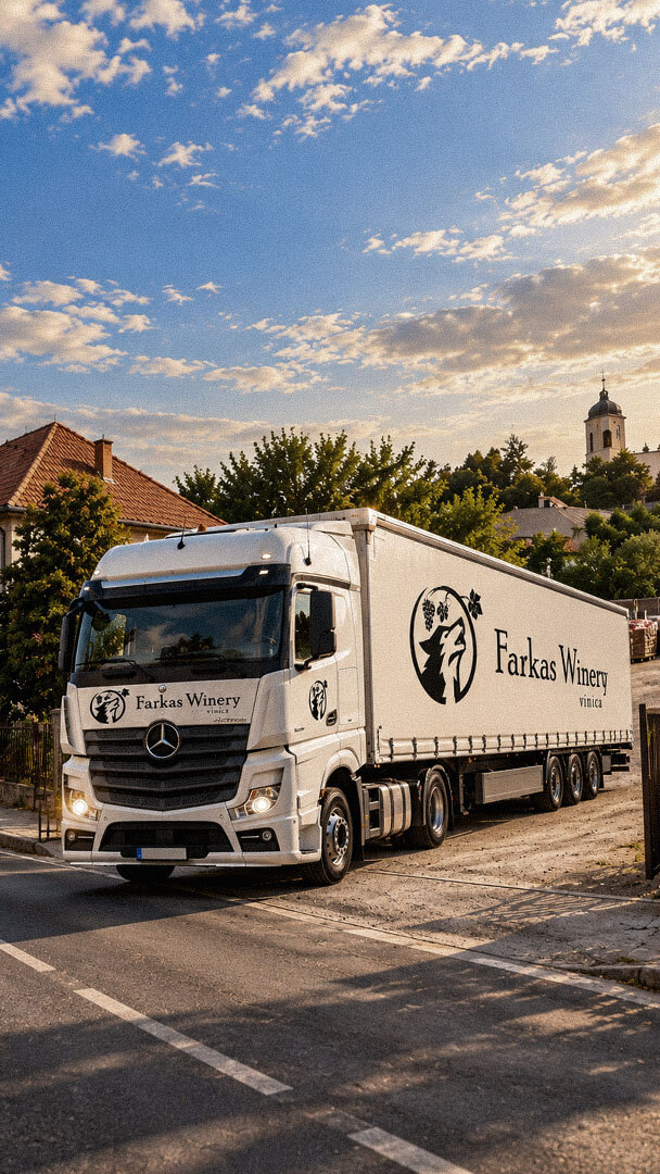
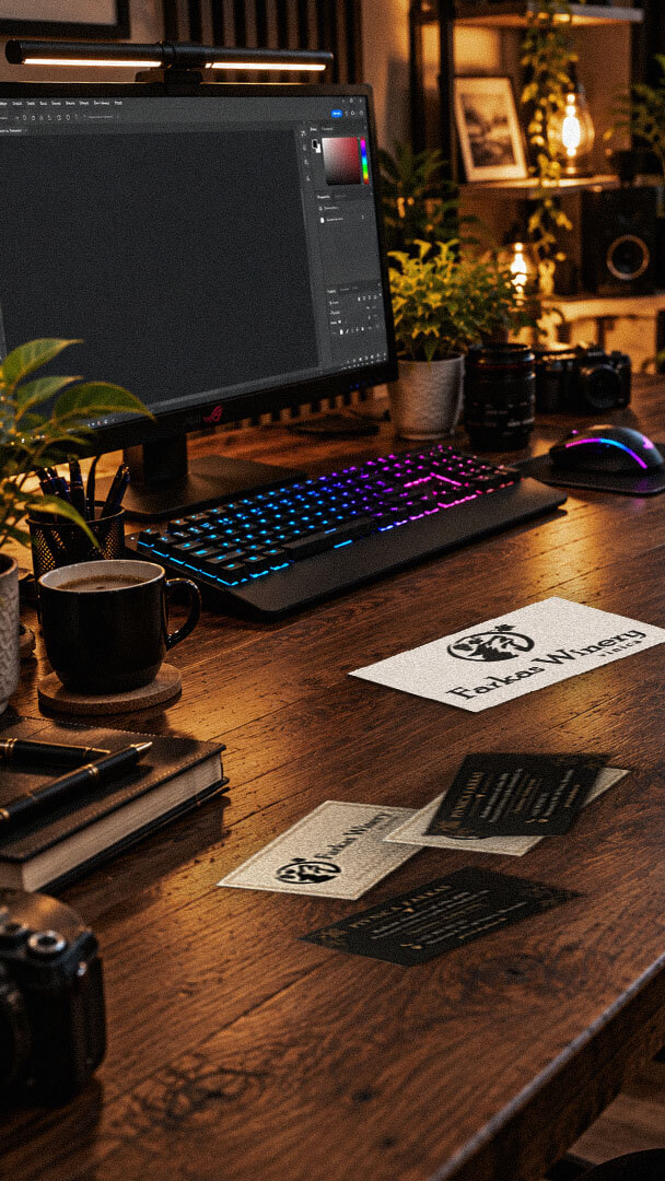
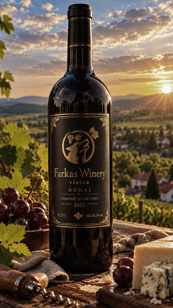
The completed brand identity provides Farkas Winery with a consistent visual system for presenting its business across multiple customer touchpoints. The combination of the wolf-and-grape symbol, refined typography and defined colour palette establishes a recognisable connection between the brand name and the winery’s identity. Logo variations and documented usage guidelines provide a practical foundation for applying the identity across digital channels, printed materials, wine labels and vehicle graphics while maintaining visual consistency.
The design process centred on developing a logomark that combines a stylised wolf with grape and vine elements, linking the client’s name to the natural setting and activity of the winery. The accompanying typography was selected to complement the symbol and establish an elegant, traditional visual character without competing with the illustration.
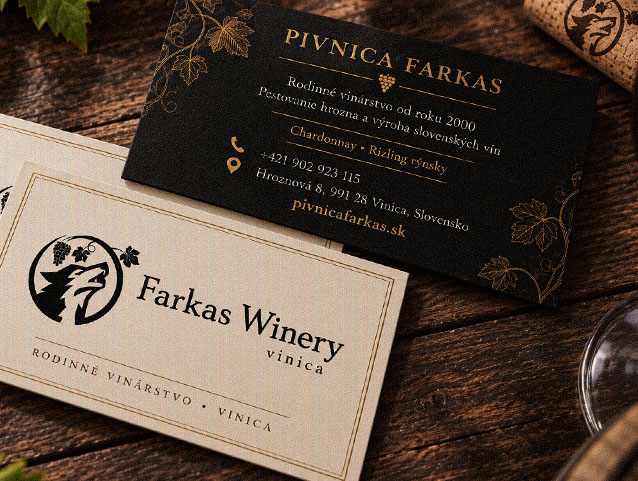
A predominantly black-and-white colour system provides a versatile foundation for different applications, while the brand guidelines define supplementary colour options, typography recommendations, logo variations, protective spacing and minimum-size requirements. The identity was then carried through to business cards, wine labels, vehicle graphics and social media materials, creating a coordinated set of brand assets for use across both digital and physical environments.

Playful Sparkle established and manages Modul Motorsport’s YouTube channel, combining channel branding, search-optimized video metadata, and 3D product animation. The initial video content includes a branded intro and a product showcase featuring 52 3D models of motorsport components for enthusiasts, specialists, and customers working on historic motorsport projects.
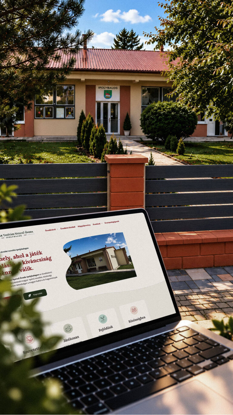
Playful Sparkle created a bilingual WordPress website and a distinctive visual identity for the Hungarian-language kindergarten in Balog nad Ipľom. The project includes Slovak and Hungarian logo variants, published school documents, admissions information, teacher profiles, educational programme details and activity pages, giving parents convenient access to essential information in both...
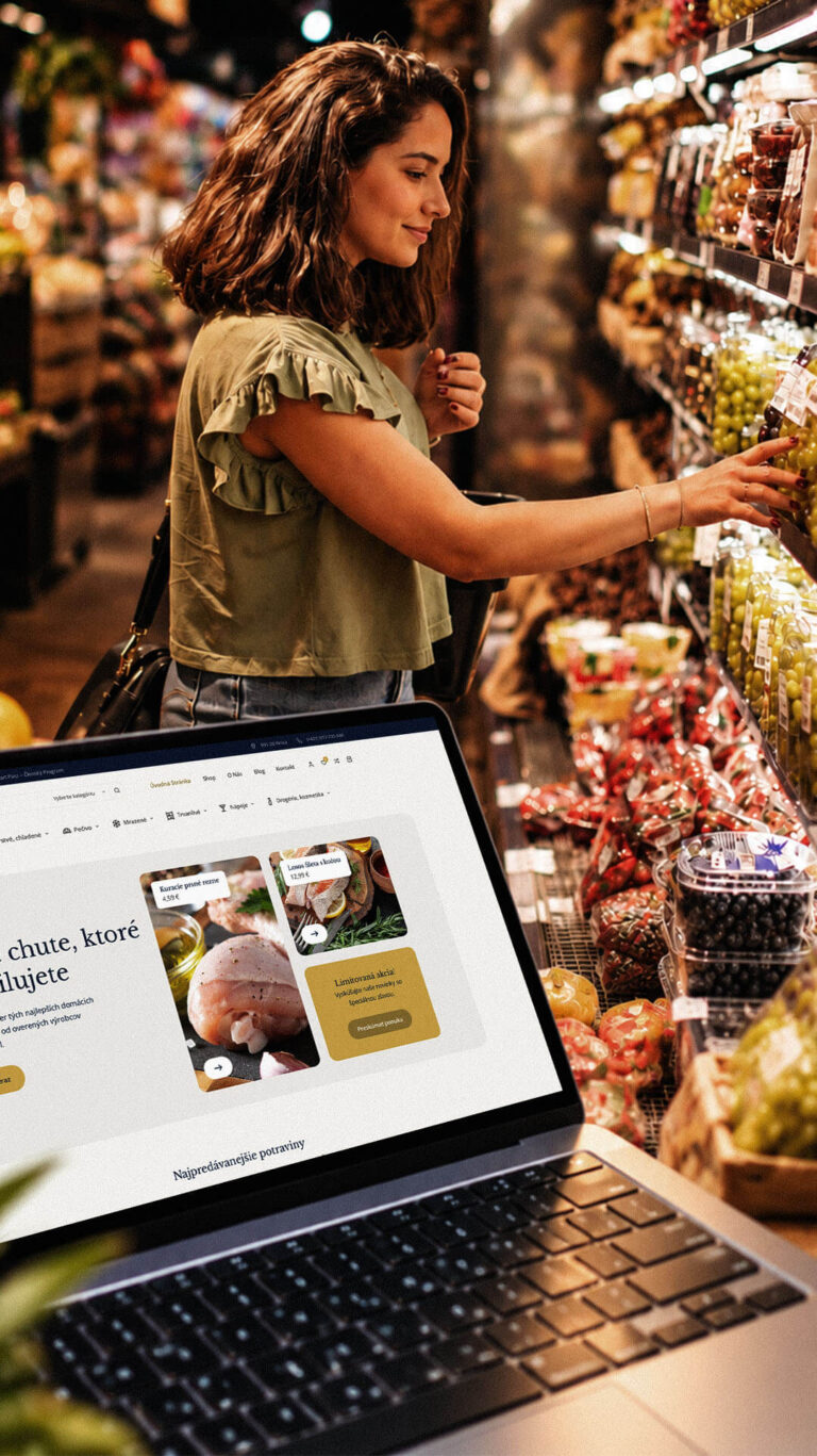
Playful Sparkle developed a WordPress and WooCommerce e-commerce platform for Dirolio Freshbox, bringing fresh and chilled foods, bakery products, frozen goods, pantry essentials, beverages and household care products into one organized catalogue. The store also includes a membership discount system linked to customer purchases, supporting the business’s planned local delivery...
