Let’s Build Something Great
Tell us about your goals and request a free project estimate.

Product Label Design for a Locally Produced Sauerkraut Range
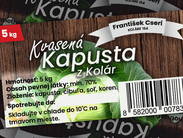
František Cseri, an independent producer from Koláre, approached Playful Sparkle to design product labels for his Kvasená Kapusta sauerkraut range. The labels needed to accommodate different container sizes while maintaining a consistent product identity across the available packaging variants.
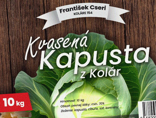
The design places a freshly cut cabbage at the centre of the composition, visually communicating the product’s connection to fresh ingredients and traditional food production. A dark wood texture, bold typography, and clearly differentiated weight indicators establish a distinctive visual presentation, while the label layout accommodates essential product information, including ingredients, storage instructions, net weight, and barcode details.

Create a distinctive product label for locally produced sauerkraut, with layouts adapted to different container sizes. The design needed to communicate the product’s fresh-cabbage ingredients, identify its local origin, and present essential packaging information in a clear, consistent format across the full range.
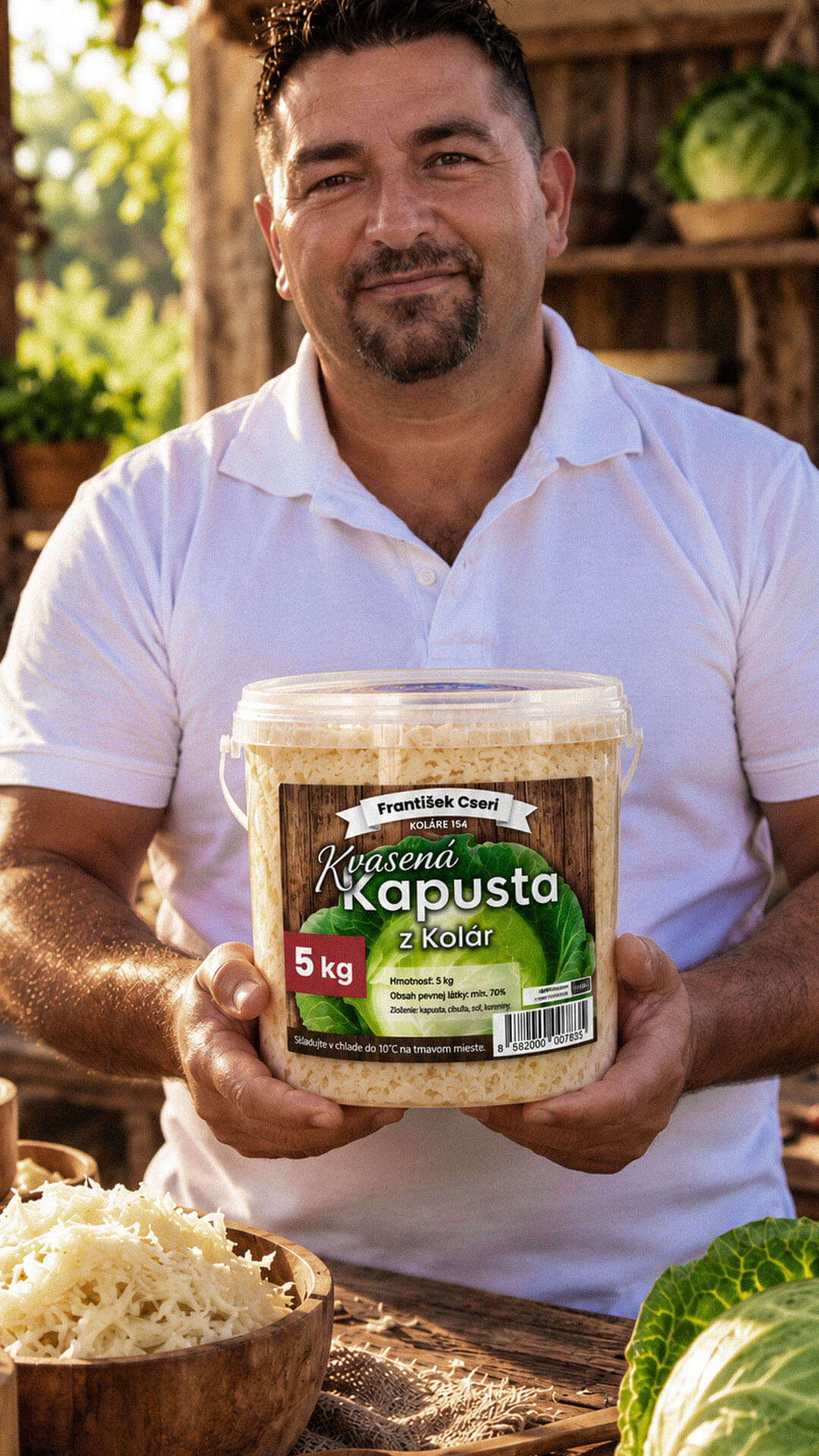
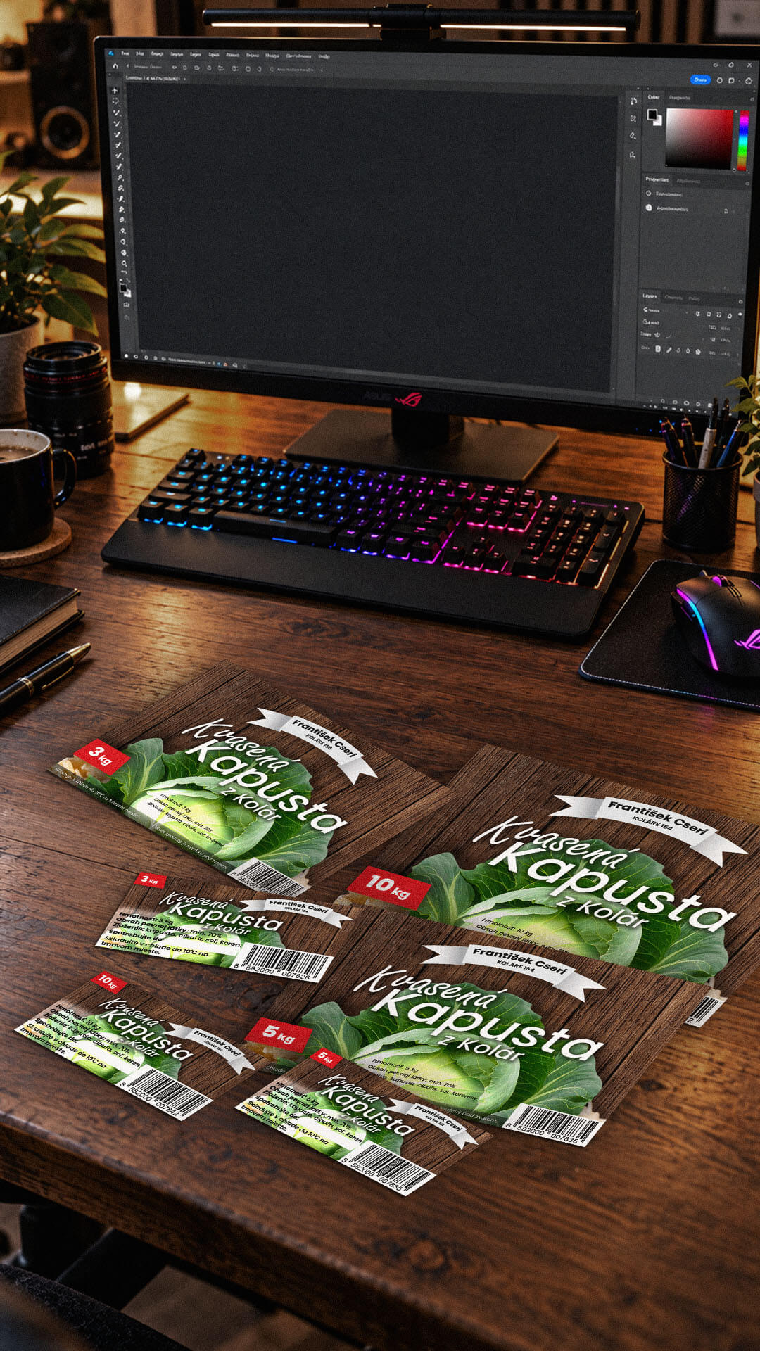
The project included two label formats: one for larger containers and one for smaller containers. Each format was adapted for the 3 kg, 5 kg, and 10 kg product variants.
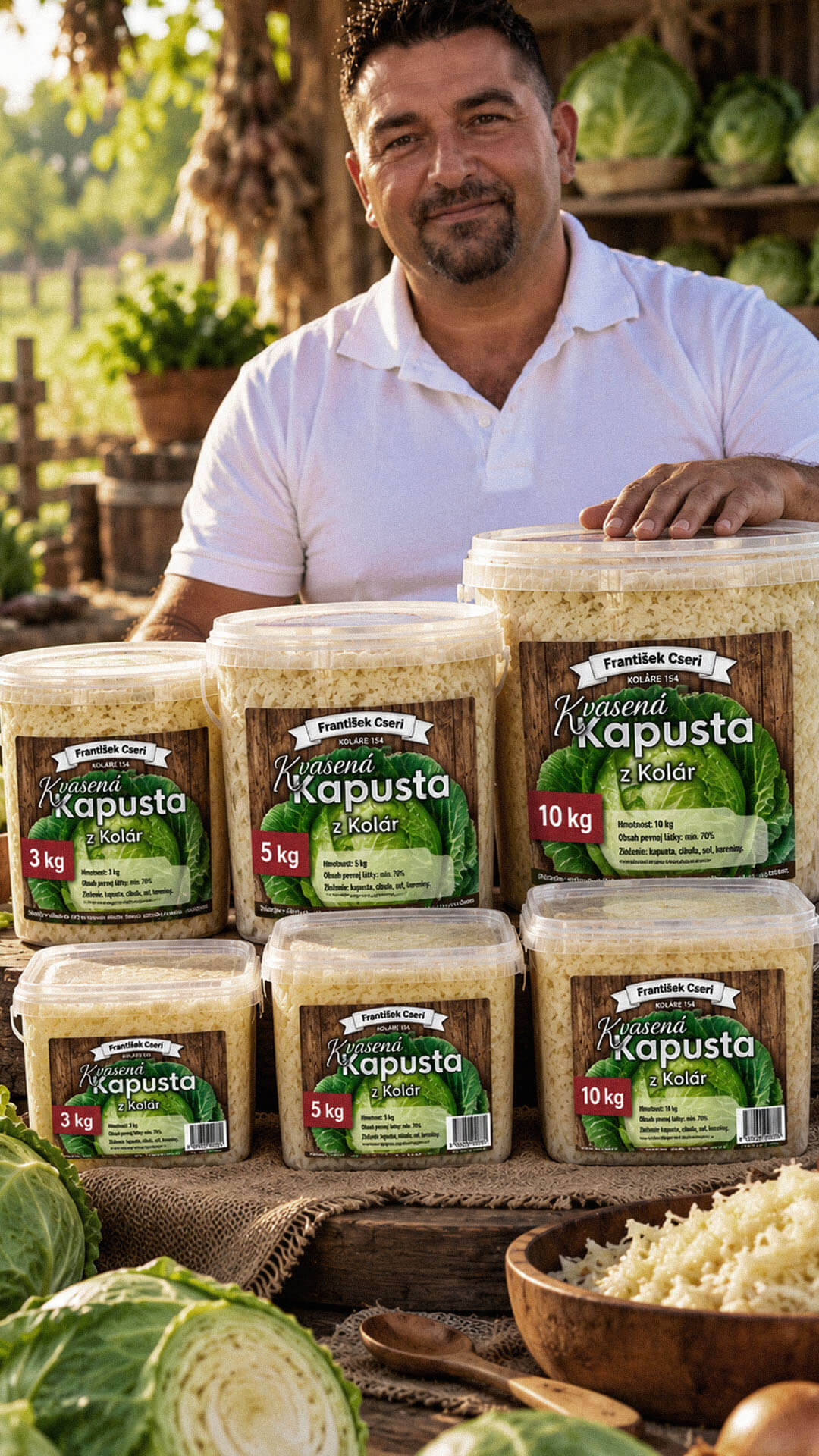
The completed labels provide the sauerkraut range with a consistent visual identity across all three packaging sizes. The prominent cabbage imagery reinforces the product’s association with freshly cut cabbage, while the wood-textured background and producer identification communicate its traditional, local character.
Two label formats accommodate the different container dimensions, and clearly differentiated weight indicators help distinguish the 3 kg, 5 kg, and 10 kg variants. Essential product details remain integrated into the composition, giving the packaging a recognizable appearance while supporting practical product identification.
The design process centred on combining product identification, visual character, and packaging information within a flexible label system. A large cabbage image serves as the main visual element, supported by a natural wood texture that establishes a rustic appearance suited to a traditional fermented vegetable product. The producer’s name and location receive a dedicated position at the top, while the product name remains the dominant typographic element.
Red weight indicators distinguish the available package sizes, and supporting text communicates net weight, solid content, ingredients, storage conditions, and expiry-date information. Barcode placement accommodates product identification requirements. Rather than forcing one layout onto every container, two label formats were prepared for larger and smaller boxes, with variants for 3 kg, 5 kg, and 10 kg packaging. This approach maintains consistency across the range while accommodating the practical differences between container sizes.

Playful Sparkle established and manages Modul Motorsport’s YouTube channel, combining channel branding, search-optimized video metadata, and 3D product animation. The initial video content includes a branded intro and a product showcase featuring 52 3D models of motorsport components for enthusiasts, specialists, and customers working on historic motorsport projects.
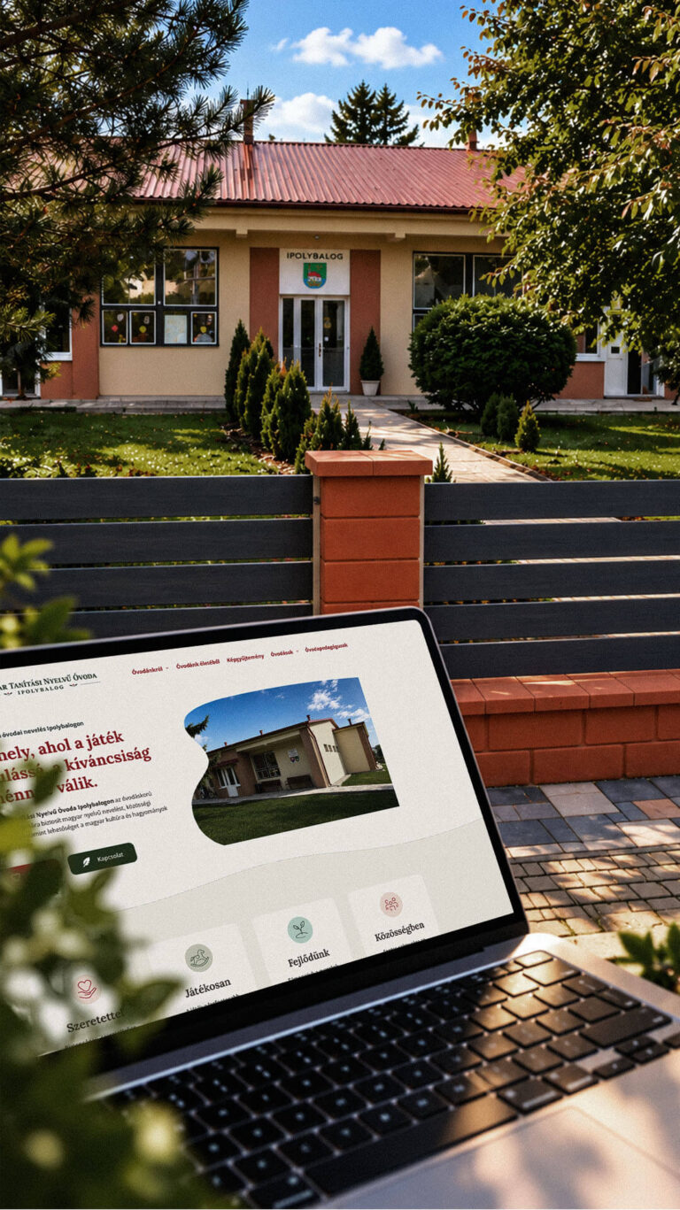
Playful Sparkle created a bilingual WordPress website and a distinctive visual identity for the Hungarian-language kindergarten in Balog nad Ipľom. The project includes Slovak and Hungarian logo variants, published school documents, admissions information, teacher profiles, educational programme details and activity pages, giving parents convenient access to essential information in both...
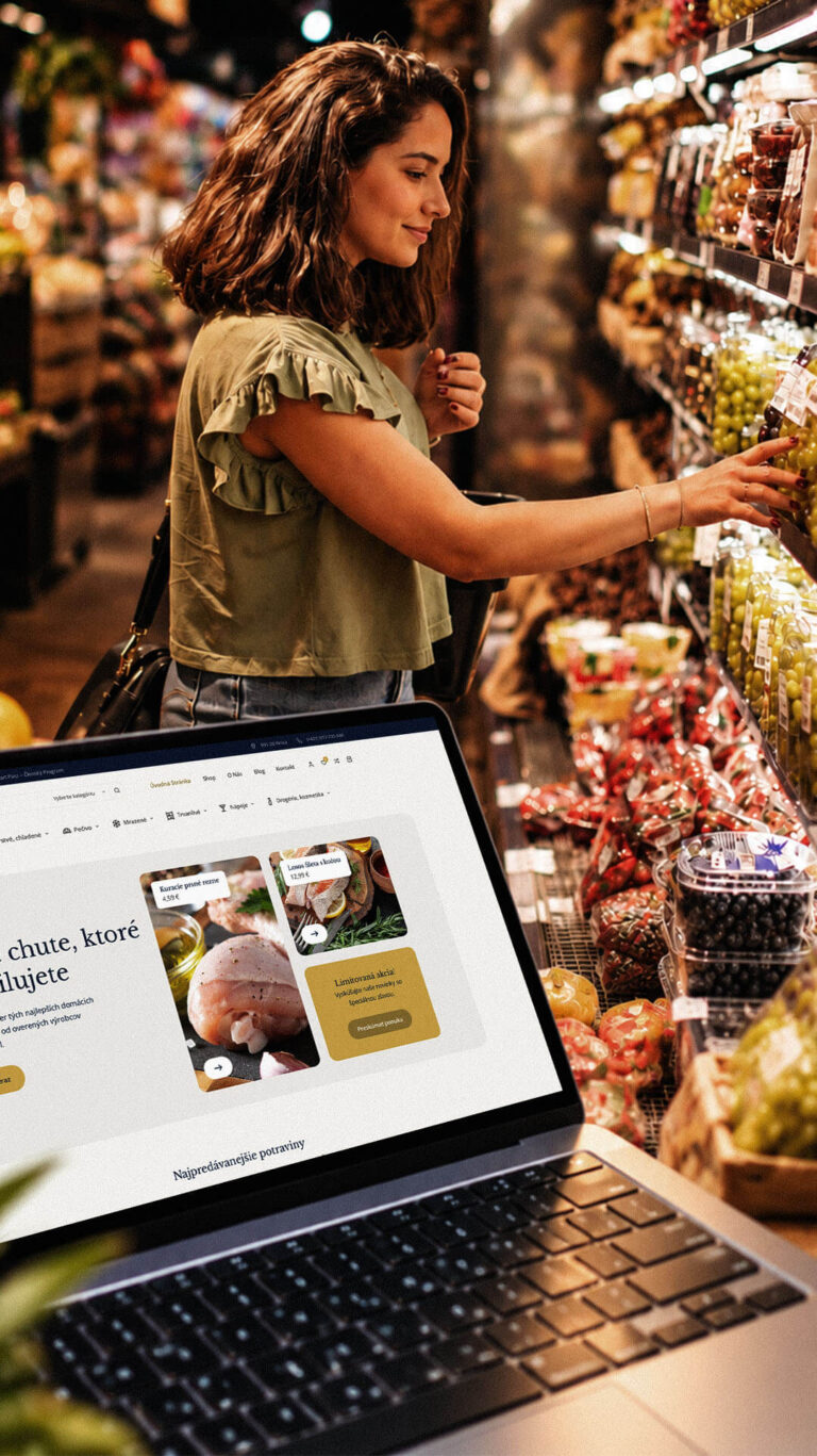
Playful Sparkle developed a WordPress and WooCommerce e-commerce platform for Dirolio Freshbox, bringing fresh and chilled foods, bakery products, frozen goods, pantry essentials, beverages and household care products into one organized catalogue. The store also includes a membership discount system linked to customer purchases, supporting the business’s planned local delivery...
