School Tableau Graphic Design for 9th Grade (2015-2024)
Client Overview
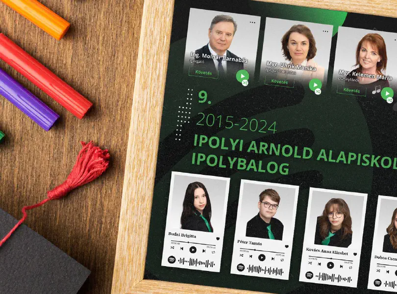
Základná škola Arnolda Ipolyiho, located in Balog nad Ipľom, Slovakia, is a primary school that takes pride in fostering creativity and innovation among its students while remaining deeply rooted in the traditions of the region. As the school approached the 2024 graduation of its 9th-grade class, they sought to commemorate this special occasion with a modern twist on the traditional school tableau. The client requested a unique and personalized design that would not only celebrate the individuality of each student but also incorporate a contemporary theme reflective of the students’ interests. They envisioned a Spotify-inspired tableau that would blend the formalities of a traditional school tableau with the cultural relevance of music and technology, creating a memorable keepsake for both students and teachers.
Objective
The main objective was to create a visually appealing and contemporary school tableau that reflected the individual personalities of the students. It was important to integrate music, a significant part of student culture, while presenting the students and teachers in a meaningful and unique design. The school specifically requested a Spotify-themed tableau that would visually resemble a digital music interface.

Challenges
- Innovative theme execution: The design had to integrate modern music streaming aesthetics, particularly Spotify’s branding, while remaining respectful of the formality of a school tableau.
- Personalization: Each student's and teacher’s portrait needed to reflect their individuality while remaining cohesive within the overall design concept.
- Incorporating technology: The client requested a functional element in the form of Spotify QR codes for each student, which added an extra layer of complexity in terms of alignment, layout, and scannability.
- Balancing tradition and modernity: Although the tableau had to be modern, it was essential to still respect traditional elements expected from a school tableau. This called for a balanced design approach.
Solution


Design Concept
The primary inspiration for this project was the Spotify music player interface, a widely recognized platform among students. The design concept revolved around creating a “playlist” of students and teachers, with each individual represented as a song or music track within a Spotify-like player component. The background featured a silhouette of a person with sunglasses, symbolizing a relaxed vibe, and emphasized the connection to music.
Each student portrait was accompanied by their favorite song, represented by icons such as a play button, heart button, time elapsed, and other Spotify-like features. Additionally, each student's image contained a QR code that could be scanned to reveal their favorite song on Spotify, merging digital interaction with the physical tableau.

Design Process
- Client consultation: We began with in-depth consultations to clarify the client's vision and goals. It was important to make sure we fully understood the specifics of the Spotify theme and how it should be incorporated into the tableau.
- Concept development: Initial sketches and wireframes were created, laying out the positions for student portraits, teacher portraits, and functional elements like the QR codes. Various mockups were created to visualize how the Spotify theme would blend into the formal tableau structure.
- Portrait integration: The next step was to arrange the portraits of both students and teachers. The teachers were given prominent positions at the top of the tableau, maintaining an authority figure presence, while still within the same Spotify-themed component. The students' portraits below followed a playlist style layout, ensuring consistency and uniformity in design.
- QR code embedding: Special attention was given to the correct placement and functionality of the Spotify QR codes. These codes were tested to ensure that they could be scanned easily from the printed tableau.
- Color palette and typography: The color palette stayed true to the signature Spotify green, black, and white, aligning with the music streaming app’s familiar branding. Textual elements, including student names and song titles, were carefully placed for readability and aesthetic appeal.

Final Deliverables
- A high-resolution digital tableau design for printing.
- Individual components for digital distribution, such as a digital version with functional QR codes that could be shared online.
- A Spotify-themed background design with a music-listening figure, representing the spirit of the tableau.

Implementation
The final design was printed as a high-quality poster that was displayed within the school. The digital version was also distributed among students and teachers, allowing them to share the tableau online, with the added functionality of Spotify song integration. QR codes worked seamlessly, allowing others to scan and listen to each student's favorite track, creating a unique interactive experience.

Success Metrics
- Client satisfaction: The client was highly impressed with the tableau's modern yet formal appearance, appreciating the careful attention to detail in both the design and functional aspects.
- Student engagement: Students responded enthusiastically to the incorporation of their favorite music and the personal touch this brought to the tableau. Many enjoyed sharing their tableau with friends and family via social media and appreciated the interactive elements, like the QR codes.
- Positive feedback: The tableau attracted positive feedback from both within the school community and beyond. Its modern design and interactive features were praised as innovative, demonstrating how traditional school traditions can evolve to embrace contemporary themes.
- Enhanced visibility: The digital version of the tableau was shared on social media platforms, resulting in increased visibility for the school and promoting the creative and innovative atmosphere of the institution.
This project successfully merged the timeless tradition of the school tableau with modern digital culture, creating a memorable and unique keepsake for the students of the 9th-grade graduating class of 2024.
Let’s amplify your success together!
Request a Free QuoteRelated case studies

ZbraneBudai.sk roll up banner Graphic Design
ZbraneBudai.sk sought a captivating roll-up banner design to effectively promote their extensive range of firearms and hunting accessories. The objective was to create an eye-catching tool for trade shows and promotional events that highlighted the quality of their products and the reputable brands they represent. This design aimed to attract potential customers while effectively communicating the brand’s commitment to providing reliable hunting equipment.

Jubilee Commemorative Book Cover Graphic Design
We were commissioned to design a Jubilee Commemorative Book cover for Základná škola Arnolda Ipolyiho, celebrating its cultural and historical significance. The design aimed to embody the school’s values and identity, utilizing its main colors for visual consistency. This cover not only serves as a decorative element but also symbolizes the institution’s legacy and impact on the community.