LILI-MED Honey Jar Label Packaging Design
Client Overview
LILI-MED is a family-run beekeeping business, specializing in the production of high-quality honey and honey products such as propolis and bee pollen. Based in Vinica, Slovakia, LILI-MED has a reputation for offering honey directly from their farm to customers. Their product line includes various types of honey, such as spring blossom honey, acacia honey, linden honey, and others. As their business expanded, LILI-MED needed a fresh, cohesive, and professional label design to match their high-quality products and emphasize their local and family-owned values.

Objective
The primary objective was to create a consistent, visually appealing, and informative packaging label design for LILI-MED's honey jars. The client wanted to maintain consistency across different honey varieties while clearly distinguishing them through distinct illustrations and labels for each product.
Additionally, the client requested a redesign of their logo to convert it into vector format, ensuring scalability and modern aesthetics for future uses.

Challenges
- Logo redesign: The original LILI-MED logo was not in vector format, making it difficult to scale and use across different media. Redesigning it while retaining its original identity was a priority.
- Consistency across labels: Ensuring a uniform design style across multiple product labels while maintaining distinctive features for each honey variant.
- Product differentiation: Each honey jar needed a unique label that was visually identifiable, even from a distance. However, they still had to look like they belonged to the same product line and brand family.
- Vectorizing all elements: Every part of the design, including illustrations and icons, needed to be vector-based to maintain quality across different printing formats.
Solution


Design Concept
The design approach focused on creating a harmonious balance between playfulness and professionalism. We emphasized natural, warm colors like yellow and orange, which resonate with the theme of honey and beekeeping. The typography and bee illustrations add a friendly and approachable tone, while the structured layout ensures a clean and clear presentation of information.
Each honey type was visually distinguished by a dedicated illustration, yet the overall design followed a uniform pattern, ensuring brand recognition.

Design Process
- Logo redesign: We began by vectorizing the LILI-MED logo, ensuring that it was scalable and met modern design standards. The logo retained its badge-like appearance with the brand name, bee imagery, and an updated color palette for a fresh, polished look.
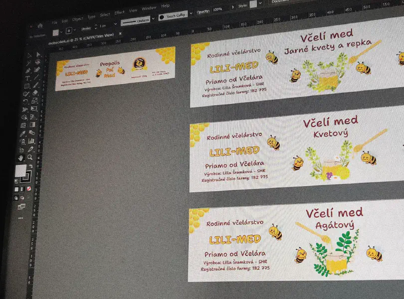
- Label layout: A consistent layout was developed that would be applied across all the honey varieties. The layout featured:
- The LILI-MED logo prominently displayed at the top-right corner.
- A playful bee character that helped add visual appeal to the text.
- Consistent font choices that ensured legibility and brand consistency.
- The farm information and weight were placed in standardized positions for easy recognition.
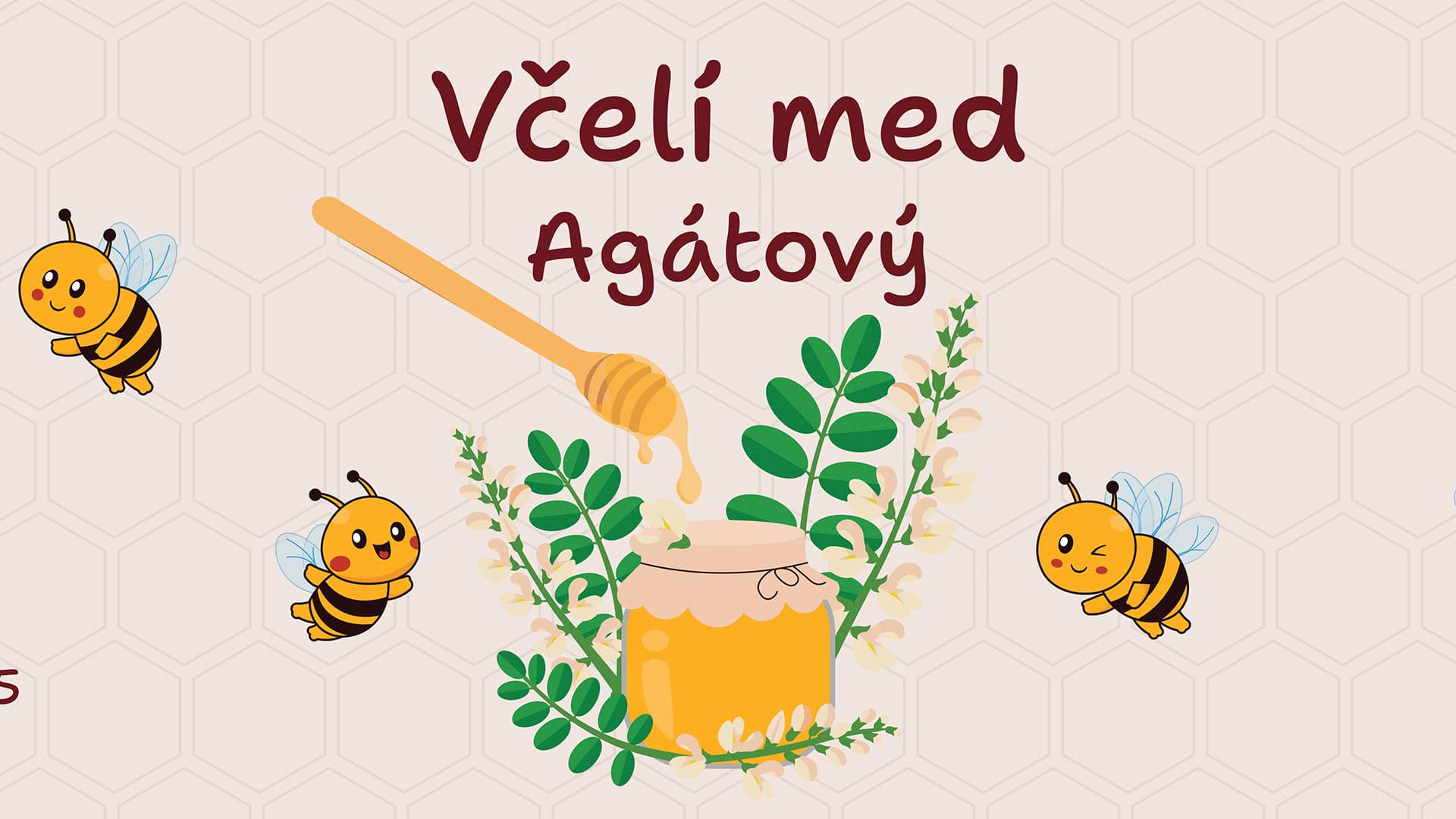
- Custom illustrations: To differentiate the various types of honey (e.g., spring blossom, acacia, linden, etc.), custom illustrations were created for each variety. The illustrations highlighted the source of the honey—such as flowers or specific plants—while maintaining the same artistic style, enhancing consistency across the product line.
- Propolis and pollen design: Special care was taken to design the "Propolis - Peľ - Med" label. The use of larger bee illustrations and distinct typography helped this label stand out while still aligning with the rest of the product range.

Final Deliverables
- Logo in Vector Format: The final, fully vectorized version of the LILI-MED logo that can be used in various media (print, web, etc.).
- Honey Jar Labels: Unique labels for the following products:
- Spring blossom and rapeseed honey ("Včelí med Jarné kvety a repka")
- Acacia honey ("Včelí med Agátový")
- Linden honey ("Včelí med Lipový")
- Flower honey ("Včelí med Kvetový")
- Propolis, pollen, and honey ("Propolis - Peľ - Med")
Each label featured custom illustrations, the new logo, and consistent typographical and layout elements across all varieties.
Implementation
The labels were printed and applied to honey jars, ensuring that the product packaging reflected the premium quality of the honey inside. The vectorized logo and scalable illustrations were used across various promotional materials, such as social media, product brochures, and in-store displays.
To further enhance brand consistency, LILI-MED implemented the new packaging design across their entire product line. The cohesive design allowed for easier identification of the brand on store shelves, as well as providing a professional and modern aesthetic.

Success Metrics
- Brand recognition: After the implementation of the new packaging design, LILI-MED experienced an increase in brand recognition both in local markets and online platforms. The consistent design across all products helped reinforce their identity as a family-run, high-quality honey producer.
- Sales growth: The new packaging contributed to improved shelf visibility, which led to an increase in sales. Customers were attracted to the fresh and vibrant look of the labels, which communicated the natural and family-oriented values of the brand.
- Customer feedback: LILI-MED received positive feedback from customers who appreciated the playful yet professional design, and the clear product differentiation across the different honey varieties.
- Business expansion: The updated logo and packaging enabled LILI-MED to explore new sales channels, including partnerships with local shops and online retail opportunities. The professional branding made it easier to present their products to a wider audience.
Let’s amplify your success together!
Request a Free QuoteRelated case studies

School Tableau Graphic Design for 9th Grade (2015-2024)
Základná škola Arnolda Ipolyiho aimed to create a modern, Spotify-inspired school tableau for its graduating 9th-grade class in 2024. The objective was to develop a visually appealing design that celebrated each student’s individuality while incorporating contemporary themes relevant to their interests. This unique tableau would blend traditional school elements with modern music culture, resulting in a memorable keepsake for the entire 9th-grade class and their teachers.

ZbraneBudai.sk roll up banner Graphic Design
ZbraneBudai.sk sought a captivating roll-up banner design to effectively promote their extensive range of firearms and hunting accessories. The objective was to create an eye-catching tool for trade shows and promotional events that highlighted the quality of their products and the reputable brands they represent. This design aimed to attract potential customers while effectively communicating the brand’s commitment to providing reliable hunting equipment.

Jubilee Commemorative Book Cover Graphic Design
We were commissioned to design a Jubilee Commemorative Book cover for Základná škola Arnolda Ipolyiho, celebrating its cultural and historical significance. The design aimed to embody the school’s values and identity, utilizing its main colors for visual consistency. This cover not only serves as a decorative element but also symbolizes the institution’s legacy and impact on the community.